Now that you have a connection from R to SQL, WOO HOO, what the heck do you do with it? Well for starters all of the reports that you wish Microsoft would write and ship with SSMS, now is your chance to do it yourself.
I will give you a few scripts every now and then just to get you started, I don’t have a production environment and I don’t have access to one so when I offer t-sql and R it will be from whatever data I can generate for a rudimentary test. If you have more data over a longer period of time, I may be interested in looking at it just to test out a bit. I am not going to write a system for you, but I can get you started. And i make no promises that when you run my code it wont blow chunks, my life time running joke is that i would never run my code in production, so i would certainly advise you not to either. Just consider everything i do introductory demos.
We have covered histograms in several posts so far and if you have been around the block a few times you probably decided it was a bar chart. Well, thats kinda true, the x axis is represented of the data, age n the x axis for instance would simply be age sorted ascending from left to right and the y axis for a frequency histogram would be the number of occurrences of that age. The most important option being the number of bins, everything else is just scale.
Load up some data and lets start by looking at the barchart versions of the histogram.
install.packages("mosaicData")
install.packages("mosaic")
library("mosaic")
library("mosaicData")
data("HELPmiss")
View("HELPmiss")
str(HELPmiss)
x <- HELPmiss[c("age","anysub","cesd","drugrisk","sex","g1b","homeless","racegrp","substance")]
#the par command will allow you to show more than one plot side by side
#par(mfrow=c(2,2)); or par(mfrow=c(3,3)); etc...
par(mfrow=c(1,2))
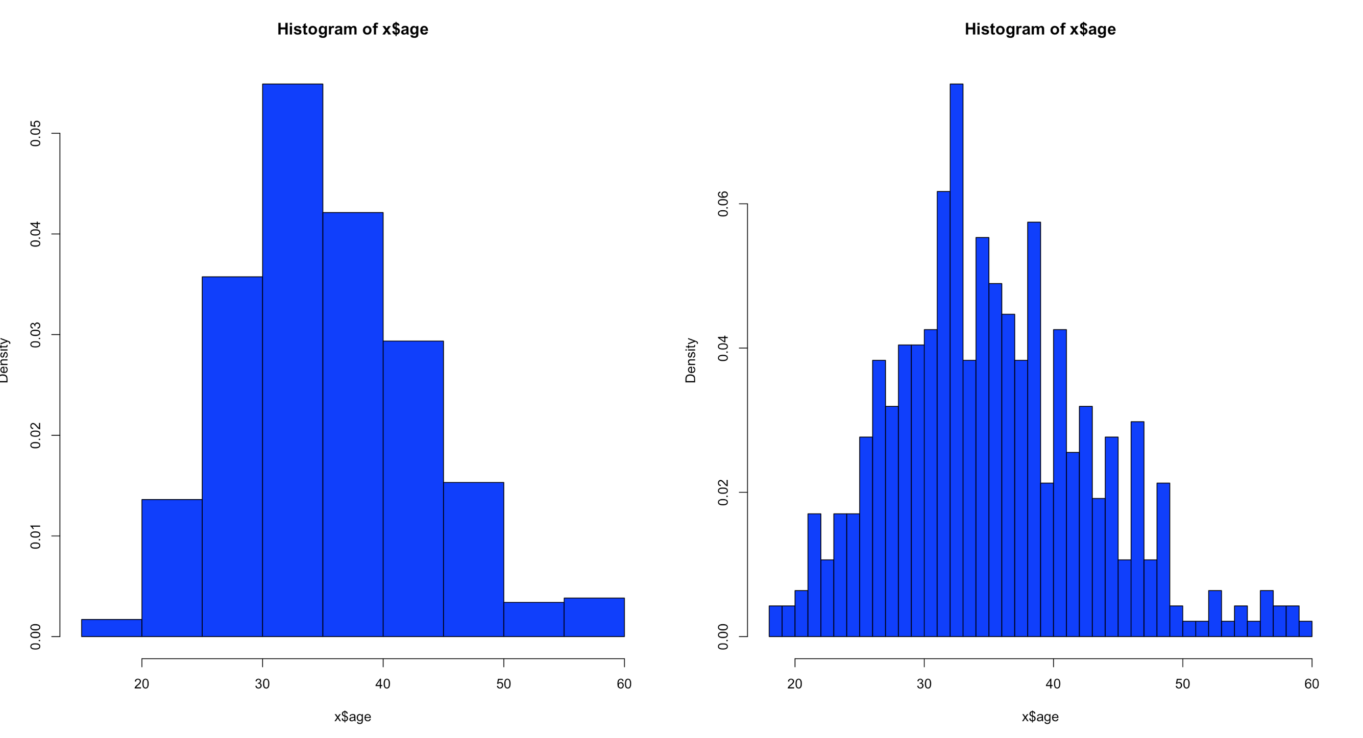
hist(x$age,col="blue",breaks=10)
hist(x$age,col="blue",breaks=50)
Using the code above you can see that the number of bins does change the graph too dramatically though some averaging clearly is taking place, but the x and y axis both make sense. We are basically looking at a bar chart, and based on shape we can derive some level of data distribution.
So, what happens when we add the line, the density curve, the PDF call it what you will? I have mentioned before it is a probability density function, but what does that really mean? And why do the numbers on the y axis charge so dramatically?
Well, first lets look at the code to create it. Same dataset as above, but lets add the "prob=TRUE" option.
Notice the y axis scale is no longer frequency, but density. Okay, whats that? Density is a probability of that number occurring relative to all other numbers. Being a probability function and being relative to all numbers it should probably add up to 100% then, or in the case of proportions which is what we have all should add up to 1. The problem is a histogram is a miserable way to figure that out. And clearly changing the bins from 20 to 50 not only changed the number of bins as we would expect it also changed the y-axis. Whaaaaaaa? As if to tell me that even though the data is the same the probability has changed. So how can i ever trust this?
Well, there is a way to figure out what is going on! I'm not going to lie, the first time i saw this my mind was a little blown. You can get all the data that is generated and used to create the histogram.
Pipe the results into a variable then simply display the variable.
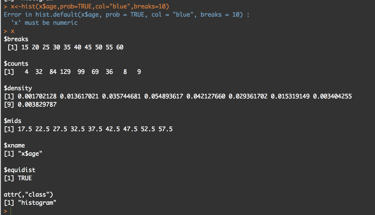
y<-hist(x$age,prob=TRUE,col="blue",breaks=10)
y
What you will see is the guts of what it takes to create the hist(); what we care about is the $counts, $density, and the $mids. Counts are the height of the bins, density is the actual probability and what will be the y axis, and mids is the x axis.
So, based on any probability we should get "1" indicating 100% of the data if we sum $density... Lets find out.
sum(y$density)
#[1] 0.2
I got .2...
Lets increase the bins and see what happens, we know the scale changed, maybe my density distribution will to.
z<-hist(x$age,prob=TRUE,col="blue",breaks=50)
z

sum(y$density)
#[1] 1
Hmm, this time i get a "1". You will also notice that when the bins are increased to 50 the number of values in $mids and $density increased, it just so happens that for this dataset 50 was a better number of bins, though you will see that $density and $mids only went to a count of 42 values, which is enough.
With the below code you can get an estimation of the probability of specific numbers occurring. For the dataset i am using, 32.5 occurs 7.66% of the time, so that is the likely probability of that age occurring on future random variables. With less bins, you are basically getting an estimated average but not necessarily the full picture, so a density function in a histogram can be tricky and misleading if you attempt to make a decision on this.
z<-hist(x$age,prob=TRUE,col="blue",breaks=50)
z

distz<- as.data.frame(list(z$density,z$mids))
names(distz) <- c("density","mids")
distz
So what is all of this? well, when you switch the hist() function to prob=true, you pretty much leave descriptive statistics and are now in probability. The thing that is used to figure out the distribution is called a kernel density estimation and in some cases called the Parzen-Rosenblatt-Window Density estimation, or kernel estimation. The least painful definition " to estimate a probability density function p(x) for a specific point p(x) from a sample p(xn) that doesn’t require any knowledge or assumption about the underlying distribution."
The definitions of the hist fields are int eh CRAN Help under hist() in the values section. Try this out, try different data and check out how the distribution changes with more or less bins.
Picking up from the last post we will now look at Chebyshevs rule. For this one we will be using ggplot2 histogram with annotations just to shake things up a bit.
Chebyshevs rule, theorem, inequality, whatever you want to call it states that all possible datasets regardless of shape will have 75% of the data within 2 standard deviations, and 88.89% within 3 standard deviations. This should apply to mound shaped datasets as well as bimodal (two mounds) and multimodal.
First, below is the empirical R code from the last blog post using ggplot2 if you are interested, otherwise skip this and move down. This is the script for the empirical rule calculations. Still using the US-Education.csv data.
require(ggplot2)

usa <- read.csv("/data/US-Education.csv",stringsAsFactors=FALSE)
str(usa)

highSchool <- subset(usa[c("FIPS.Code","Percent.of.adults.with.a.high.school.diploma.only..2010.2014")],FIPS.Code >0)

#reanme the second column to something less annoying
colnames(highSchool)[which(colnames(highSchool) == 'Percent.of.adults.with.a.high.school.diploma.only..2010.2014')] <- 'percent'


#create a variable with the mean and the standard devaiation
hsMean <- mean(highSchool$percent,na.rm=TRUE)
hsSD <- sd(highSchool$percent,na.rm=TRUE)

#one standard deviation from the mean will "mean" one SD
#to the left (-) of the mean and one SD to the right(+) of hte mean.
oneSDleftRange <- (hsMean - hsSD)
oneSDrightRange <- (hsMean + hsSD)
oneSDleftRange;oneSDrightRange
oneSDrows <- nrow(subset(highSchool,percent > oneSDleftRange & percent < oneSDrightRange))
oneSDrows / nrow(highSchool)


#two standard deviations from the mean will "mean" two SDs
#to the left (-) of the mean and two SDs to the right(+) of the mean.
twoSDleftRange <- (hsMean - hsSD*2)
twoSDrightRange <- (hsMean + hsSD*2)
twoSDleftRange;twoSDrightRange
twoSDrows <- nrow(subset(highSchool,percent > twoSDleftRange & percent < twoSDrightRange))
twoSDrows / nrow(highSchool)

#two standard deviations from the mean will "mean" two SDs
#to the left (-) of the mean and two SDs to the right(+) of the mean.
threeSDleftRange <- (hsMean - hsSD*3)
threeSDrightRange <- (hsMean + hsSD*3)
threeSDleftRange;threeSDrightRange
threeSDrows <- nrow(subset(highSchool,percent > threeSDleftRange & percent < threeSDrightRange))
threeSDrows / nrow(highSchool)

ggplot(data=highSchool, aes(highSchool$percent)) +
  geom_histogram(breaks=seq(10, 60, by =2),
                 col="blue",
                 aes(fill=..count..))+
  labs(title="Completed High School") +
  labs(x="Percentage", y="Number of Counties")

ggplot(data=highSchool, aes(highSchool$percent)) +
  geom_histogram(breaks=seq(10, 60, by =2),
                 col="blue",
                 aes(fill=..count..))+
  labs(title="Completed High School") +
  labs(x="Percentage", y="Number of Counties") +
  geom_vline(xintercept=hsMean,colour="green",size=2)+
  geom_vline(xintercept=oneSDleftRange,colour="red",size=1)+
  geom_vline(xintercept=oneSDrightRange,colour="red",size=1)+
  geom_vline(xintercept=twoSDleftRange,colour="blue",size=1)+
  geom_vline(xintercept=twoSDrightRange,colour="blue",size=1)+
  geom_vline(xintercept=threeSDleftRange,colour="black",size=1)+
  geom_vline(xintercept=threeSDrightRange,colour="black",size=1)+
  annotate("text", x = hsMean+2, y = 401, label = "Mean")+
  annotate("text", x = oneSDleftRange+4, y = 351, label = "68%")+
  annotate("text", x = twoSDleftRange+4, y = 301, label = "95%")+
  annotate("text", x = threeSDleftRange+4, y = 251, label = "99.7%")
It would do no good to use the last dataset for to try out Chebyshevs rule as we know it is mond shaped, and fit oddly well to the empirical rule. Now lets try a different column in the US-Education dataset.
usa <- read.csv("/data/US-Education.csv",stringsAsFactors=FALSE)
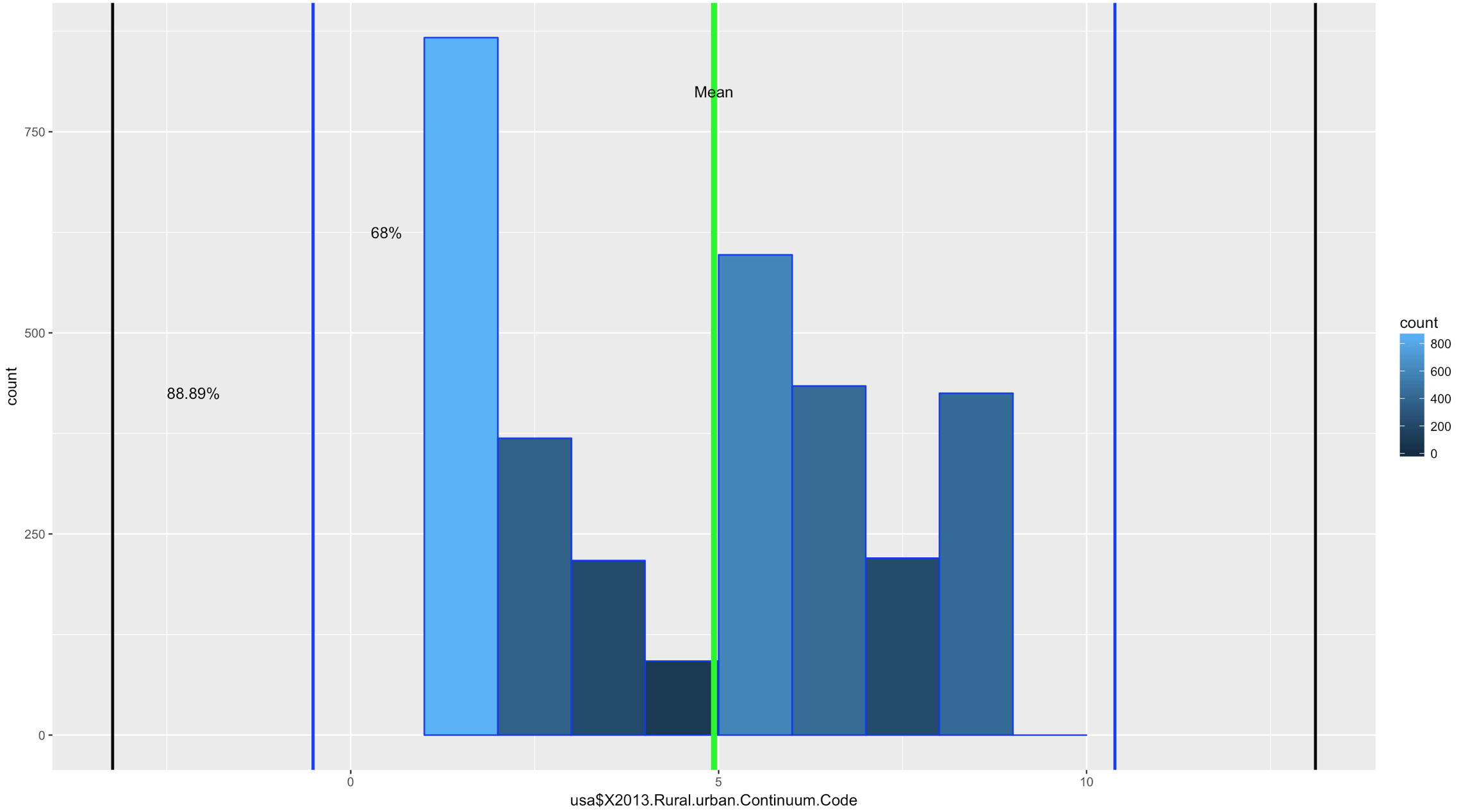
ggplot(data=usa, aes(usa$X2013.Rural.urban.Continuum.Code)) +
geom_histogram(breaks=seq(1, 10, by =1),
col="blue",
aes(fill=..count..))
Comparatively speaking, this one looks a little funky, this is certainly bimodal, if not nearly trimodal. This should be a good test for Chebyshev.
So, lets reuse some of the code above, drop the first standard dviation since Chebyshev does not need it and see if we can get this to work with "X2013.Rural.urban.Continuum.Code"
usa <- read.csv("/data/US-Education.csv",stringsAsFactors=FALSE)
str(usa)

urbanMean <- mean(usa$X2013.Rural.urban.Continuum.Code,na.rm=TRUE)
urbanSD <- sd(usa$X2013.Rural.urban.Continuum.Code,na.rm=TRUE)


#two standard deviations from the mean will "mean" two SDs
#to the left (-) of the mean and two SDs to the right(+) of the mean.
twoSDleftRange <- (urbanMean - urbanSD*2)
twoSDrightRange <- (urbanMean + urbanSD*2)
twoSDleftRange;twoSDrightRange
twoSDrows <- nrow(subset(usa,X2013.Rural.urban.Continuum.Code > twoSDleftRange & usa$X2013.Rural.urban.Continuum.Code < twoSDrightRange))
twoSDrows / nrow(usa)

#two standard deviations from the mean will "mean" two SDs
#to the left (-) of the mean and two SDs to the right(+) of the mean.
threeSDleftRange <- (urbanMean - urbanSD*3)
threeSDrightRange <- (urbanMean + urbanSD*3)
threeSDleftRange;threeSDrightRange
threeSDrows <- nrow(subset(usa,X2013.Rural.urban.Continuum.Code > threeSDleftRange & X2013.Rural.urban.Continuum.Code < threeSDrightRange))
threeSDrows / nrow(usa)


ggplot(data=usa, aes(usa$X2013.Rural.urban.Continuum.Code)) +
  geom_histogram(breaks=seq(1, 10, by =1),
                 col="blue",
                 aes(fill=..count..))+
                geom_vline(xintercept=urbanMean,colour="green",size=2)+
                geom_vline(xintercept=twoSDleftRange,colour="blue",size=1)+
                geom_vline(xintercept=twoSDrightRange,colour="blue",size=1)+
                geom_vline(xintercept=threeSDleftRange,colour="black",size=1)+
                geom_vline(xintercept=threeSDrightRange,colour="black",size=1)+
                annotate("text", x = urbanMean, y = 800, label = "Mean")+
                annotate("text", x = twoSDleftRange+1, y = 625, label = "68%")+
                annotate("text", x = threeSDleftRange+1.1, y = 425, label = "88.89%")
If you looked at the data and you looked at the range of two standard deviations above, you should know we have a problem; 98% of the data fell within 2 standard deviations. While yes, 68% of the data is also in the range it turns out this is a terrible example. The reason i include it is because it is just as important to see a test result that fails your expectation as it is for you to see on ethat is perfect! You will notice that the 3rd standard deviations is far outside the data range.
SO, what do we do? fake data to the rescue!
I try really hard to avoid using made up data because to me it makes no sense, where as car data, education data, population data, that all makes sense. But, there is no getting around it! Here is what you need to know, rnorm() generates random data based on a normal distribution using the variables standard deviation and a mean! But wait, we are trying to get multi-modal distribution. Then concatenate more than one normal distribution, eh? Lets try three.
We are going to test for one standard deviation just to see what it is, even though Chebyshevs rule has no interest in it, remember the rule states that 75% the data will fall within 2 standard deviations.
#set.seed() will make sure the random number generation is not random everytime
set.seed(500)
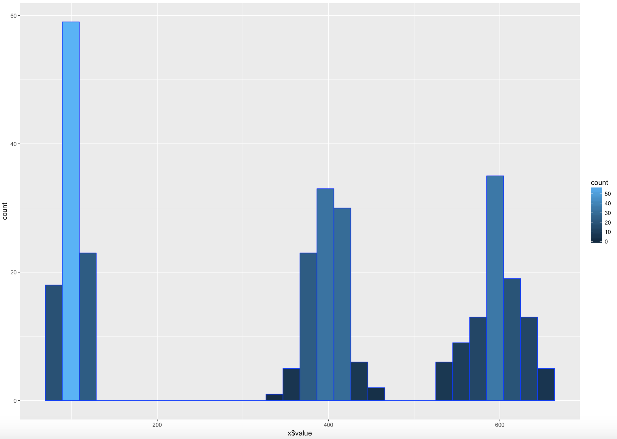
x <- as.data.frame(c(rnorm(100,100,10)
,(rnorm(100,400,20))
,(rnorm(100,600,30))))
colnames(x) <- c("value")
#hist(x$value,nclass=100)
ggplot(data=x, aes(x$value)) +
geom_histogram( col="blue",
aes(fill=..count..))
sd(x$value)
mean(x$value)
#if you are interested in looking at just the first few values
head(x)
xMean <- mean(x$value)
xSD <- sd(x$value)
#one standard deviation from the mean will "mean" 1 * SD
#to the left (-) of the mean and one SD to the right(+) of the mean.
oneSDleftRange <- (xMean - xSD)
oneSDrightRange <- (xMean + xSD)
oneSDleftRange;oneSDrightRange
oneSDrows <- nrow(subset(x,value > oneSDleftRange & x < oneSDrightRange))
print("Data within One standard deviations");oneSDrows / nrow(x)
#two standard deviations from the mean will "mean" 2 * SD
#to the left (-) of the mean and two SDs to the right(+) of the mean.
twoSDleftRange <- (xMean - xSD*2)
twoSDrightRange <- (xMean + xSD*2)
twoSDleftRange;twoSDrightRange
twoSDrows <- nrow(subset(x,value > twoSDleftRange & x$value < twoSDrightRange))
print("Data within Two standard deviations");twoSDrows / nrow(x)
#three standard deviations from the mean will "mean" 3 * SD
#to the left (-) of the mean and two SDs to the right(+) of the mean.
threeSDleftRange <- (xMean - xSD*3)
threeSDrightRange <- (xMean + xSD*3)
threeSDleftRange;threeSDrightRange
threeSDrows <- nrow(subset(x,value > threeSDleftRange & x$value < threeSDrightRange))
print("Data within Three standard deviations");threeSDrows / nrow(x)
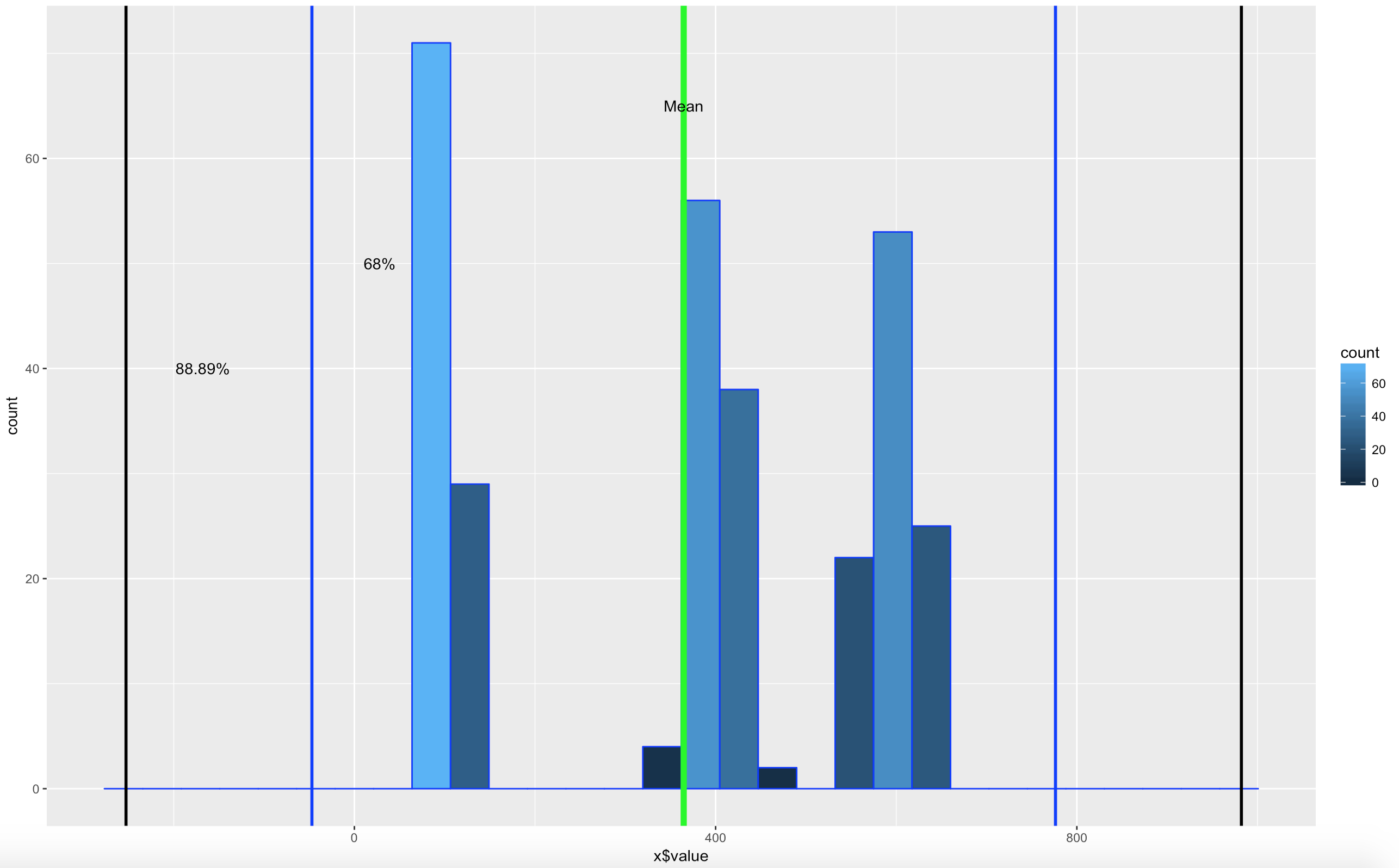
WOOHOO, Multimodal! Chebyshev said it works on anything, lets find out. The histogram below is a hot mess based on how the data was created, but it is clear that the empirical rule will not apply here, as the data is not mound shaped and is multimodal or trimodal.
Though Chebyshevs rule has no interest in 1 standard deviation i wanted to show it just so you could see what the 1 SD looks like. I challenge you to take the rnorm and see if you can modify the mean and SD parameters passed in to make it fall outside o the 75% of two standard deviations.
[1] "Data within One standard deviations" = 0.3966667 # or 39.66667%
[1] "Data within Two standard deviations" = 1 # or 100%
[1] "Data within Three standard deviations" = 1 or 100%
Lets add some lines;
ggplot(data=x, aes(x$value)) +
  geom_histogram( col="blue",
                    aes(fill=..count..))+
                    geom_vline(xintercept=xMean,colour="green",size=2)+
                    geom_vline(xintercept=twoSDleftRange,colour="blue",size=1)+
                    geom_vline(xintercept=twoSDrightRange,colour="blue",size=1)+
                    geom_vline(xintercept=threeSDleftRange,colour="black",size=1)+
                    geom_vline(xintercept=threeSDrightRange,colour="black",size=1)+
                    annotate("text", x = xMean, y = 65, label = "Mean")+
                    annotate("text", x = twoSDleftRange+75, y = 50, label = "68%")+
                    annotate("text", x = threeSDleftRange+85, y = 40, label = "88.89%")
There you have it! It is becoming somewhat clear that based on the shape of the data and if you are using empirical or Chebyshevs rule, data falls into some very predictable patters, maybe from that we can make some predictions about new data coming in...?
So, we have covered standard deviation and mean, discussed central tendency, and we have demonstrated some histograms. You are familiar with what a histogram looks like and that depending on the data, it can take many shapes. Today we are going to discuss distribution that specifically applies to mound shaped data. We happen to have been working with a couple of datasets that meet this criteria perfectly, or at least it does in shape.
In the last blog, we had two datasets from US Educational attainment that appeared to be mound shaped, that being the key word, mound shaped. If it is mound shaped, we should be able to make some predictions about the data using the Empirical Rule, and if not mound shape, the Chebyshevs rule.
The point of this as stated in my stats class, to link visualization of distributions to numerical measures of center and location. This will only apply to mound shaped data, like the following;
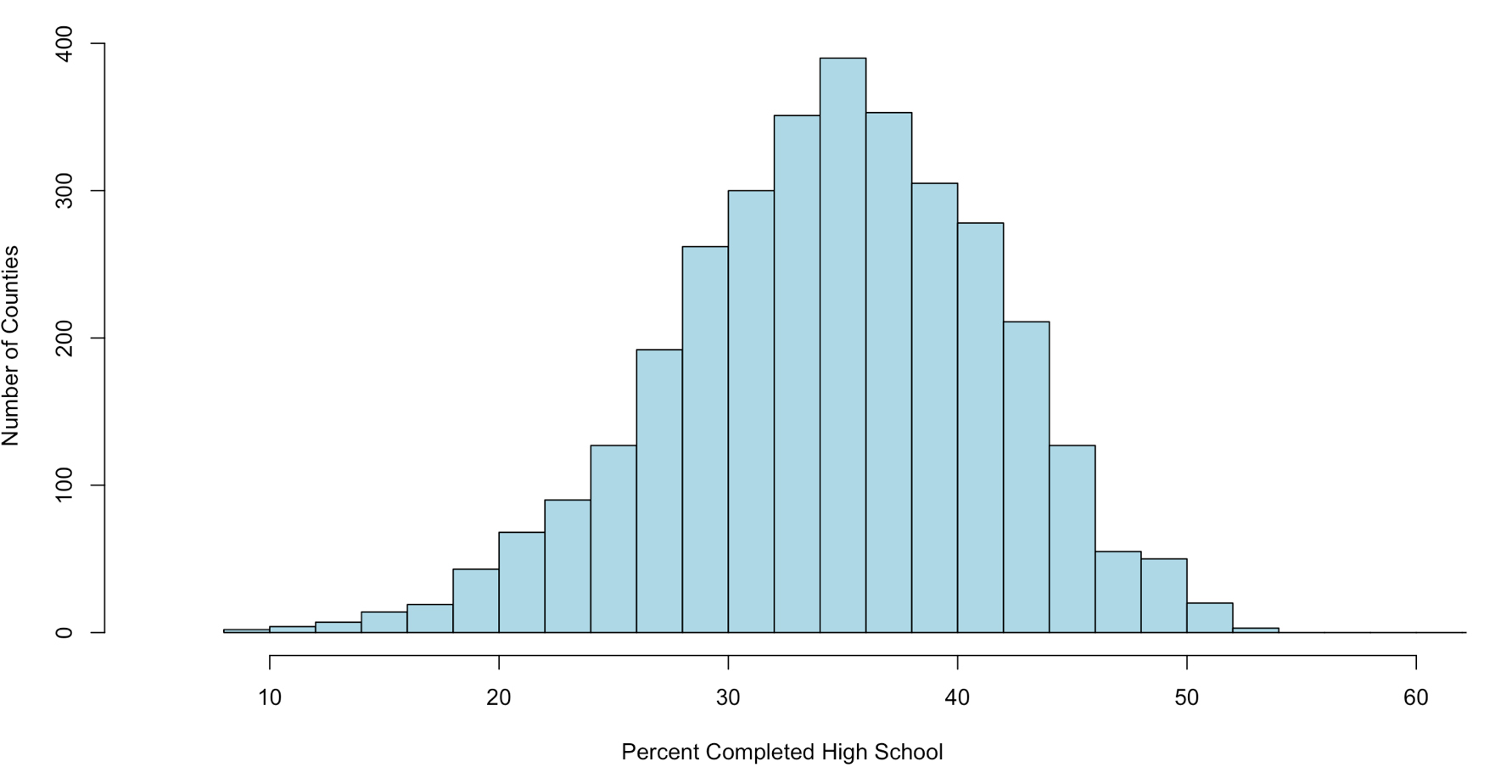
When someone says mound shaped data, this is the text book example of mound shaped. This is from the US-Education.csv data that we have been playing with, below are the commands to get you started and get you a histogram.
Just so you fully understand wha this data is, every person in the US reports their level of educational attainment to the Census every ten years, every few years this data is updated and projected to estimate reasonably current values. This we will be using is for the 2010-2014 years which is the five year average compiled by the American Community Survey. I highly encourage use of this website for test data, all of it has to be manipulated a little bit, but it typically takes minutes to get it into a format R can use.
usa <- read.csv("/data/US-Education.csv",stringsAsFactors=FALSE)
str(usa)

#While not required, i want to isolate the data we will be working with
highSchool <- subset(usa[c("FIPS.Code","Percent.of.adults.with.a.high.school.diploma.only..2010.2014")],FIPS.Code >0)

#reanme the second column to something less annoying
colnames(highSchool)[which(colnames(highSchool) == 'Percent.of.adults.with.a.high.school.diploma.only..2010.2014')] <- 'percent'

#Display a histogram
hist(highSchool$percent
    ,xlim=c(5,60)
    ,breaks=20
    ,xlab = "Percent Completed High School "
    ,ylab = "Number of Counties"
    ,main = ""
    ,col = "lightblue")
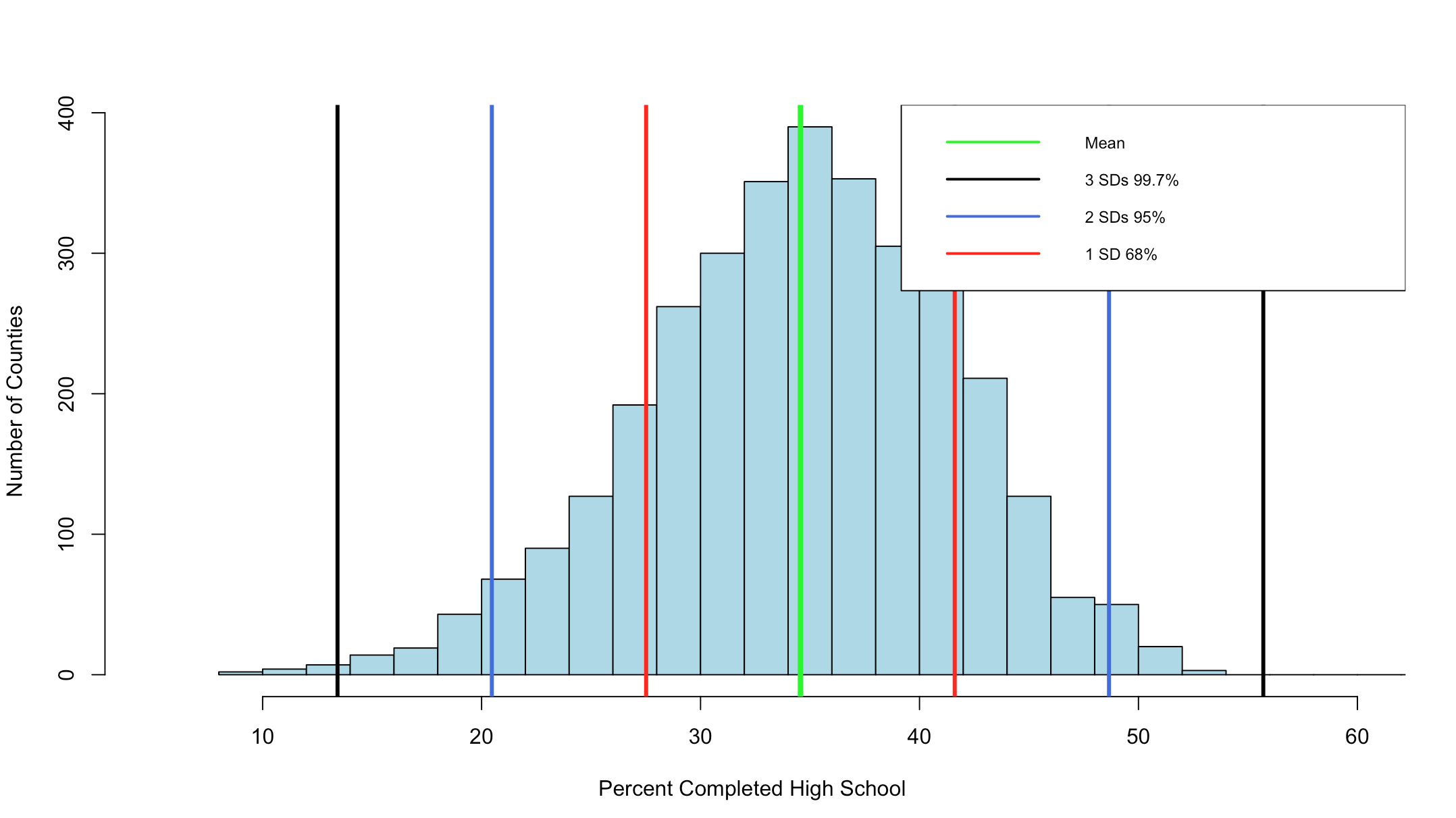
The Empirical rule states that
68% of the data will fall with in 1 standard deviation of the mean,
95% of the data will fall within 2 standard deviations of the mean, and
99.7% of the data will fall within 3 standard deviations of them mean.
Lets find out!
#create a variable with the mean and the standard devaiation
hsMean <- mean(highSchool$percent,na.rm=TRUE)
hsSD <- sd(highSchool$percent,na.rm=TRUE)

#one standard deviation from the mean will "mean" one SD
#to the left (-) of the mean and one SD to the right(+) of the mean.
#lets calculate and store them

oneSDleftRange <- (hsMean - hsSD)
oneSDrightRange <- (hsMean + hsSD)

oneSDleftRange;oneSDrightRange


##[1] 27.51472 is one sd to the left of the mean
##[1] 41.60826 is one sd to the right of the mean

#lets calculate the number of rows that fall
#between 27.51472(oneSDleftRange) and 41.60826(oneSDrightRange)
oneSDrows <- nrow(subset(highSchool,percent > oneSDleftRange & percent < oneSDrightRange))

# whats the percentage?
oneSDrows / nrow(highSchool)
If everything worked properly, you should have seen that the percentage of counties within one standard deviation of the mean is "0.6803778" or 68.04%. Wel that was kinda creepy wasn't it? The empirical rule states that 68% of the data will be within one standard deviation.
Lets keep going.
#two standard deviations from the mean will "mean" two SDs
#to the left (-) of the mean and two SDs to the right(+) of the mean.
twoSDleftRange <- (hsMean - hsSD*2)
twoSDrightRange <- (hsMean + hsSD*2)


twoSDleftRange;twoSDrightRange

##[1] 20.46795 is two sds to the left of the mean
##[1] 48.65503 is two sds to the right of the mean

twoSDrows <- nrow(subset(highSchool,percent > twoSDleftRange & percent < twoSDrightRange))

twoSDrows / nrow(highSchool)
If your math is the same as my math, you should have gotten 95.09%, so far the empirical rule is holding...
You can see the distribution of the data below, it really does seem to fall into pretty predictable standard deviations.
It has frequently been my opinion and others that R was written by an angry teenager to get even with his boomer parents, while not entirely true R has many frustrations. The nice thing is, you can write your own package to handle many of these more complex visualizations, i stuck to Base R for this histogram, and it does get the point across, but ggplot provides much better graphics and legends.
This is a slight diversion into a tool built into R called R Markdown, and Shiny will be coming up in a few days. Why is this important? It gives you a living document you can add text and r scripts to to produce just the output from R. I wrote my Stats grad project using just R Markdown and saved it to a PDF, no Word or open office tools.
Its a mix of HTML and R, so if you know a tiny bit about HTML programing you will be fine, otherwise, use the R Markdown Cheat sheet and Reference Guide which i just annoyingly found out existed…
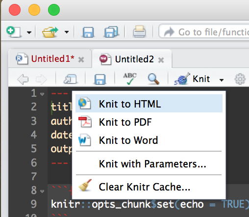
I am going to give you a full R Markdown document to get you started.
Create a new R Markdown file;
Then Run it by selecting the “Knit” drop down in the middle left of the toolbar and selecting Knit to HTML.
This will create an html document that you can open in a browser, it comes with some default mtcars data just so you can see some output. Try out some R commands and doodle around a bit before starting the code below. This is the file data file we will be using, US-Education.csv It contains just the 2010-2014 educational attainment estimates per count in the US.
In the code books below i will put in each section of the R Markdown and discuss it, each R code block can me moved to r console to be run.
The first section Is the title that will show up on the top of the doc, copy this into the markdown file and run it by itself. I am using an html style tag as i want some of the plots to be two columns across.
You will also see the first R command in an “R” block identified by ““`{r} and terminated with ““`”. Feel free to remove options and change options to see what happens.
Notice below the style tag is wrong, when you copy it out you will need to put the “<" back in from of the style tag. If i format it correctly wordpress takes it as an internal style tag to this post.
---
title: "Educational Attainment by County"

output: html_document
---

style>
  .col2 {
    columns: 2 200px;         /* number of columns and width in pixels*/
    -webkit-columns: 2 200px; /* chrome, safari */
    -moz-columns: 2 200px;    /* firefox */
     line-height: 2em;
     font-size: 10pt;

  }

/style>

```{r setup, include=FALSE}
knitr::opts_chunk$set(echo = FALSE,warning=FALSE)

#require is the fancy version of install package/library
require(choroplethr)

```
This will be the next section in the markup, load a dataframe for each of the four educational attainment categories.
```{r one}

#Load data
 setwd("/data/")
 usa <- read.csv("US-Education.csv",stringsAsFactors=FALSE)

#Seperate data for choropleth
 lessHighSchool <- subset(usa[c("FIPS.Code","Percent.of.adults.with.less.than.a.high.school.diploma..2010.2014")],FIPS.Code >0)

highSchool <- subset(usa[c("FIPS.Code","Percent.of.adults.with.a.high.school.diploma.only..2010.2014")],FIPS.Code >0)

someCollege <- subset(usa[c("FIPS.Code","Percent.of.adults.completing.some.college.or.associate.s.degree..2010.2014")],FIPS.Code >0)

college <- subset(usa[c("FIPS.Code","Percent.of.adults.with.a.bachelor.s.degree.or.higher..2010.2014")],FIPS.Code >0)

#rename columns for Choropleth

 colnames(lessHighSchool)[which(colnames(lessHighSchool) == 'FIPS.Code')] <- 'region'

 colnames(lessHighSchool)[which(colnames(lessHighSchool) == 'Percent.of.adults.with.less.than.a.high.school.diploma..2010.2014')] <- 'value'

#
# or
#
 names(highSchool) <-c("region","value")
 names(someCollege) <-c("region","value")
 names(college) <-c("region","value")


```
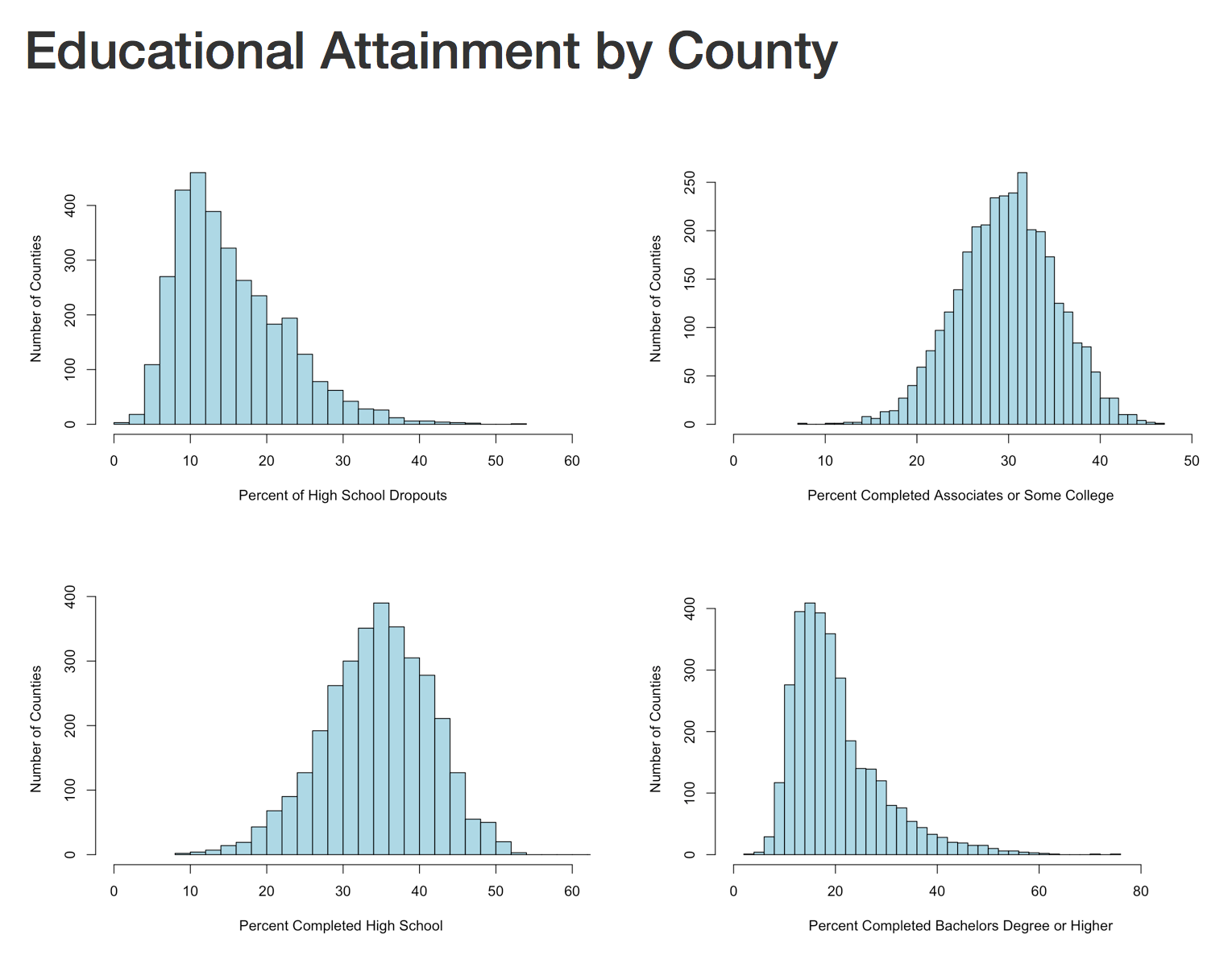
The next section will create four histograms of the college attainment by category. Notice the distribution of the data, normal distribution, right skew, left skew, bimodal? We will discuss them next blog.
Notice for the next section i have the "div" without the left "<", be sure to put those back.
div class="col2">

```{r Histogram 1}
 hist(lessHighSchool$value,xlim=c(0,60),breaks=30, xlab = "Percent of High School Dropouts", ylab="Number of Counties",main="",col="lightblue")


 hist(highSchool$value,xlim=c(0,60),breaks=30, xlab = "Percent Completed High School ", ylab="Number of Counties",main="",col="lightblue")

```


```{r Histogram 2}

 hist(someCollege$value,xlim=c(0,50),breaks=30, xlab = "Percent Completed Associates or Some College ", ylab="Number of Counties",main="",col="lightblue")

 hist(college$value,xlim=c(0,90),breaks=30, xlab = "Percent Completed Bachelors Degree or Higher ", ylab="Number of Counties",main="",col="lightblue")


```

/div>
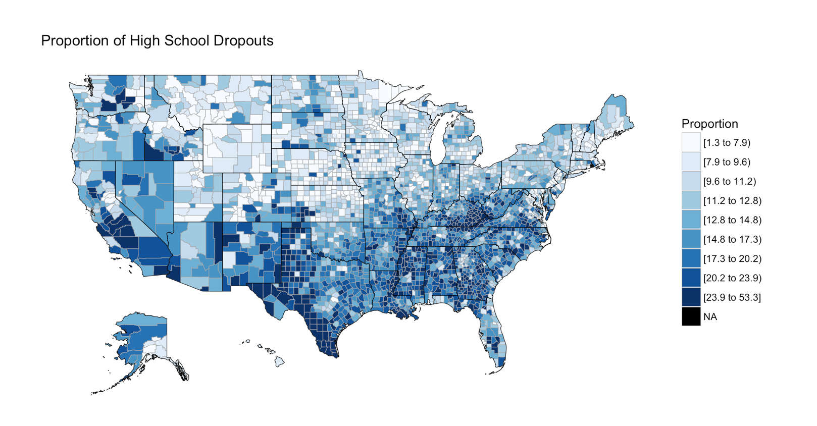
The next section is the choropleth, for the high school dropouts, notice the R chunk parameters to size the plot area.
```{r two, fig.width=9, fig.height=5, fig.align='right'}


 county_choropleth(lessHighSchool,

                   title = "Proportion of High School Dropouts",
                   legend="Proportion",
                   num_colors=9)

```
There are three more choropleths that you will have to do on your own! you have the data, and the syntax. If you have trouble with this, the red file i used is here Education.rmd
In the end, you should have a histogram looking like this;
And if you make it to the first choropleth, Percentage that did not complete high school;
In the ongoing visualization show and tell scatterplots have come up next on my list. As I write this blog I try very hard to check and double check my knowledge and methods, I usually have a dataset or two in mind long before I get to the point I want to write about it. This time, I wanted to use the mtcars dataset to play around with the dataset and run a line through the scatter plot to show a trend, lo and behold its already been done to the exact spec I was thinking of doing. Truth be told i am not the first to do any of this, google is your friend when learning R.
So with that, I will do one set with mtcars and send you to Quick-R Scatterplots for the rest. Be careful of some of the visualizations, while nothing will stop you from creating a 3d spinning scatter plot, it is considered chart junk and there is a special website for people who create those are honored. I bet you didn’t know there was a “wtf” domain did you?
I did run into an interesting issue though that I will discuss today, it is a leap ahead, but it is important.
But, lets get some scatterplot going on first.
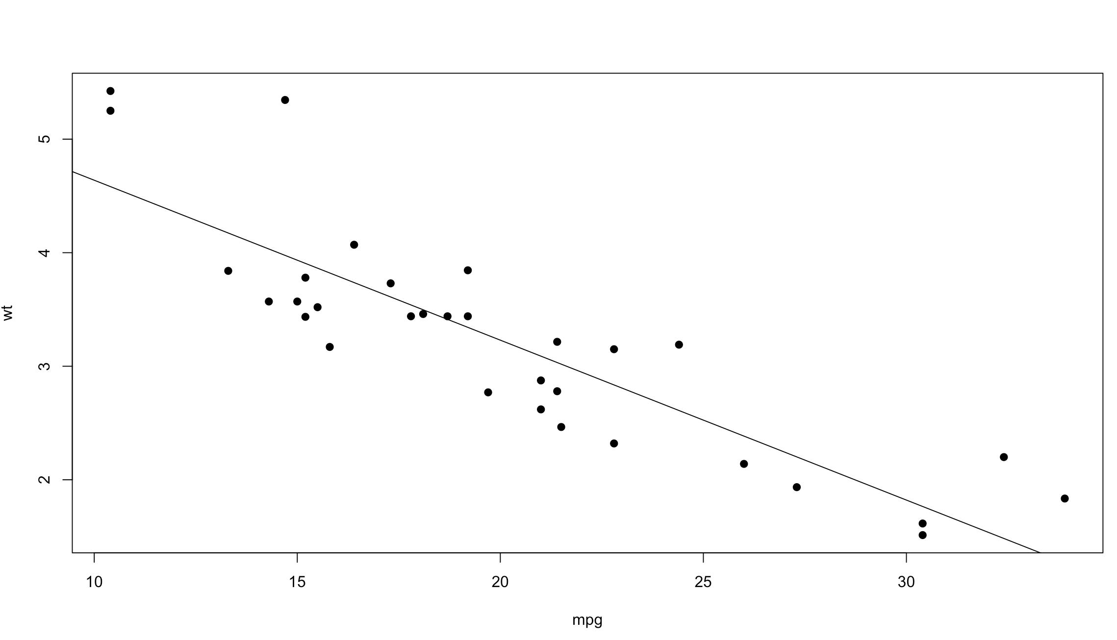
Below we have loaded the mtcars dataset, and run an attach(). Attach() gives the ability to access the variables/columns of the dataset without having to reference the dataset name. So, instead of mtcars$cyl we can just reference cyl in functions after the attach. It has down sides, so be careful, sort of like a global anything in programming.
data(mtcars)
mtcars
attach(mtcars)

plot(mpg,wt)
With the scatterplot we have two dimensions of data, on the left is the y axis, the weight of the vehicle in thousands of pounds, and on the bottom is the x axis, mpg or miles per gallon.
That was cool, no? Lets add “pch=19” to the next plot to make the dots a bit more visible, and add a line through the data. Abline() draws a straight line through the plot using intercept and slope, we can get the intercept and slope by passing the wt and mpg into a linear model function called lm(). Run lm(wt ~ mpg) by itself and see what you get. Make sure mpg and wt are in the order specified below, “mpg, wt” for the plot and wt~mpg for the lm function. if you dig into the lm() function you will see that we are passing in just a formula of “wt ~ mpg”, from the R documentation for lm() y must be first which is the response variable. Much, Much more on this later, just know for now, y must be first when using lm(), not x.
So, using our scatterplot and the lm function it would appear that as weight increases mpg decreases.
Well thats all pretty cool, but a straight line through my data gives me an idea of the trend but can be misleading if the data is wiggly in the scatter plot, or appears not to be trending.
Using the lines() and “lowess” option you can see that the line is a little more in tune with the trend of the data. LOWESS is locally weighted scatterplot smoothing. This is much more than just intercept and slope. Depending on the package you are using, there is more than one way to get a line to fit the data.
Lets have a little fun. Hopefully you have played with the mtcars dataset a little bit and maybe even tried out some of the other base R datasets, or loaded your own. The best way to engage in topics like this is to use a dataset you have some passion or curiosity about.
region – County name CountyFipsCode – The Federal Information Processing Standard code the uniquely identifies the county. population – American Community Survey estimated population CollegeDegree – percentage of residents that have completed at least an undergraduate degree. College – this is the sum of CollegeDegree percentage and the completed some college percentage.
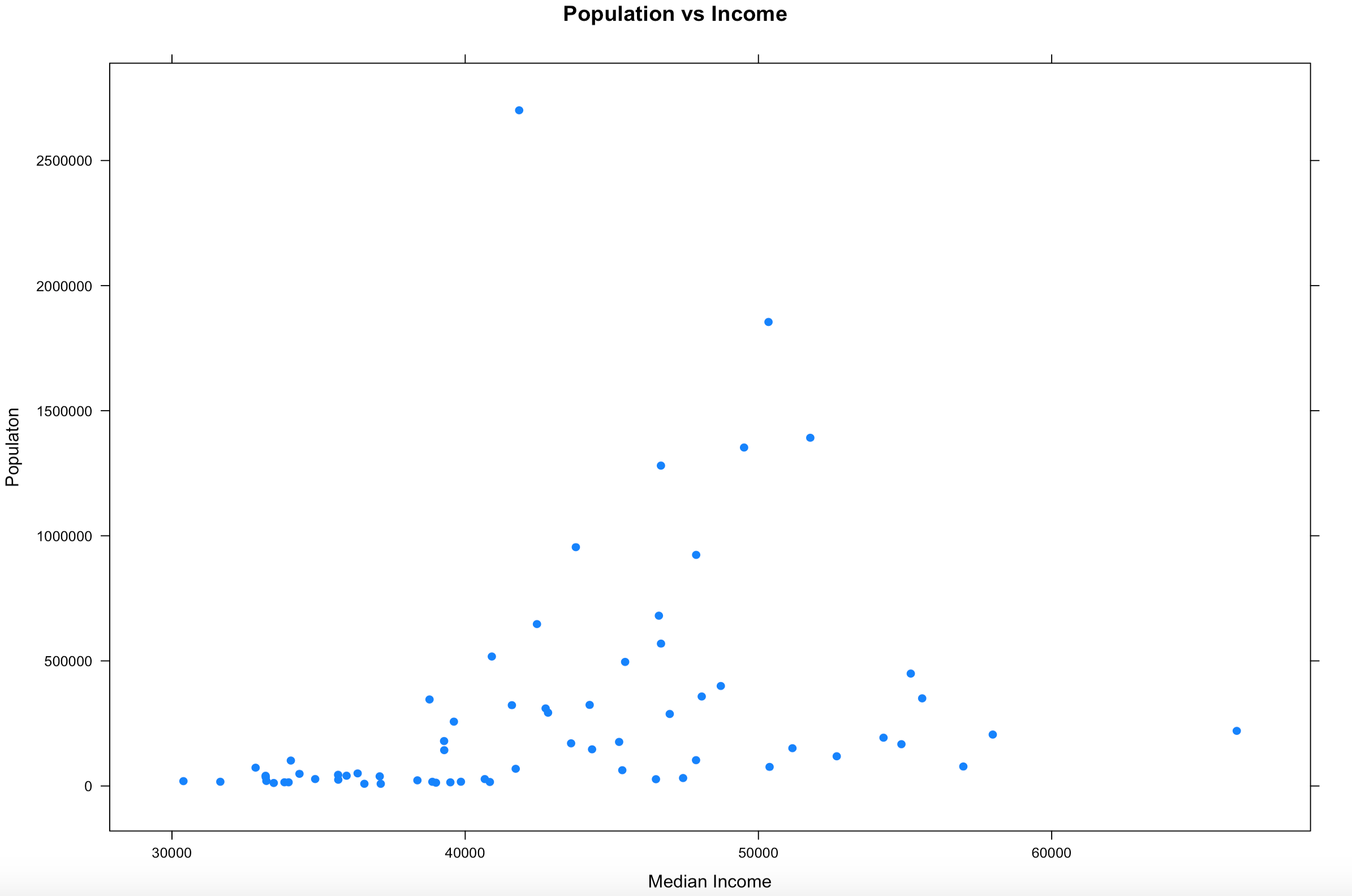
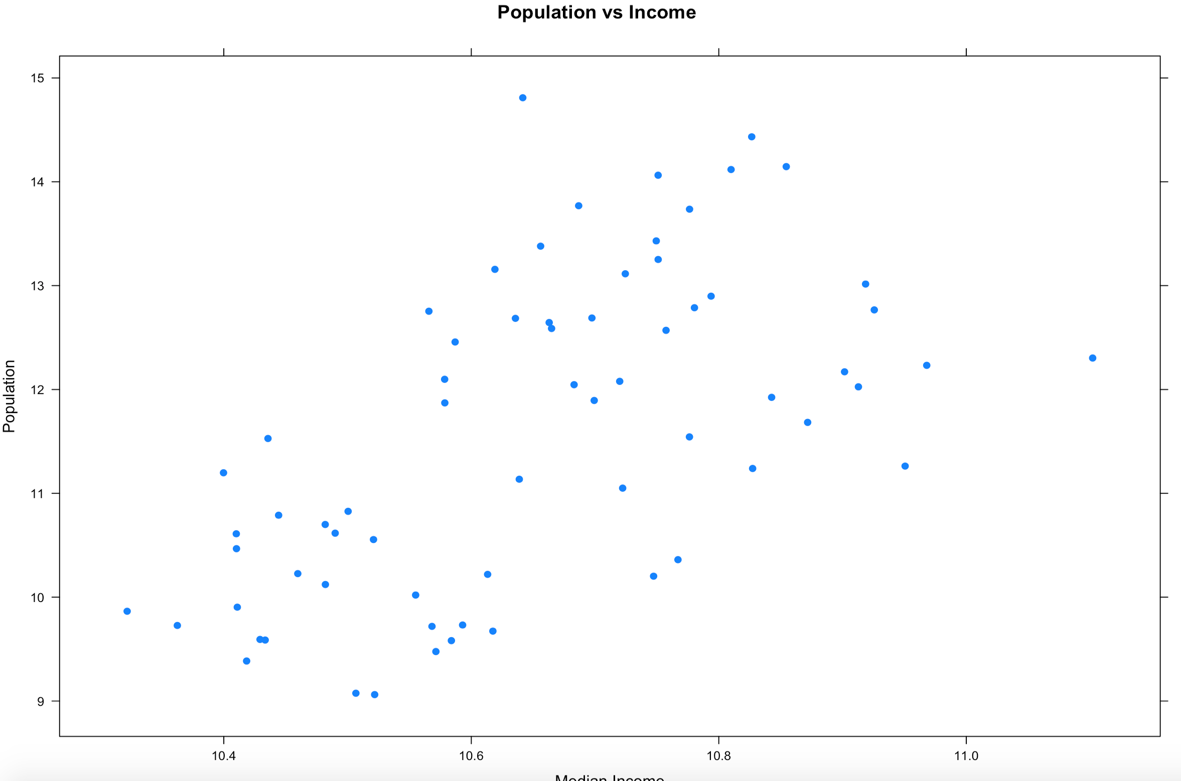
We will be using the xyplot from the lattice package, and the dataset listed above, be sure to change the file location two where every you put it, or use setwd to set your working directory. For this we will start with just the population and median income.
Hopefully your plot looks a little bit, or exactly like this one. I think this is a good example because it is an imperfect sample. Hopefully on a good day you will get something more like this, and not complete randomness. One point to notice right away is there is one dot way out of range of the rest of the dots at the top of population. Not hard to figure out that is probably the county that Miami resides in, Miami-Dade, and then four other counties coming in at over a population of 1 million. You will also notice there is one county way off to the right in median income, that is St Johns county, which is where the city of Jacksonville is located. Now the median income of Jacksonville is lower than the median income of the county, so what could be going on there?
Hmmm, this just raises more questions, it just so happens, with a population of about 27,000 Ponte Vedra Beach has a median income of $116,000 according to wikipedia, so this one city is dragging the average for the entire county of 220,257 up pretty significantly compared to other counties. So, the with the population of Miami-Dade and the median income of St. Johns being far away from the rest of the data, these are what we call outliers. For now we are going to leave them in, in the next couple of blogs i will demonstrate a method for dealing with outliers. Clearly one like the county of St. Johns will need to be handled eventually.
So from looking at the scatter plot, we can kind of make out a general direction of the relationship of income to population, but it is sort of vague. In cases like this there are a few things to do.
1. When your data looks like it has gone to crazy town, try applying a transformation function for a better graphical representation. This will change the x/y scale, but will still represent the trend of the data. More on log transforms here.
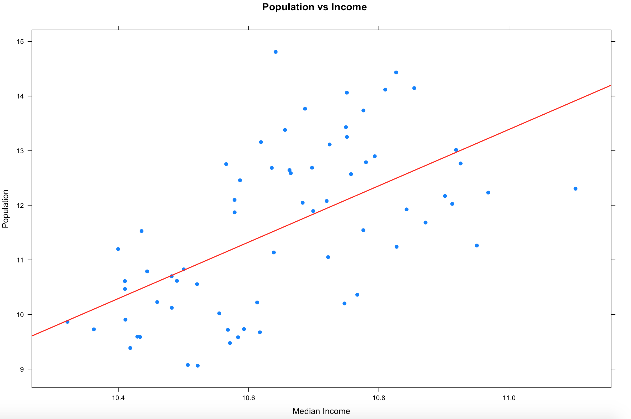
2. Draw a linear regression line through it so see if there is a trend. We will get into lm() later, but it takes the (y ~ x) as model input and returns an intercept and slope, remember algebra? 🙂
There is more than one way to do this, xyplot uses the panel function, the much lengthier syntax.
xyplot(log(population) ~ log(MedianIncome),
       data=florida,
       main="Population vs Income",
       xlab="Median Income",
       ylab = "Population",
       panel = function(x, y, ...) {
       panel.xyplot(x, y, ...)
       panel.abline(lm(y~x), col='red',lwd=2)},
       pch=19)
##
## OR
##

plot(log(florida$MedianIncome),log(florida$population),pch=19)
abline(lm(log(florida$population) ~ log(florida$MedianIncome)))
3. In the previous sample we just used a lm, straight line, slope and intercept to run a line through the data, that alone does show a trend. Even if you remove the log function you still seen upward trend of greater population seems to indicate greater income.
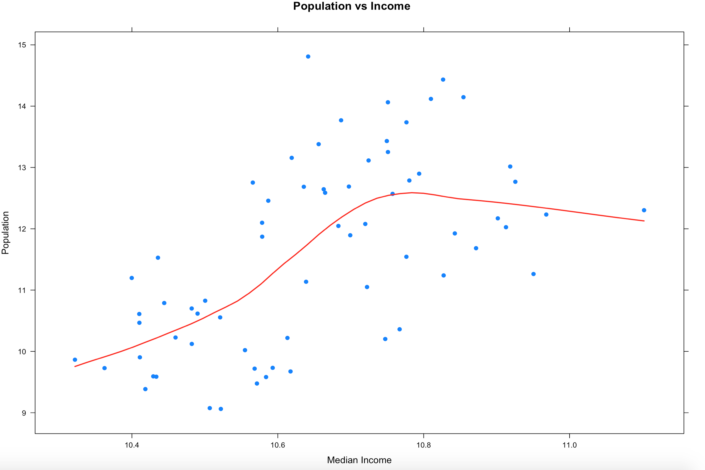
So lets try the LOWESS again, this time with xyplot. The type parameter below is using a "p" parameter, this is the LOWESS (locally weighted scatterplot smoothing), it will take our bumpy data and smooth the line to the data. You can read up on it, we will be hitting it thoroughly later on.
One thing appear to be somewhat clear from this, as the population of the county increases, the income does increase to a point hen it seems to stabilize. We will revisit this once we learn how to deal with outliers and see if it changes the trend.
There are a couple more columns in the Florida data provided that you can try on your own, see if you can visually show a relationship between college and income, or even college and population. Do more rural counties have more or less college educated population?
In the last blog you were able to get a dataset with county and population data to display on a US map and zoom in on a state, and maybe even a county if you went exploring. In this demo we will be using the same choroplethr package but this time we will be using external data. Specifically, we will focus on one state, and check out the education level per county for one state.
The data is hosted by the USDA Economic Research Division, under Data Products / County-level Data Sets. What will be demonstrated is the proportion of the population who have completed college, the datasets “completed some college”, “completed high school”, and “did not complete high school” are also available on the USDA site.
For this effort, You can grab the data off my GitHub site or the data is at the bottom of this blog post, copy it out into a plain text file. Make sure you change the name of the file in the script below, or make sure the file you create is “Edu_CollegeDegree-FL.csv”.
Generally speaking when you start working with GIS data of any sort you enter a whole new world of acronyms and in many cases mathematics to deal with the craziness. The package we are using eliminates almost all of this for quick and dirty graphics via the choroplethr package. The county choropleth takes two values, the first is the region which must be the FIPS code for that county. If you happen to be working with states, then the FIPS state code must be used for region. To make it somewhat easier, the first two digits of the county FIPS code is the state code, the remainder is the county code for the data we will be working with.
Use the setwd() to set the local working directory, getwd() will display what the current R working directory.
setwd("/Users/Data")
getwd()
Read.csv will read in a comma delimited file. “<-“ is the assignment operator, much like using the “=”. The “=” can be used as well. Which to assignment operator to use is a bit if a religious argument in the R community, i will stay out of it.
# read a csv file from my working directory
edu.CollegeDegree <- read.csv("Edu_CollegeDegree-FL.csv")
View() will open a new tab and display the contents of the data frame.
View(edu.CollegeDegree)
str() will display the structure of the data frame, essentially what are the data types of the data frame
str(edu.CollegeDegree)
Looking at the structure of the dataframe we can see that the counties imported as Factors, for this task it will not matter as i will not need the county names, but in the future it may become a problem. To nip this we will reimport using stringsAsFactors option of read.csv we will get into factors later, but for now we don't need them.
Now the region/county name is a character however, the there is actually more data in the file than we need. While we only have 68 counties, we have more columns/variables than we need. The only year i am interested in is the CollegeDegree2010.2014 so there are several ways to remove the unwanted columns.
The following is actually using index to include only columns 1,2,3,8 much like using column numbers in SQL vs the actual column name, this can bite you in the butt if the order or number of columns change though not required for this import, header=True never hurts. You only need to run one of the following commands below, but you can see two ways to reference columns.
edu.CollegeDegree <- read.csv("Edu_CollegeDegree-FL.csv", header=TRUE,stringsAsFactors=FALSE)[c(1,2,3,8)]

# or Use the colun names

edu.CollegeDegree <- read.csv("Edu_CollegeDegree-FL.csv", header=TRUE,stringsAsFactors=FALSE)[c("FIPS","region","X2013RuralUrbanCode","CollegeDegree2010.2014")]

#Lets check str again
str(edu.CollegeDegree)
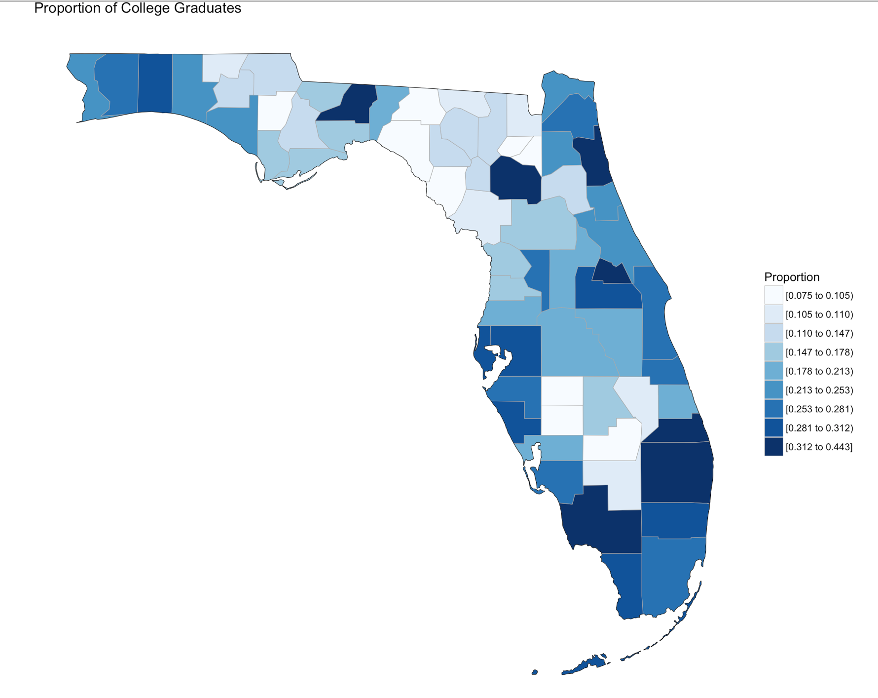
Using summary() we can start reviewing the data from statistical perspective. The CollegeDegree2010.2014 variable, we can see the county with the lowest proportion of college graduates is .075, or 7.5% of the population of that county the max value is 44.3%. The average across all counties is 20.32% that have completed college.
summary(edu.CollegeDegree)
Looking at the data we can see that we have a FIPS code, and the only other column we are interested in for mapping is CollegeDegree2010.2014, so lets create a dataframe with just what we need.
View(edu.CollegeDegree)

# the follwoing will create a datafram with just the FIPS and percentage of college grads
flCollege <- edu.CollegeDegree[c(1,4)]

# Alternatively, you can use the column names vs. the positions. Probably smarter ;-)
flCollege <- edu.CollegeDegree[c("FIPS","CollegeDegree2010.2014")]

# the following will create a dataframe with just the FIPS and percentage of college grads

flCollege
But, from reading the help file on county_choropleth, it requires that only two variables(columns) be passed in, region, and value. Region must be a FIPS code so, we need to rename the columns using colnames().
Since we are only using Florida, set the state_zoom, it will work without the zoom but you will get many warnings. You will also notice a warning that 12000 is not mappable. Looking at the data you will see that 12000 is the entire state of Florida.
county_choropleth(flCollege,
                  title = "Proportion of College Graduates ",
                  legend="Proportion",
                  num_colors=9,
                  state_zoom="florida")
For your next task, go find a different state and a different data set from the USDA or anywhere else for that matter and create your own map. Beware of the "value", that must be an integer, sometimes these get imported as character if there is a comma in the number. This may be a good opportunity for you to learn about gsub and as.numeric, it would look something like the following command. Florida is the dataframe, and MedianIncome is the column.
Visualization is said to be the gateway drug to statistics. In an effort to get you all hooked, I am going to spend some time on visualization. Its fun (I promise), i expect that after you see how easy some visuals are in R you will be off and running with your own data explorations. Data visualization is one of the Data Science pillars, so it is critical that you have a working knowledge of as many visualizations as you can, and be able to produce as many as you can. Even more important is the ability to identify a bad visualization, if for no other reason to make certain you do not create one and release it into the wild, there is a site for those people, don’t be those people!
We are going to start easy, you have installed R Studio, if you have not back up one blog and do it. Your first visualization is what is typically considered advanced, but I will let you be the judge of that after we are done.
Some lingo to learn: Packages – Packages are the fundamental units of reproducible R code. They include reusable R functions, the documentation that describes how to use them, and sample data.
Choropleth – is a thematic map in which areas are shaded or patterned in proportion to the measurement of the statistical variable being displayed on the map, such as population density or per-capita income.
Below is the code for a choropleth, using the package choroplethr and the data set df_pop_county, which is the population of every county in the US.
This is what todays primary objective is;
To learn more about any R command “?”, “??”, or “help(“object”)” Keep in mind, R is case sensitive. If you can only remember part of a command name use apropos().
#Install package called choroplethr,
#quotes are required,
#you will get a meaningless error without them
#Only needs to be installed once per machine
install.packages("choroplethr")
The library function will load the installed package to make any functions available for use.
library("choroplethr")
To find out what functions are in a package use help(package=””).
help(package="choroplethr")
Many packages come with test or playground datasets, you will use many in classes and many for practice, data(package=””) will list the datasets that ship with a package.
data(package="choroplethr")
For this example we will be using the df_pop_county dataset, this command will load it from the package and you will be able to verify it is available by checking out the Environment Pane in R Studio.
data("df_pop_county")
View(“”) will open a view pane so you can explore the dataset. Similar to clicking on the dataset name in the Environment Pane.
View(df_pop_county)
Part of learning R is learning the features and commands for data exploration, str will provide you with details on the structure of the object it is passed.
str(df_pop_county)
Summary will provide basic statistics about each column/variable in the object that it is passed.
summary(df_pop_county)
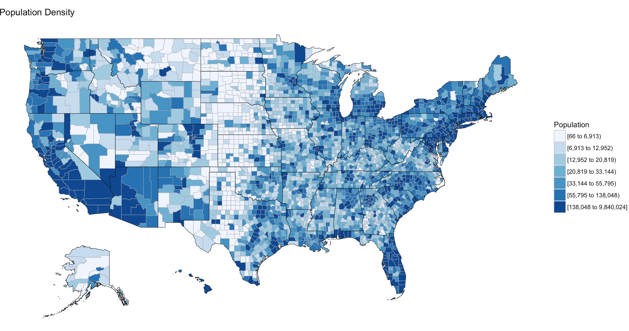
If your heart is true, you should get something very similar to the image above after running the following code. county_choropleth is a function that resides in the choroplethr package, it is used to generate a county level US map. The data passed in must be in the format of county number and value, the value will populate the map. WHen the map renders it will be in the plot pane of the RStudio IDE, be sure to select zoom and check out your work.
There are som additioanl parameters we can pass to the function, use help to find more.
county_choropleth(df_pop_county,
                  title = "Population Density",
                  legend="Population")
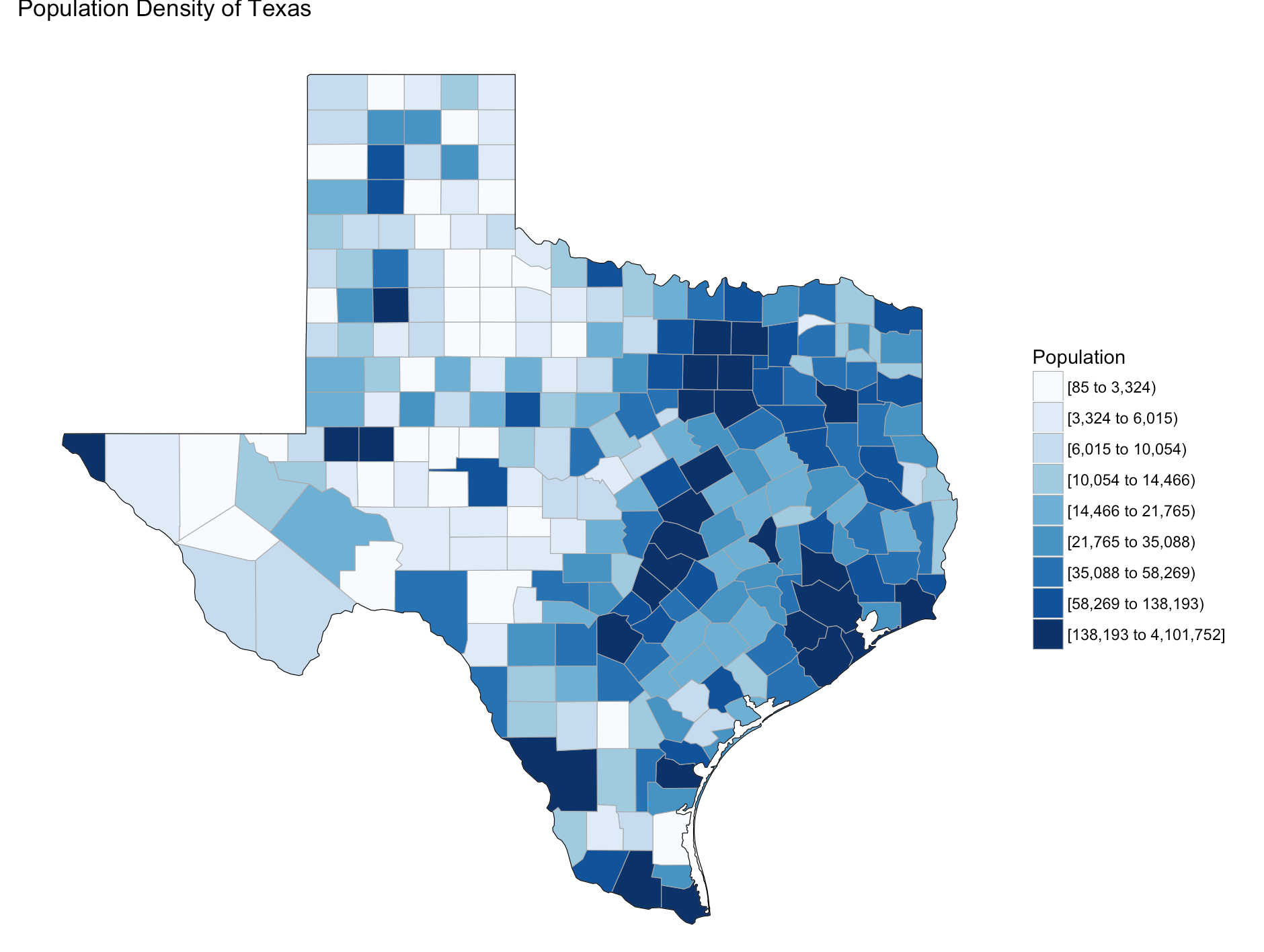
Try changing the number of colors and change the state zoom. If your state is not working read the help to see if you can find out why.
county_choropleth(df_pop_county,
                  title = "Population Density of Texas",
                  legend="Population",
                  num_colors=9,
                  state_zoom="texas")
There is an additional option for county_choropleth, reference_map. If it does not work for you do not fret, as of this blog post it is not working for me either, the last R upgrade whacked it, be ready for this to happen and make sure you have backs and versions, especially before you get up on stage in front 200 people to present.
There you have it! Explore the commands used, look at the other datasets that ship with choroplethr and look at the other functions that ship with choroplethr, it can be tricky to figure out which ones work, be sure to check the help for each function you want to run, no help may mean no longer supported. Remember that these packages are community driven and written, which is good, but sometimes they can be a slightly imperfect.
In the next post i will cover how to upload and create your own dataset and use the choroplethr function with your own data. On a side note, the choropleth falls under a branch of statistics called descriptive statistics which covers visuals used to describe data.