Such a mean title, Annoying may not be the right word, but i couldn’t think of a better title and to e truthful these are not visualization i use everyday. Stem and Leaf plot, Boxplot, Frequency Polygon.
First lets get some data loaded, we will switch to a mosaic data package for this one. We will be using a data set called HELPmiss, Health Evaluation And Linkage To Primary Care – The HELP study was a clinical trial for adult inpatients recruited from a detoxification unit. Patients with no primary care physician were randomized to receive a multidisciplinary assessment and a brief motivational intervention or usual care, with the goal of linking them to primary medical care. There are three HELP datasets in mosaicData, feel free to go exploring.
install.packages("mosaicData")
install.packages("mosaic")

library("mosaic")
library("mosaicData")

data("HELPmiss")
View("HELPmiss")

str(HELPmiss)

x <- HELPmiss[c("age","anysub","cesd","drugrisk","sex","g1b","homeless","racegrp","substance")]

#stem is the first one
stem(x$cesd)
Stem and Leaf
For this output, the stem is the first digit on the left, and the leaf would be each digit on the right of the "|". the first row, "0 | 1334444" is equal to the values 1,3,3,4,4,4,4, and continued on the second row of the stem and leaf plot. Looking at the last row you will see "6 | 0" which means that one 60 occurred in the vector. I have not seen this used in day modern visualizations.
> stem(x$cesd)
The decimal point is 1 digit(s) to the right of the |
0 | 1334444
0 | 56666778889999
1 | 00001111122223444
1 | 55555555566666666777777778888888999999999
2 | 00001111111112222223333333333444444444
2 | 55555556666666666677777777777888888888888899999999999999
3 | 00000000000000111111111111111122222222333333333333334444444444444444
3 | 55555555555566666666666666666666777777777777777777888888888888889999+3
4 | 000000000000000000011111111111112222222223333333333444444444
4 | 5555555555666666666677777778888888999999999
5 | 00111111111111222223333344444
5 | 555666777888
6 | 0
Boxplot
Boxplot or, whisker plot! You will see this one, and its always a little fuzzy to recall what is what until you have been doing it for a while.
You can also go a little crazy of you like by using one plot, or combining one quantitative variable and many qualitative, like the last one.
?boxplot
boxplot(x$age)
boxplot(age ~ sex, data=x)
boxplot(age ~ racegrp, data=x)
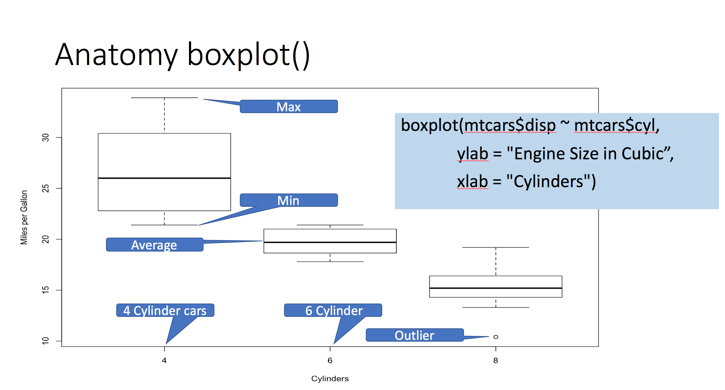
boxplot(age ~ substance*racegrp, data=x, notch=TRUE, col=(c("darkblue","red","lightblue")))
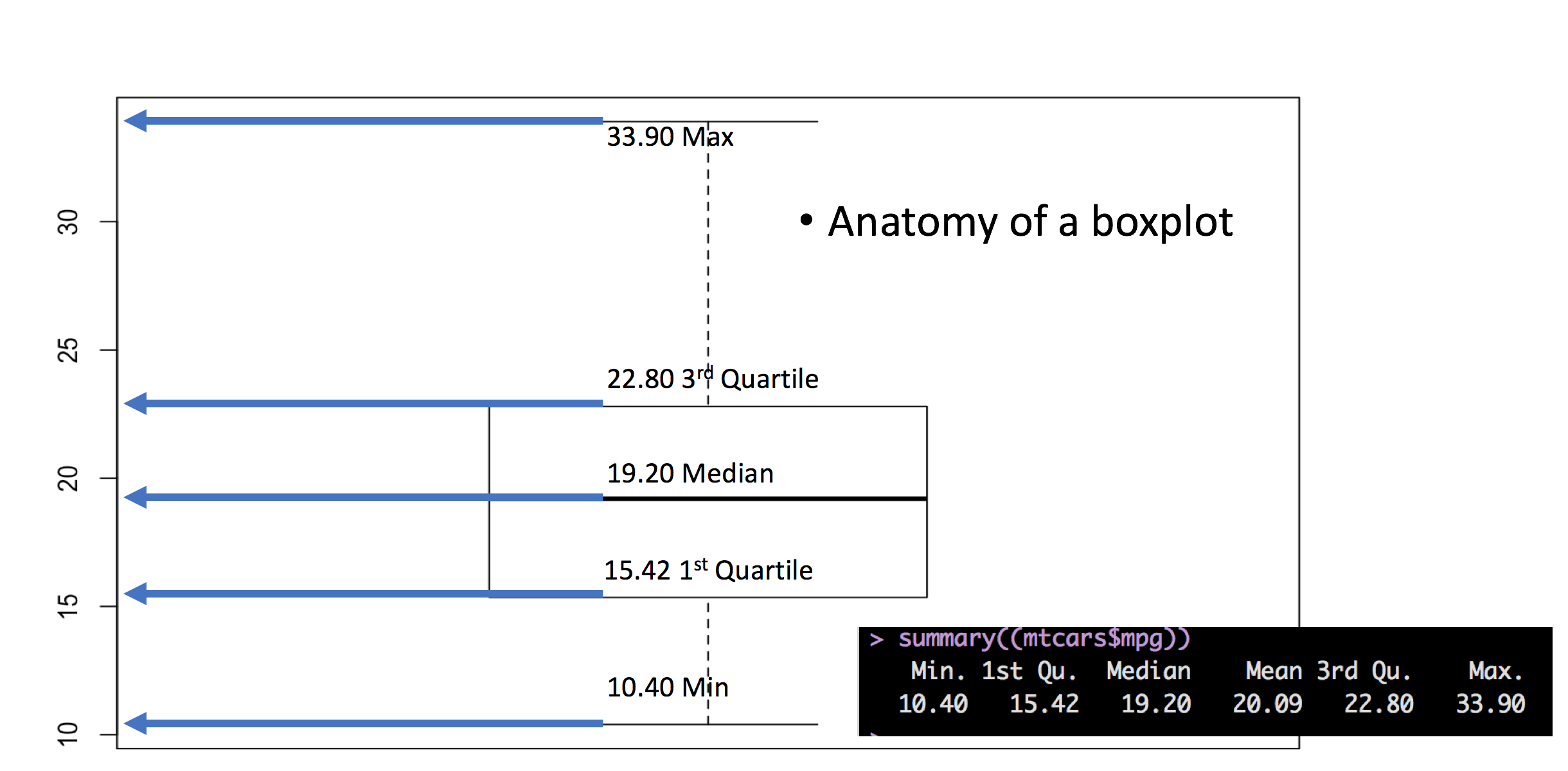
This is generated from one of the commands above, you will have to figure out which.
Here is what you need to know; the Box is the IQR, the interquartile range, the bottom of the "box" is the first 25 percentile, the top of the box is the 75th percentile, the line in the middle is the median. So, the box represents the middle 50% of the data. The horizontal line at the top and bottom is where it starts to get tricky. In this case it is the minimum and maximum value, it is 2 standard deviations away from median.
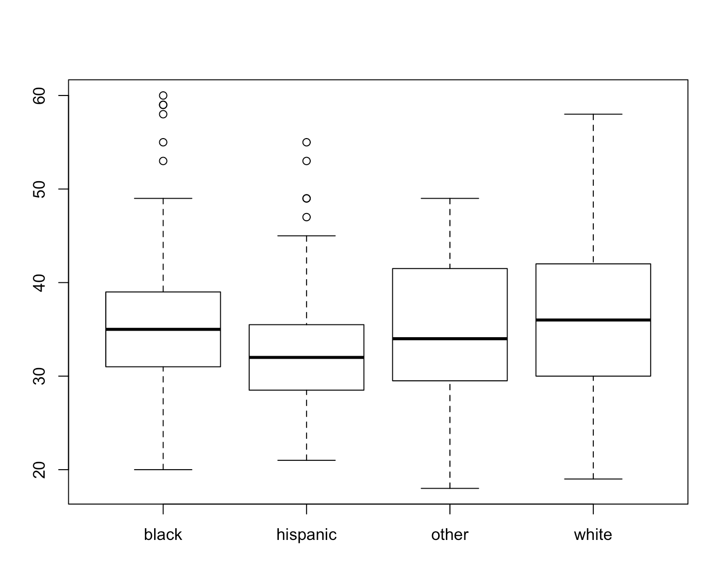
These are screen grabs from one of my R graphics sessions, click to enlarge, if you have trouble with box plots this should help. Keep in mind the outlier calculation can be different for each tool, so be careful and make sure you know what it has defined as an outlier.
favstats(subset(x$age, x$racegrp=="black" ))
# min Q1 median Q3 max     mean      sd   n missing
#  20 31     35 39  60 35.80275 7.12124 218       0
Lets look at age and ragegrp black, the median of age is 35, the standard deviation is 7.1 (rounded). Using 2 standard deviations this would give us a range of 20.8 to 49.2, if you look at the boxplot for racegrp black, you will see that this does cover age, about 20 to 50. So what are the dots? Remember a few blogs back when using IQR has a tool to detect outliers? This is it, anything beyond two standard deviations for this boxplot is considered an outlier, the hollow circle.
There are More boxplot variations you may run into, this post does a good job of describing them, though not specific to R
Frequency Polygon
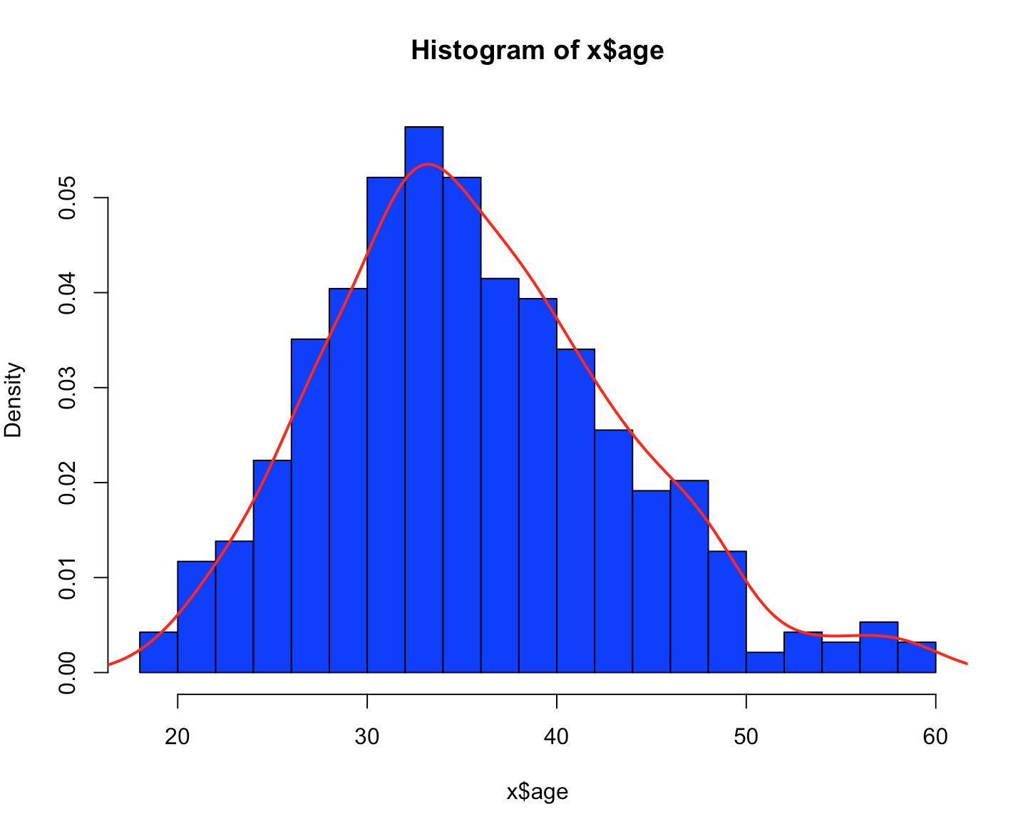
Last but not least frequency polygon. You will sometimes see a frequency polygon follow a histogram or even laid over a histogram. Lets just start and see what happens. For base R we start with plot(), though if you use it without density(), you get scatter, Same with hist(). This is called probability density, remember Probability Density Function from a few posts back, here we are again. The meat of it is, what are the odds of a value falling into a range, if you are looking at the peak of the curve, there is a higher likelihood of that data occurring.
plot(density(x$age))
polygon(density(x$age), col="red", border="blue")

hist(x$age,prob=TRUE,col="blue",breaks=20)
lines(density(x$age),col="red",lwd=2)