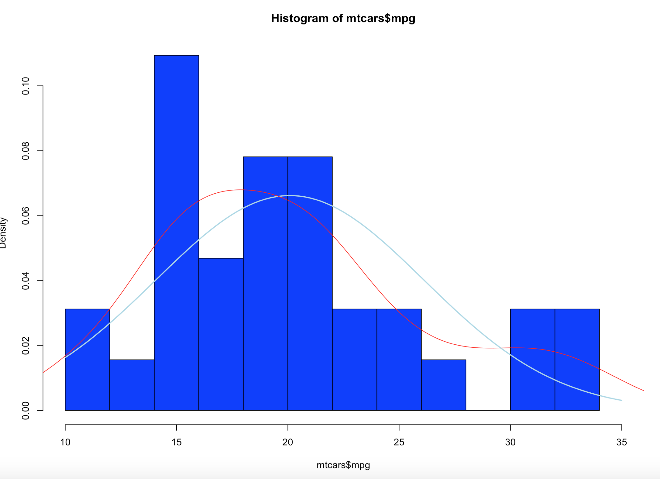
We have covered histograms in several posts so far and if you have been around the block a few times you probably decided it was a bar chart. Well, thats kinda true, the x axis is represented of the data, age n the x axis for instance would simply be age sorted ascending from left to right and the y axis for a frequency histogram would be the number of occurrences of that age. The most important option being the number of bins, everything else is just scale.
Load up some data and lets start by looking at the barchart versions of the histogram.
install.packages("mosaicData")
install.packages("mosaic")
library("mosaic")
library("mosaicData")
data("HELPmiss")
View("HELPmiss")
str(HELPmiss)
x <- HELPmiss[c("age","anysub","cesd","drugrisk","sex","g1b","homeless","racegrp","substance")]
#the par command will allow you to show more than one plot side by side
#par(mfrow=c(2,2)); or par(mfrow=c(3,3)); etc...
par(mfrow=c(1,2))
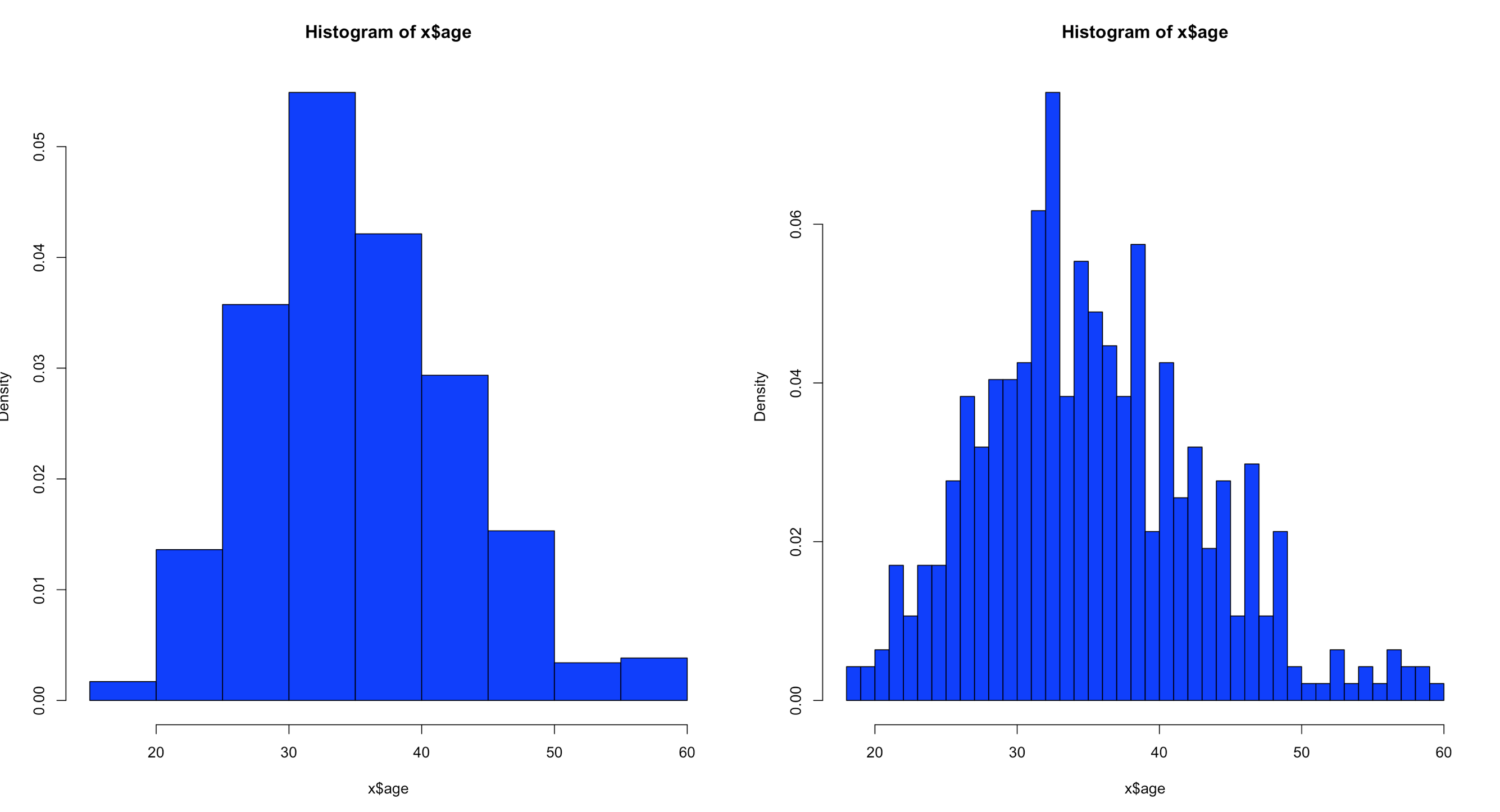
hist(x$age,col="blue",breaks=10)
hist(x$age,col="blue",breaks=50)
Using the code above you can see that the number of bins does change the graph too dramatically though some averaging clearly is taking place, but the x and y axis both make sense. We are basically looking at a bar chart, and based on shape we can derive some level of data distribution.

So, what happens when we add the line, the density curve, the PDF call it what you will? I have mentioned before it is a probability density function, but what does that really mean? And why do the numbers on the y axis charge so dramatically?
Well, first lets look at the code to create it. Same dataset as above, but lets add the "prob=TRUE" option.
par(mfrow=c(1,2))
hist(x$age,prob=TRUE,col="blue",breaks=10)
hist(x$age,prob=TRUE,col="blue",breaks=50)
Notice the y axis scale is no longer frequency, but density. Okay, whats that? Density is a probability of that number occurring relative to all other numbers. Being a probability function and being relative to all numbers it should probably add up to 100% then, or in the case of proportions which is what we have all should add up to 1. The problem is a histogram is a miserable way to figure that out. And clearly changing the bins from 20 to 50 not only changed the number of bins as we would expect it also changed the y-axis. Whaaaaaaa? As if to tell me that even though the data is the same the probability has changed. So how can i ever trust this?
Well, there is a way to figure out what is going on! I'm not going to lie, the first time i saw this my mind was a little blown. You can get all the data that is generated and used to create the histogram.
Pipe the results into a variable then simply display the variable.
y<-hist(x$age,prob=TRUE,col="blue",breaks=10)
y
What you will see is the guts of what it takes to create the hist(); what we care about is the $counts, $density, and the $mids. Counts are the height of the bins, density is the actual probability and what will be the y axis, and mids is the x axis.
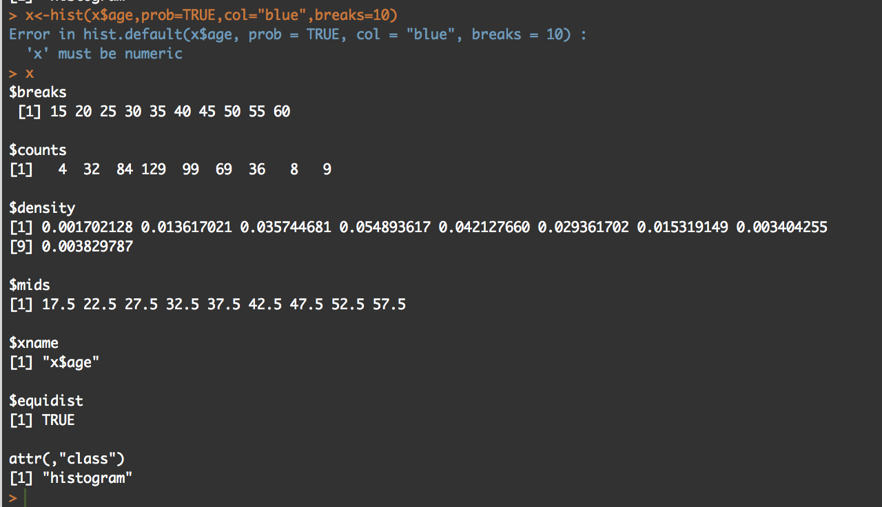
So, based on any probability we should get "1" indicating 100% of the data if we sum $density... Lets find out.
sum(y$density)
#[1] 0.2
I got .2...
Lets increase the bins and see what happens, we know the scale changed, maybe my density distribution will to.
z<-hist(x$age,prob=TRUE,col="blue",breaks=50)
z

sum(y$density)
#[1] 1
Hmm, this time i get a "1". You will also notice that when the bins are increased to 50 the number of values in $mids and $density increased, it just so happens that for this dataset 50 was a better number of bins, though you will see that $density and $mids only went to a count of 42 values, which is enough.
With the below code you can get an estimation of the probability of specific numbers occurring. For the dataset i am using, 32.5 occurs 7.66% of the time, so that is the likely probability of that age occurring on future random variables. With less bins, you are basically getting an estimated average but not necessarily the full picture, so a density function in a histogram can be tricky and misleading if you attempt to make a decision on this.
z<-hist(x$age,prob=TRUE,col="blue",breaks=50)
z

distz<- as.data.frame(list(z$density,z$mids))
names(distz) <- c("density","mids")
distz
So what is all of this? well, when you switch the hist() function to prob=true, you pretty much leave descriptive statistics and are now in probability. The thing that is used to figure out the distribution is called a kernel density estimation and in some cases called the Parzen-Rosenblatt-Window Density estimation, or kernel estimation. The least painful definition " to estimate a probability density function p(x) for a specific point p(x) from a sample p(xn) that doesn’t require any knowledge or assumption about the underlying distribution."
The definitions of the hist fields are int eh CRAN Help under hist() in the values section. Try this out, try different data and check out how the distribution changes with more or less bins.