We have covered histograms in several posts so far and if you have been around the block a few times you probably decided it was a bar chart. Well, thats kinda true, the x axis is represented of the data, age n the x axis for instance would simply be age sorted ascending from left to right and the y axis for a frequency histogram would be the number of occurrences of that age. The most important option being the number of bins, everything else is just scale.
Load up some data and lets start by looking at the barchart versions of the histogram.
install.packages("mosaicData")
install.packages("mosaic")
library("mosaic")
library("mosaicData")
data("HELPmiss")
View("HELPmiss")
str(HELPmiss)
x <- HELPmiss[c("age","anysub","cesd","drugrisk","sex","g1b","homeless","racegrp","substance")]
#the par command will allow you to show more than one plot side by side
#par(mfrow=c(2,2)); or par(mfrow=c(3,3)); etc...
par(mfrow=c(1,2))
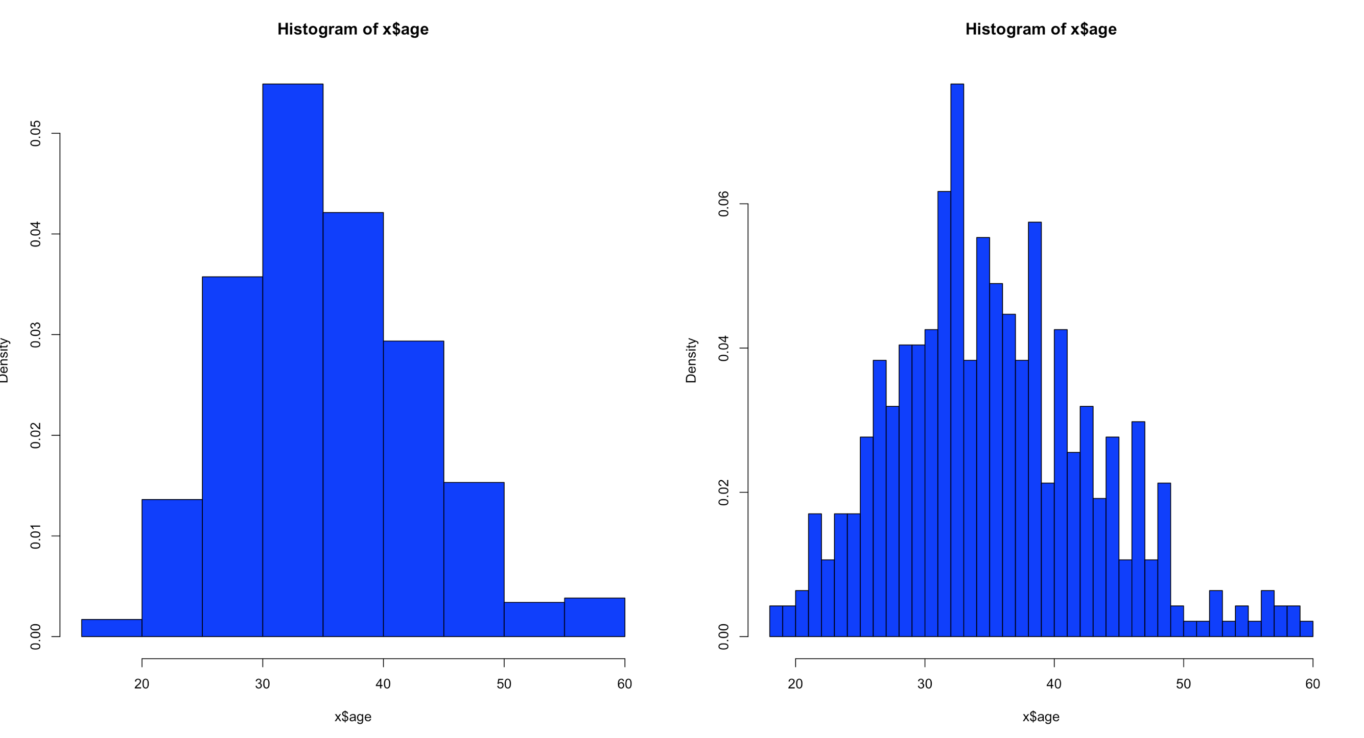
hist(x$age,col="blue",breaks=10)
hist(x$age,col="blue",breaks=50)
Using the code above you can see that the number of bins does change the graph too dramatically though some averaging clearly is taking place, but the x and y axis both make sense. We are basically looking at a bar chart, and based on shape we can derive some level of data distribution.
So, what happens when we add the line, the density curve, the PDF call it what you will? I have mentioned before it is a probability density function, but what does that really mean? And why do the numbers on the y axis charge so dramatically?
Well, first lets look at the code to create it. Same dataset as above, but lets add the "prob=TRUE" option.
Notice the y axis scale is no longer frequency, but density. Okay, whats that? Density is a probability of that number occurring relative to all other numbers. Being a probability function and being relative to all numbers it should probably add up to 100% then, or in the case of proportions which is what we have all should add up to 1. The problem is a histogram is a miserable way to figure that out. And clearly changing the bins from 20 to 50 not only changed the number of bins as we would expect it also changed the y-axis. Whaaaaaaa? As if to tell me that even though the data is the same the probability has changed. So how can i ever trust this?
Well, there is a way to figure out what is going on! I'm not going to lie, the first time i saw this my mind was a little blown. You can get all the data that is generated and used to create the histogram.
Pipe the results into a variable then simply display the variable.
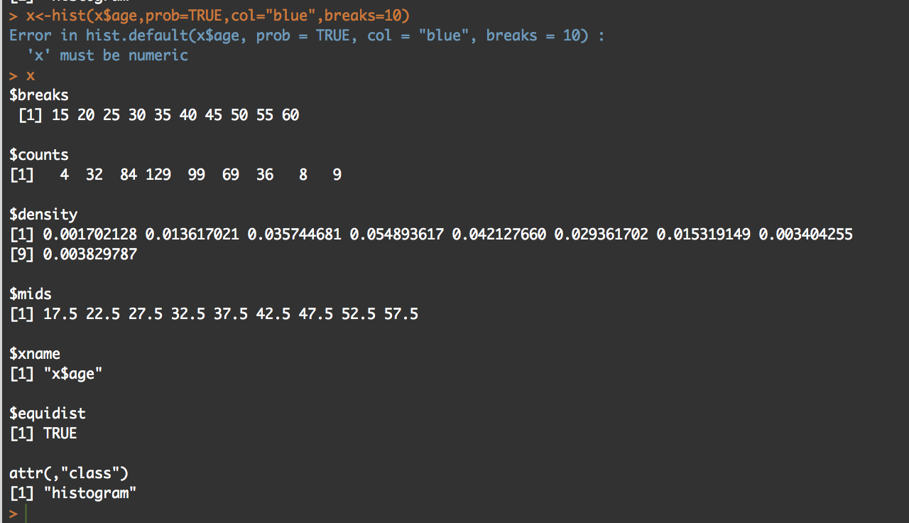
y<-hist(x$age,prob=TRUE,col="blue",breaks=10)
y
What you will see is the guts of what it takes to create the hist(); what we care about is the $counts, $density, and the $mids. Counts are the height of the bins, density is the actual probability and what will be the y axis, and mids is the x axis.
So, based on any probability we should get "1" indicating 100% of the data if we sum $density... Lets find out.
sum(y$density)
#[1] 0.2
I got .2...
Lets increase the bins and see what happens, we know the scale changed, maybe my density distribution will to.
z<-hist(x$age,prob=TRUE,col="blue",breaks=50)
z

sum(y$density)
#[1] 1
Hmm, this time i get a "1". You will also notice that when the bins are increased to 50 the number of values in $mids and $density increased, it just so happens that for this dataset 50 was a better number of bins, though you will see that $density and $mids only went to a count of 42 values, which is enough.
With the below code you can get an estimation of the probability of specific numbers occurring. For the dataset i am using, 32.5 occurs 7.66% of the time, so that is the likely probability of that age occurring on future random variables. With less bins, you are basically getting an estimated average but not necessarily the full picture, so a density function in a histogram can be tricky and misleading if you attempt to make a decision on this.
z<-hist(x$age,prob=TRUE,col="blue",breaks=50)
z

distz<- as.data.frame(list(z$density,z$mids))
names(distz) <- c("density","mids")
distz
So what is all of this? well, when you switch the hist() function to prob=true, you pretty much leave descriptive statistics and are now in probability. The thing that is used to figure out the distribution is called a kernel density estimation and in some cases called the Parzen-Rosenblatt-Window Density estimation, or kernel estimation. The least painful definition " to estimate a probability density function p(x) for a specific point p(x) from a sample p(xn) that doesn’t require any knowledge or assumption about the underlying distribution."
The definitions of the hist fields are int eh CRAN Help under hist() in the values section. Try this out, try different data and check out how the distribution changes with more or less bins.
Picking up from the last post we will now look at Chebyshevs rule. For this one we will be using ggplot2 histogram with annotations just to shake things up a bit.
Chebyshevs rule, theorem, inequality, whatever you want to call it states that all possible datasets regardless of shape will have 75% of the data within 2 standard deviations, and 88.89% within 3 standard deviations. This should apply to mound shaped datasets as well as bimodal (two mounds) and multimodal.
First, below is the empirical R code from the last blog post using ggplot2 if you are interested, otherwise skip this and move down. This is the script for the empirical rule calculations. Still using the US-Education.csv data.
require(ggplot2)

usa <- read.csv("/data/US-Education.csv",stringsAsFactors=FALSE)
str(usa)

highSchool <- subset(usa[c("FIPS.Code","Percent.of.adults.with.a.high.school.diploma.only..2010.2014")],FIPS.Code >0)

#reanme the second column to something less annoying
colnames(highSchool)[which(colnames(highSchool) == 'Percent.of.adults.with.a.high.school.diploma.only..2010.2014')] <- 'percent'


#create a variable with the mean and the standard devaiation
hsMean <- mean(highSchool$percent,na.rm=TRUE)
hsSD <- sd(highSchool$percent,na.rm=TRUE)

#one standard deviation from the mean will "mean" one SD
#to the left (-) of the mean and one SD to the right(+) of hte mean.
oneSDleftRange <- (hsMean - hsSD)
oneSDrightRange <- (hsMean + hsSD)
oneSDleftRange;oneSDrightRange
oneSDrows <- nrow(subset(highSchool,percent > oneSDleftRange & percent < oneSDrightRange))
oneSDrows / nrow(highSchool)


#two standard deviations from the mean will "mean" two SDs
#to the left (-) of the mean and two SDs to the right(+) of the mean.
twoSDleftRange <- (hsMean - hsSD*2)
twoSDrightRange <- (hsMean + hsSD*2)
twoSDleftRange;twoSDrightRange
twoSDrows <- nrow(subset(highSchool,percent > twoSDleftRange & percent < twoSDrightRange))
twoSDrows / nrow(highSchool)

#two standard deviations from the mean will "mean" two SDs
#to the left (-) of the mean and two SDs to the right(+) of the mean.
threeSDleftRange <- (hsMean - hsSD*3)
threeSDrightRange <- (hsMean + hsSD*3)
threeSDleftRange;threeSDrightRange
threeSDrows <- nrow(subset(highSchool,percent > threeSDleftRange & percent < threeSDrightRange))
threeSDrows / nrow(highSchool)

ggplot(data=highSchool, aes(highSchool$percent)) +
  geom_histogram(breaks=seq(10, 60, by =2),
                 col="blue",
                 aes(fill=..count..))+
  labs(title="Completed High School") +
  labs(x="Percentage", y="Number of Counties")

ggplot(data=highSchool, aes(highSchool$percent)) +
  geom_histogram(breaks=seq(10, 60, by =2),
                 col="blue",
                 aes(fill=..count..))+
  labs(title="Completed High School") +
  labs(x="Percentage", y="Number of Counties") +
  geom_vline(xintercept=hsMean,colour="green",size=2)+
  geom_vline(xintercept=oneSDleftRange,colour="red",size=1)+
  geom_vline(xintercept=oneSDrightRange,colour="red",size=1)+
  geom_vline(xintercept=twoSDleftRange,colour="blue",size=1)+
  geom_vline(xintercept=twoSDrightRange,colour="blue",size=1)+
  geom_vline(xintercept=threeSDleftRange,colour="black",size=1)+
  geom_vline(xintercept=threeSDrightRange,colour="black",size=1)+
  annotate("text", x = hsMean+2, y = 401, label = "Mean")+
  annotate("text", x = oneSDleftRange+4, y = 351, label = "68%")+
  annotate("text", x = twoSDleftRange+4, y = 301, label = "95%")+
  annotate("text", x = threeSDleftRange+4, y = 251, label = "99.7%")
It would do no good to use the last dataset for to try out Chebyshevs rule as we know it is mond shaped, and fit oddly well to the empirical rule. Now lets try a different column in the US-Education dataset.
usa <- read.csv("/data/US-Education.csv",stringsAsFactors=FALSE)
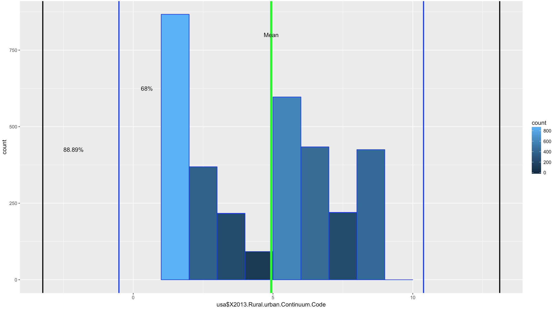
ggplot(data=usa, aes(usa$X2013.Rural.urban.Continuum.Code)) +
geom_histogram(breaks=seq(1, 10, by =1),
col="blue",
aes(fill=..count..))
Comparatively speaking, this one looks a little funky, this is certainly bimodal, if not nearly trimodal. This should be a good test for Chebyshev.
So, lets reuse some of the code above, drop the first standard dviation since Chebyshev does not need it and see if we can get this to work with "X2013.Rural.urban.Continuum.Code"
usa <- read.csv("/data/US-Education.csv",stringsAsFactors=FALSE)
str(usa)

urbanMean <- mean(usa$X2013.Rural.urban.Continuum.Code,na.rm=TRUE)
urbanSD <- sd(usa$X2013.Rural.urban.Continuum.Code,na.rm=TRUE)


#two standard deviations from the mean will "mean" two SDs
#to the left (-) of the mean and two SDs to the right(+) of the mean.
twoSDleftRange <- (urbanMean - urbanSD*2)
twoSDrightRange <- (urbanMean + urbanSD*2)
twoSDleftRange;twoSDrightRange
twoSDrows <- nrow(subset(usa,X2013.Rural.urban.Continuum.Code > twoSDleftRange & usa$X2013.Rural.urban.Continuum.Code < twoSDrightRange))
twoSDrows / nrow(usa)

#two standard deviations from the mean will "mean" two SDs
#to the left (-) of the mean and two SDs to the right(+) of the mean.
threeSDleftRange <- (urbanMean - urbanSD*3)
threeSDrightRange <- (urbanMean + urbanSD*3)
threeSDleftRange;threeSDrightRange
threeSDrows <- nrow(subset(usa,X2013.Rural.urban.Continuum.Code > threeSDleftRange & X2013.Rural.urban.Continuum.Code < threeSDrightRange))
threeSDrows / nrow(usa)


ggplot(data=usa, aes(usa$X2013.Rural.urban.Continuum.Code)) +
  geom_histogram(breaks=seq(1, 10, by =1),
                 col="blue",
                 aes(fill=..count..))+
                geom_vline(xintercept=urbanMean,colour="green",size=2)+
                geom_vline(xintercept=twoSDleftRange,colour="blue",size=1)+
                geom_vline(xintercept=twoSDrightRange,colour="blue",size=1)+
                geom_vline(xintercept=threeSDleftRange,colour="black",size=1)+
                geom_vline(xintercept=threeSDrightRange,colour="black",size=1)+
                annotate("text", x = urbanMean, y = 800, label = "Mean")+
                annotate("text", x = twoSDleftRange+1, y = 625, label = "68%")+
                annotate("text", x = threeSDleftRange+1.1, y = 425, label = "88.89%")
If you looked at the data and you looked at the range of two standard deviations above, you should know we have a problem; 98% of the data fell within 2 standard deviations. While yes, 68% of the data is also in the range it turns out this is a terrible example. The reason i include it is because it is just as important to see a test result that fails your expectation as it is for you to see on ethat is perfect! You will notice that the 3rd standard deviations is far outside the data range.
SO, what do we do? fake data to the rescue!
I try really hard to avoid using made up data because to me it makes no sense, where as car data, education data, population data, that all makes sense. But, there is no getting around it! Here is what you need to know, rnorm() generates random data based on a normal distribution using the variables standard deviation and a mean! But wait, we are trying to get multi-modal distribution. Then concatenate more than one normal distribution, eh? Lets try three.
We are going to test for one standard deviation just to see what it is, even though Chebyshevs rule has no interest in it, remember the rule states that 75% the data will fall within 2 standard deviations.
#set.seed() will make sure the random number generation is not random everytime
set.seed(500)
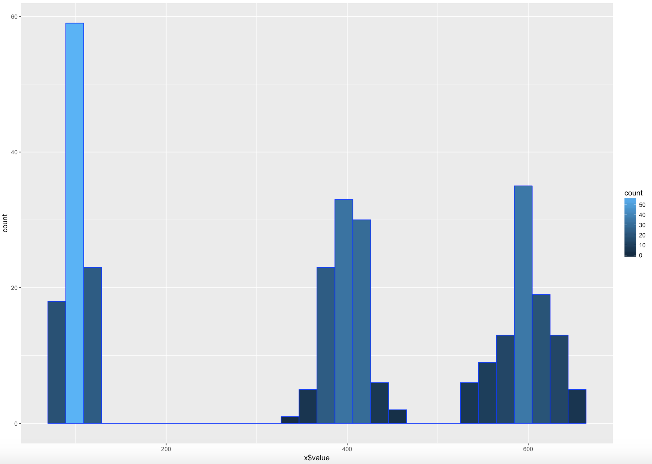
x <- as.data.frame(c(rnorm(100,100,10)
,(rnorm(100,400,20))
,(rnorm(100,600,30))))
colnames(x) <- c("value")
#hist(x$value,nclass=100)
ggplot(data=x, aes(x$value)) +
geom_histogram( col="blue",
aes(fill=..count..))
sd(x$value)
mean(x$value)
#if you are interested in looking at just the first few values
head(x)
xMean <- mean(x$value)
xSD <- sd(x$value)
#one standard deviation from the mean will "mean" 1 * SD
#to the left (-) of the mean and one SD to the right(+) of the mean.
oneSDleftRange <- (xMean - xSD)
oneSDrightRange <- (xMean + xSD)
oneSDleftRange;oneSDrightRange
oneSDrows <- nrow(subset(x,value > oneSDleftRange & x < oneSDrightRange))
print("Data within One standard deviations");oneSDrows / nrow(x)
#two standard deviations from the mean will "mean" 2 * SD
#to the left (-) of the mean and two SDs to the right(+) of the mean.
twoSDleftRange <- (xMean - xSD*2)
twoSDrightRange <- (xMean + xSD*2)
twoSDleftRange;twoSDrightRange
twoSDrows <- nrow(subset(x,value > twoSDleftRange & x$value < twoSDrightRange))
print("Data within Two standard deviations");twoSDrows / nrow(x)
#three standard deviations from the mean will "mean" 3 * SD
#to the left (-) of the mean and two SDs to the right(+) of the mean.
threeSDleftRange <- (xMean - xSD*3)
threeSDrightRange <- (xMean + xSD*3)
threeSDleftRange;threeSDrightRange
threeSDrows <- nrow(subset(x,value > threeSDleftRange & x$value < threeSDrightRange))
print("Data within Three standard deviations");threeSDrows / nrow(x)
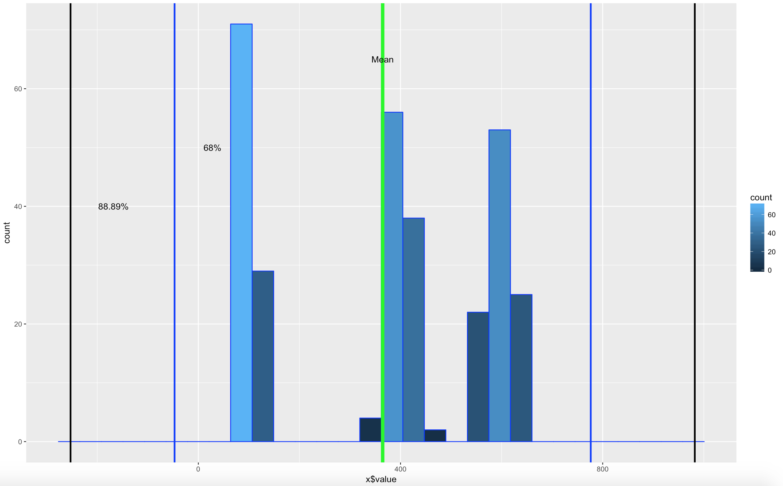
WOOHOO, Multimodal! Chebyshev said it works on anything, lets find out. The histogram below is a hot mess based on how the data was created, but it is clear that the empirical rule will not apply here, as the data is not mound shaped and is multimodal or trimodal.
Though Chebyshevs rule has no interest in 1 standard deviation i wanted to show it just so you could see what the 1 SD looks like. I challenge you to take the rnorm and see if you can modify the mean and SD parameters passed in to make it fall outside o the 75% of two standard deviations.
[1] "Data within One standard deviations" = 0.3966667 # or 39.66667%
[1] "Data within Two standard deviations" = 1 # or 100%
[1] "Data within Three standard deviations" = 1 or 100%
Lets add some lines;
ggplot(data=x, aes(x$value)) +
  geom_histogram( col="blue",
                    aes(fill=..count..))+
                    geom_vline(xintercept=xMean,colour="green",size=2)+
                    geom_vline(xintercept=twoSDleftRange,colour="blue",size=1)+
                    geom_vline(xintercept=twoSDrightRange,colour="blue",size=1)+
                    geom_vline(xintercept=threeSDleftRange,colour="black",size=1)+
                    geom_vline(xintercept=threeSDrightRange,colour="black",size=1)+
                    annotate("text", x = xMean, y = 65, label = "Mean")+
                    annotate("text", x = twoSDleftRange+75, y = 50, label = "68%")+
                    annotate("text", x = threeSDleftRange+85, y = 40, label = "88.89%")
There you have it! It is becoming somewhat clear that based on the shape of the data and if you are using empirical or Chebyshevs rule, data falls into some very predictable patters, maybe from that we can make some predictions about new data coming in...?
So, we have covered standard deviation and mean, discussed central tendency, and we have demonstrated some histograms. You are familiar with what a histogram looks like and that depending on the data, it can take many shapes. Today we are going to discuss distribution that specifically applies to mound shaped data. We happen to have been working with a couple of datasets that meet this criteria perfectly, or at least it does in shape.
In the last blog, we had two datasets from US Educational attainment that appeared to be mound shaped, that being the key word, mound shaped. If it is mound shaped, we should be able to make some predictions about the data using the Empirical Rule, and if not mound shape, the Chebyshevs rule.
The point of this as stated in my stats class, to link visualization of distributions to numerical measures of center and location. This will only apply to mound shaped data, like the following;
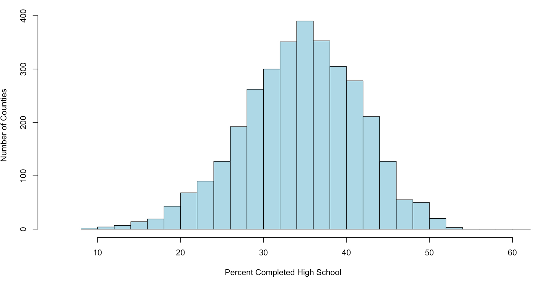
When someone says mound shaped data, this is the text book example of mound shaped. This is from the US-Education.csv data that we have been playing with, below are the commands to get you started and get you a histogram.
Just so you fully understand wha this data is, every person in the US reports their level of educational attainment to the Census every ten years, every few years this data is updated and projected to estimate reasonably current values. This we will be using is for the 2010-2014 years which is the five year average compiled by the American Community Survey. I highly encourage use of this website for test data, all of it has to be manipulated a little bit, but it typically takes minutes to get it into a format R can use.
usa <- read.csv("/data/US-Education.csv",stringsAsFactors=FALSE)
str(usa)

#While not required, i want to isolate the data we will be working with
highSchool <- subset(usa[c("FIPS.Code","Percent.of.adults.with.a.high.school.diploma.only..2010.2014")],FIPS.Code >0)

#reanme the second column to something less annoying
colnames(highSchool)[which(colnames(highSchool) == 'Percent.of.adults.with.a.high.school.diploma.only..2010.2014')] <- 'percent'

#Display a histogram
hist(highSchool$percent
    ,xlim=c(5,60)
    ,breaks=20
    ,xlab = "Percent Completed High School "
    ,ylab = "Number of Counties"
    ,main = ""
    ,col = "lightblue")
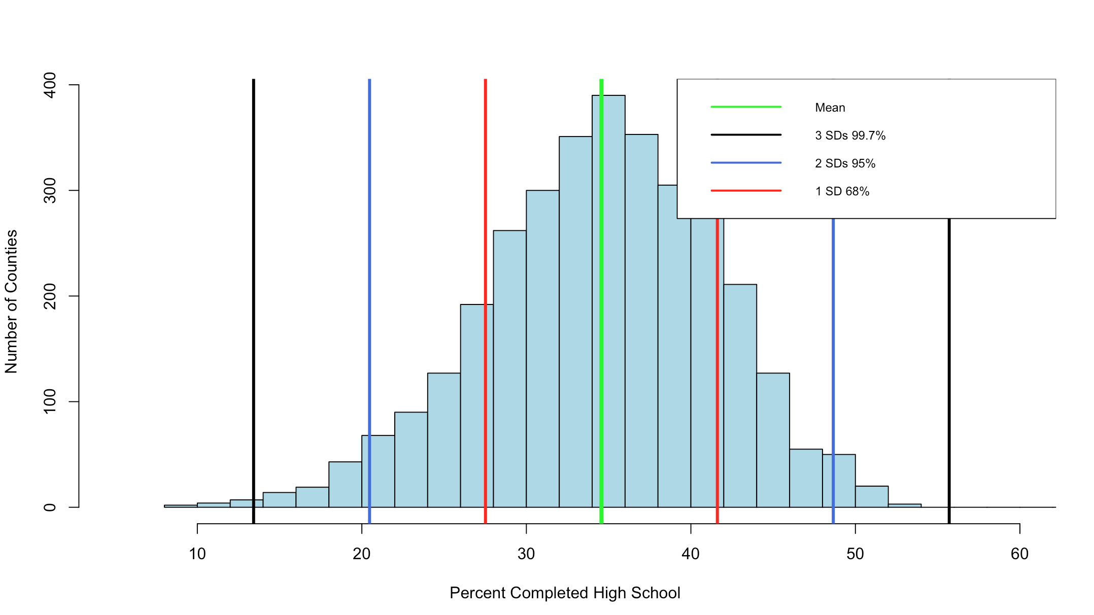
The Empirical rule states that
68% of the data will fall with in 1 standard deviation of the mean,
95% of the data will fall within 2 standard deviations of the mean, and
99.7% of the data will fall within 3 standard deviations of them mean.
Lets find out!
#create a variable with the mean and the standard devaiation
hsMean <- mean(highSchool$percent,na.rm=TRUE)
hsSD <- sd(highSchool$percent,na.rm=TRUE)

#one standard deviation from the mean will "mean" one SD
#to the left (-) of the mean and one SD to the right(+) of the mean.
#lets calculate and store them

oneSDleftRange <- (hsMean - hsSD)
oneSDrightRange <- (hsMean + hsSD)

oneSDleftRange;oneSDrightRange


##[1] 27.51472 is one sd to the left of the mean
##[1] 41.60826 is one sd to the right of the mean

#lets calculate the number of rows that fall
#between 27.51472(oneSDleftRange) and 41.60826(oneSDrightRange)
oneSDrows <- nrow(subset(highSchool,percent > oneSDleftRange & percent < oneSDrightRange))

# whats the percentage?
oneSDrows / nrow(highSchool)
If everything worked properly, you should have seen that the percentage of counties within one standard deviation of the mean is "0.6803778" or 68.04%. Wel that was kinda creepy wasn't it? The empirical rule states that 68% of the data will be within one standard deviation.
Lets keep going.
#two standard deviations from the mean will "mean" two SDs
#to the left (-) of the mean and two SDs to the right(+) of the mean.
twoSDleftRange <- (hsMean - hsSD*2)
twoSDrightRange <- (hsMean + hsSD*2)


twoSDleftRange;twoSDrightRange

##[1] 20.46795 is two sds to the left of the mean
##[1] 48.65503 is two sds to the right of the mean

twoSDrows <- nrow(subset(highSchool,percent > twoSDleftRange & percent < twoSDrightRange))

twoSDrows / nrow(highSchool)
If your math is the same as my math, you should have gotten 95.09%, so far the empirical rule is holding...
You can see the distribution of the data below, it really does seem to fall into pretty predictable standard deviations.
It has frequently been my opinion and others that R was written by an angry teenager to get even with his boomer parents, while not entirely true R has many frustrations. The nice thing is, you can write your own package to handle many of these more complex visualizations, i stuck to Base R for this histogram, and it does get the point across, but ggplot provides much better graphics and legends.
This is a slight diversion into a tool built into R called R Markdown, and Shiny will be coming up in a few days. Why is this important? It gives you a living document you can add text and r scripts to to produce just the output from R. I wrote my Stats grad project using just R Markdown and saved it to a PDF, no Word or open office tools.
Its a mix of HTML and R, so if you know a tiny bit about HTML programing you will be fine, otherwise, use the R Markdown Cheat sheet and Reference Guide which i just annoyingly found out existed…
I am going to give you a full R Markdown document to get you started.
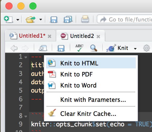
Create a new R Markdown file;
Then Run it by selecting the “Knit” drop down in the middle left of the toolbar and selecting Knit to HTML.
This will create an html document that you can open in a browser, it comes with some default mtcars data just so you can see some output. Try out some R commands and doodle around a bit before starting the code below. This is the file data file we will be using, US-Education.csv It contains just the 2010-2014 educational attainment estimates per count in the US.
In the code books below i will put in each section of the R Markdown and discuss it, each R code block can me moved to r console to be run.
The first section Is the title that will show up on the top of the doc, copy this into the markdown file and run it by itself. I am using an html style tag as i want some of the plots to be two columns across.
You will also see the first R command in an “R” block identified by ““`{r} and terminated with ““`”. Feel free to remove options and change options to see what happens.
Notice below the style tag is wrong, when you copy it out you will need to put the “<" back in from of the style tag. If i format it correctly wordpress takes it as an internal style tag to this post.
---
title: "Educational Attainment by County"

output: html_document
---

style>
  .col2 {
    columns: 2 200px;         /* number of columns and width in pixels*/
    -webkit-columns: 2 200px; /* chrome, safari */
    -moz-columns: 2 200px;    /* firefox */
     line-height: 2em;
     font-size: 10pt;

  }

/style>

```{r setup, include=FALSE}
knitr::opts_chunk$set(echo = FALSE,warning=FALSE)

#require is the fancy version of install package/library
require(choroplethr)

```
This will be the next section in the markup, load a dataframe for each of the four educational attainment categories.
```{r one}

#Load data
 setwd("/data/")
 usa <- read.csv("US-Education.csv",stringsAsFactors=FALSE)

#Seperate data for choropleth
 lessHighSchool <- subset(usa[c("FIPS.Code","Percent.of.adults.with.less.than.a.high.school.diploma..2010.2014")],FIPS.Code >0)

highSchool <- subset(usa[c("FIPS.Code","Percent.of.adults.with.a.high.school.diploma.only..2010.2014")],FIPS.Code >0)

someCollege <- subset(usa[c("FIPS.Code","Percent.of.adults.completing.some.college.or.associate.s.degree..2010.2014")],FIPS.Code >0)

college <- subset(usa[c("FIPS.Code","Percent.of.adults.with.a.bachelor.s.degree.or.higher..2010.2014")],FIPS.Code >0)

#rename columns for Choropleth

 colnames(lessHighSchool)[which(colnames(lessHighSchool) == 'FIPS.Code')] <- 'region'

 colnames(lessHighSchool)[which(colnames(lessHighSchool) == 'Percent.of.adults.with.less.than.a.high.school.diploma..2010.2014')] <- 'value'

#
# or
#
 names(highSchool) <-c("region","value")
 names(someCollege) <-c("region","value")
 names(college) <-c("region","value")


```
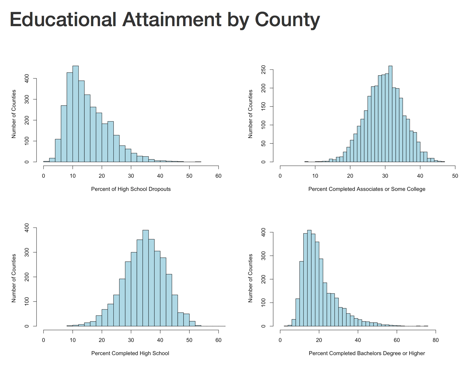
The next section will create four histograms of the college attainment by category. Notice the distribution of the data, normal distribution, right skew, left skew, bimodal? We will discuss them next blog.
Notice for the next section i have the "div" without the left "<", be sure to put those back.
div class="col2">

```{r Histogram 1}
 hist(lessHighSchool$value,xlim=c(0,60),breaks=30, xlab = "Percent of High School Dropouts", ylab="Number of Counties",main="",col="lightblue")


 hist(highSchool$value,xlim=c(0,60),breaks=30, xlab = "Percent Completed High School ", ylab="Number of Counties",main="",col="lightblue")

```


```{r Histogram 2}

 hist(someCollege$value,xlim=c(0,50),breaks=30, xlab = "Percent Completed Associates or Some College ", ylab="Number of Counties",main="",col="lightblue")

 hist(college$value,xlim=c(0,90),breaks=30, xlab = "Percent Completed Bachelors Degree or Higher ", ylab="Number of Counties",main="",col="lightblue")


```

/div>
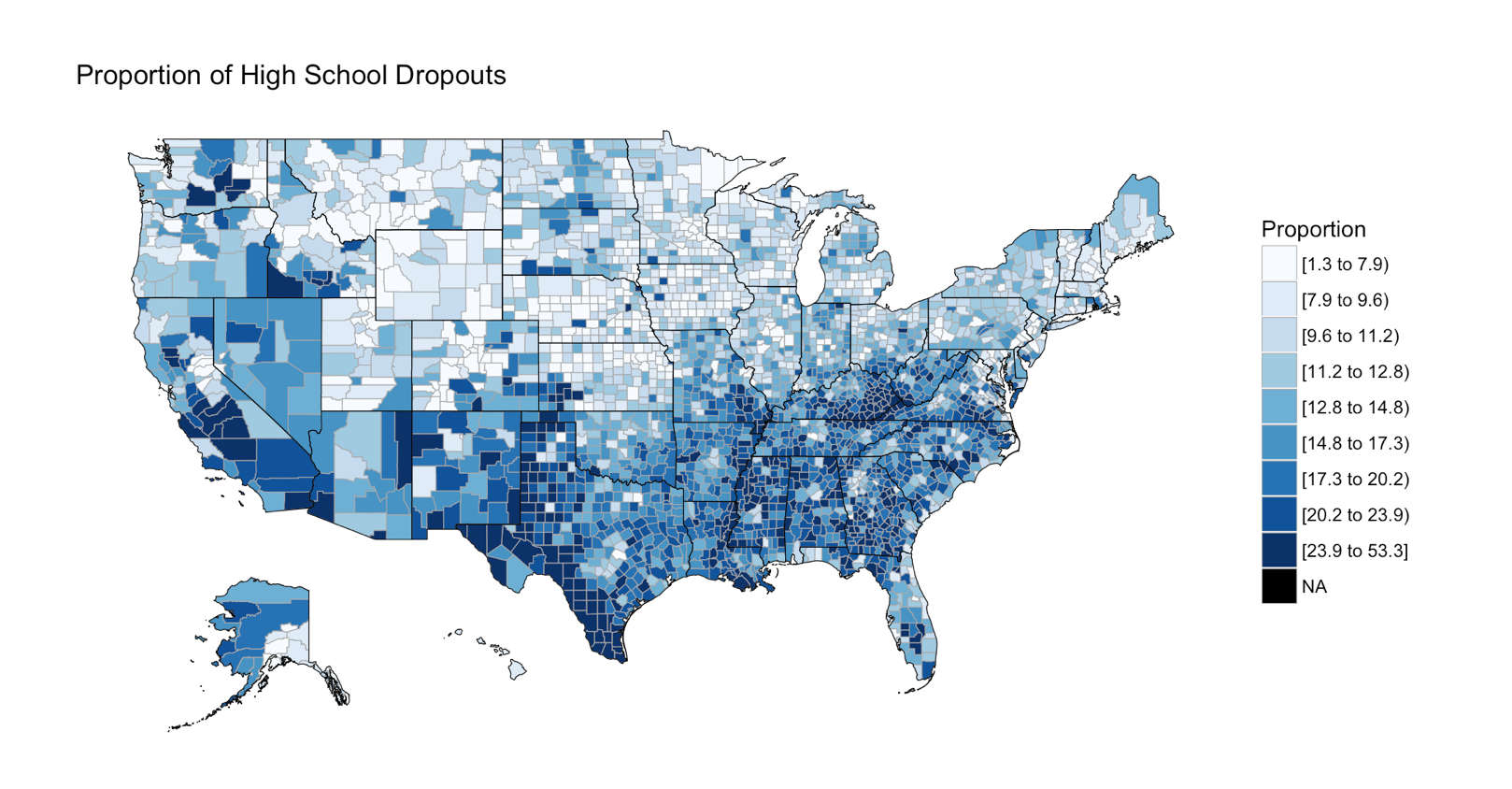
The next section is the choropleth, for the high school dropouts, notice the R chunk parameters to size the plot area.
```{r two, fig.width=9, fig.height=5, fig.align='right'}


 county_choropleth(lessHighSchool,

                   title = "Proportion of High School Dropouts",
                   legend="Proportion",
                   num_colors=9)

```
There are three more choropleths that you will have to do on your own! you have the data, and the syntax. If you have trouble with this, the red file i used is here Education.rmd
In the end, you should have a histogram looking like this;
And if you make it to the first choropleth, Percentage that did not complete high school;
So, last blog we covered a tiny bit of vocabulary, hopefully it was not too painful, today we will cover a little bit more about visualizations. You have noticed by now that R behaves very much like a scripting language which having been a T-SQL guy seemed familiar to me. And you have noticed that it behaves like a programing language in that I can install a package, and invoke function or data set stored in that package, very much like a dll, though no compiling is required. It’s clear that it is very flexible as a language, which you will learn is its strength and its downfall. If you decide to start designing your own R packages, you can write them as terribly as you want, though i would rather you didn’t.
If you want to find out what datasets are available run “data()”, and as we covered in a prior blog, data(package=) will give you the datasets for a specific package. This will provide you nice list of datasets to doodle with, as you learn something new explore the datasets to see what you can apply your new-found knowledge to.
First lets check out the histogram. If you have worked with SQL you know what a histogram is, and it is marginally similar to a statistics visual histogram. We are going to look at a real one. The basic definition is that it is a graphical representation of the distribution of numerical data.
When to use it? When you want to know the distribution of a single column or variable.
“Hist” ships with base R, which means no package required. We will go through a few Histograms from different packages.
You have become familiar with this by now, “data()” will load the mtcars dataset for use, “View” will open a new pane so you can review it, and help() will provide some information on the columns/variables in the dataset. Fun fact, if you run “view” (lowercase v) it will display the contents to the console, not a new pane. “?hist” will open the help for the hist command.
data(mtcars)
View(mtcars)
help(mtcars)

?hist
Did you notice we did not load a package? mtcars ships with base R, run “data()” to see all the base datasets.
Hist takes at a single quantitative variable, this can be passed by creating a vector or referencing just the dataframe variable you are interested in.
Try each of these out one at a time.
#When you see the following code, this is copying the contents
#of one variable into a vector, it is not necessary for what
#we are doing but it is an option. Once copied just pass it in to the function.

cylinders <- mtcars$cyl
hist(cylinders)

#Otherwise, invoke the function and pass just the variable you are interested in.

hist(mtcars$cyl)
hist(mtcars$cyl, breaks=3)
hist(mtcars$disp)
hist(mtcars$wt)
hist(mtcars$carb)
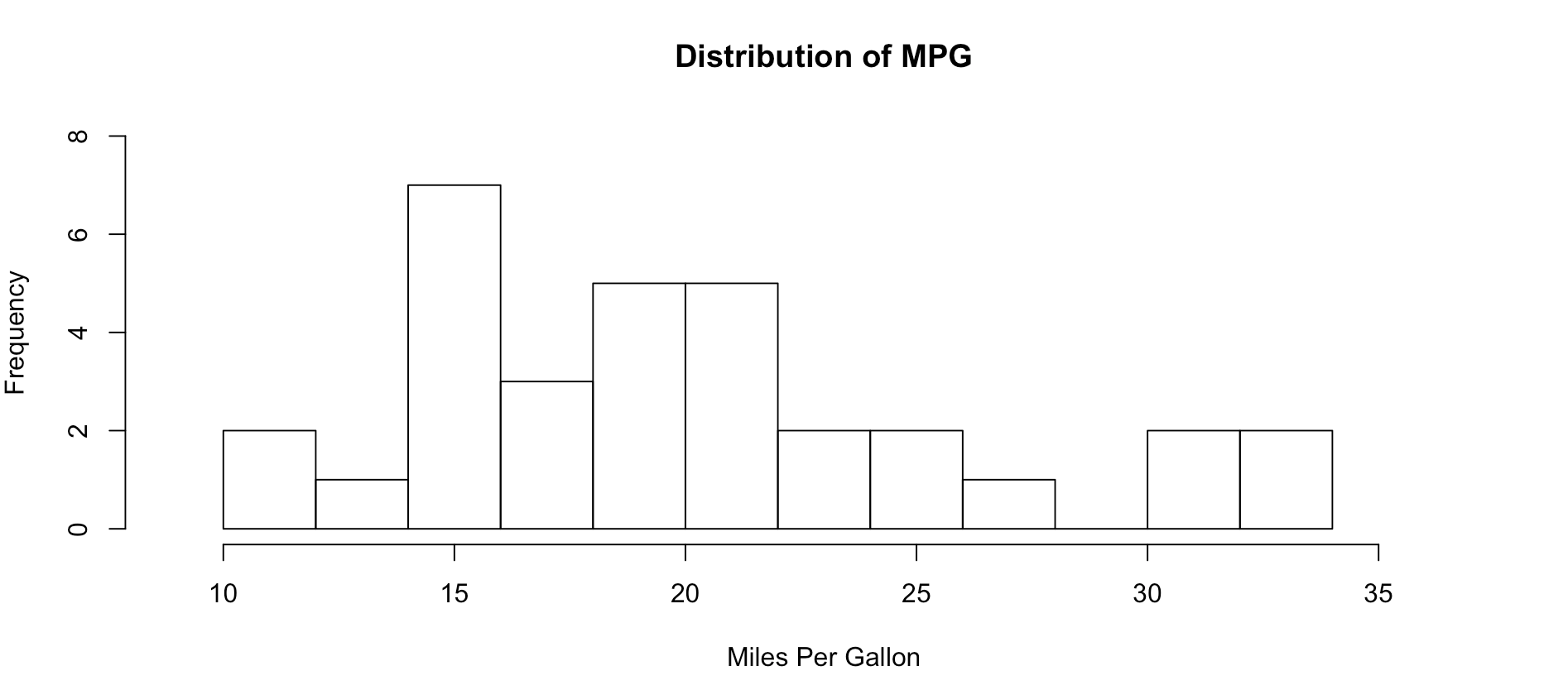
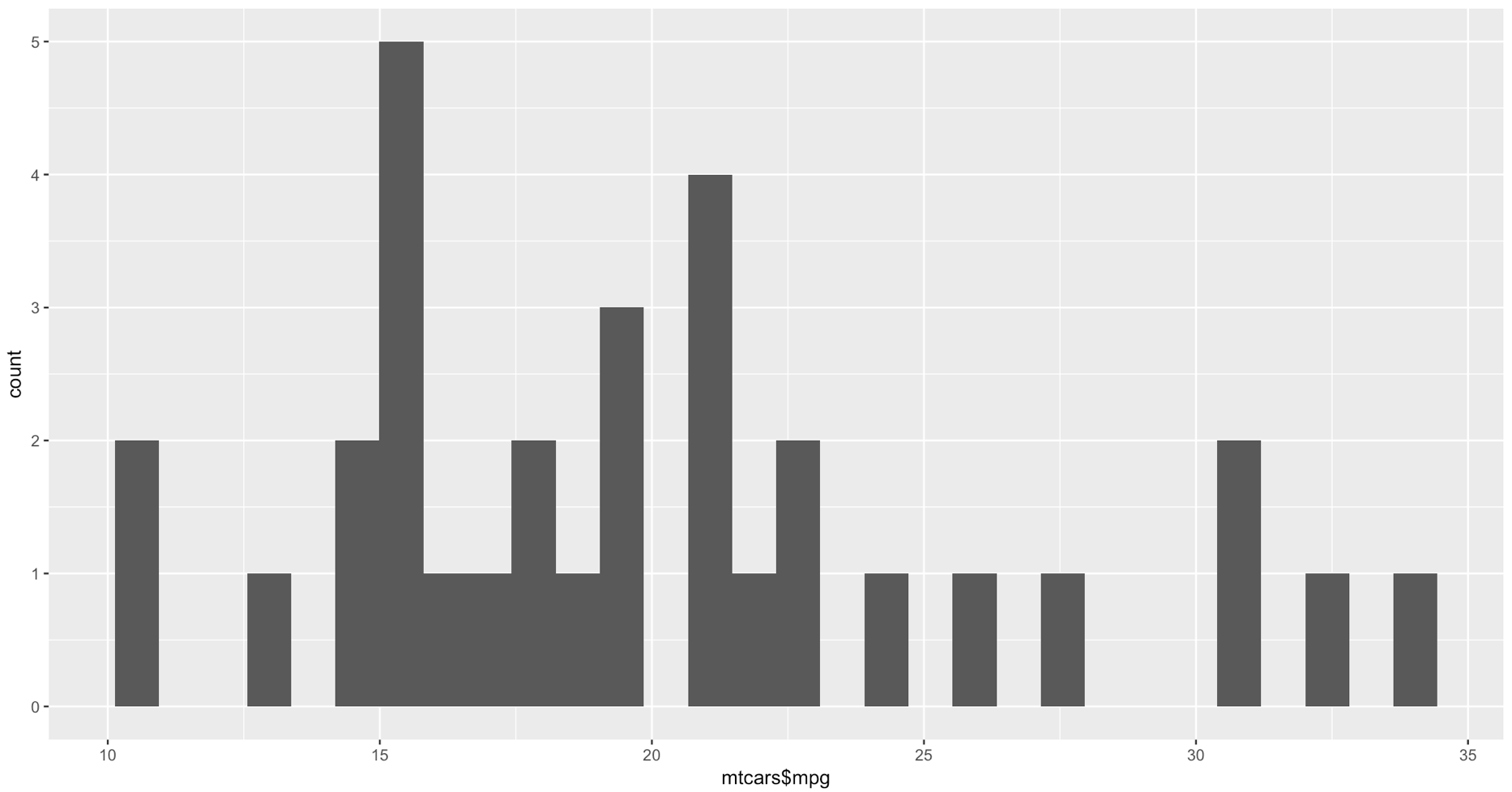
As you get wiser you can start adding more options to clean up the histogram so its starts to look a little more appealing, inherently histograms are not visually appealing but they are a good for data discovery and exploration. Without much thought you can see that more vehicles get 15mpg.
hist(mtcars$mpg, breaks = 15)

hist(mtcars$mpg, breaks = 15,
    xlim = c(9,37),
    ylim = c(0,8),
    main = "Distribution of MPG",
    xlab = "Miles Per Gallon")
Lets kick it up a notch, now we are going to use the histogram function from the Mosaic package. The commands below should be looking familiar by now.
Notice there is more than one way to pass in our dataset. Since histogram needs a vector, a dataset with one column, any method you want to use to create that on the fly will probably work.
#try out a set of numbers
histogram(c(1,2,2,3,3,3,4,4,4,4))
#from the mtcars dataset let look at mpg and a few others and try out some options
histogram(mtcars$mpg)
#Can you see the difference in these? which is the default?
histogram(~mpg, data=mtcars)
histogram(~mpg, data=mtcars, type="percent")
histogram(~mpg, data=mtcars, type="count")
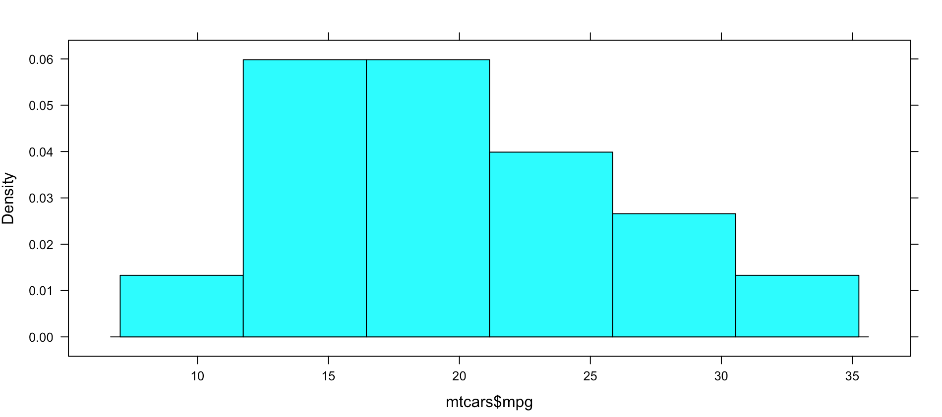
histogram(~mpg, data=mtcars, type="density")
Not very dazzling, but it is the density of the data. This is from "histogram(mtcars$mpg)"
Well, this is all sort of interesting, but quite frankly it is still just showing a data density distribution. Is there away to add a second dimension to the visual without creating three histograms manually? Well, sort of, divide the data up by a category.
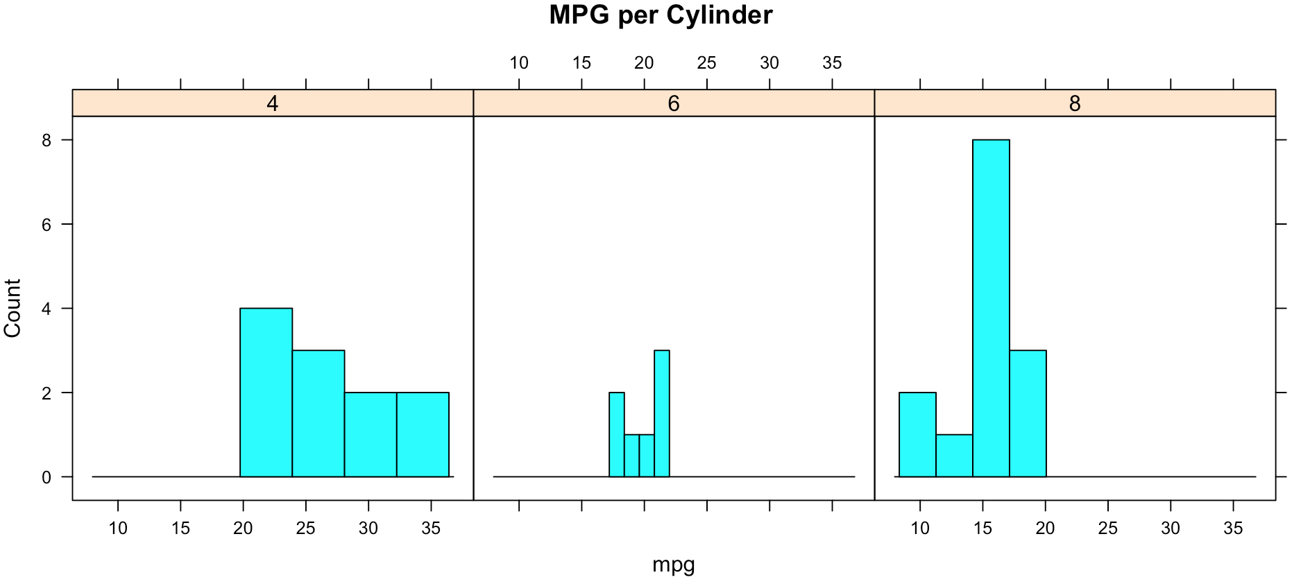
While less pretty with this particular dataset, you can see that it divided the histograms up by cylinders using the "|". You will also notice that i passed in "cyl" as a factor, this means treat it as a qualitative value, without the "as.factor" the number of cylinders in the label will not display, and that does not help with readability. Remove the as.factor to see what happens. Create your own using mtcars.wt and hp, do any patterns emerge?
histogram(~mpg | as.factor(cyl),
          main = "MPG per Cylinder",
          data=mtcars,
          center=TRUE,
          type="count",
          n=4,
          layout = c(3,1))
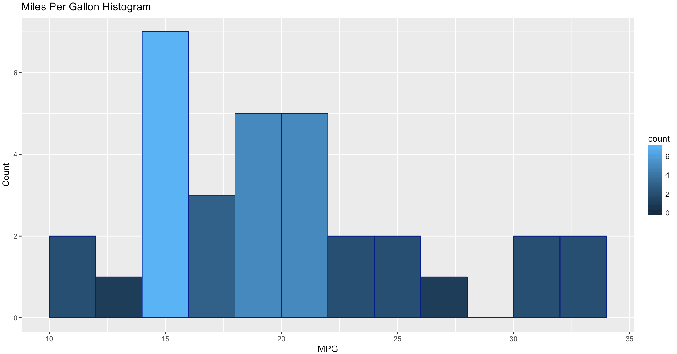
Well that was fun, remember when i said lets kick it up a notch? Here we go again. My favorite, and probably the most popular R visualization packages is ggplot or more recently, GGPLOT2
WOW, the world suddenly looks very different, just the default histogram look as if we have entered the world of grown up visualizations.
Ggplot has great flexibility. Check out help and search the web to see what you can come up with on your own. The package worth of an academic paper, or if you want to dazzle your boss.
ggplot(data=mtcars, aes(mtcars$mpg),) +
  geom_histogram(breaks=seq(10, 35, by =2),
    col="darkblue",
    aes(fill=..count..))+
    labs(title="Miles Per Gallon Histogram") +
    labs(x="MPG", y="Count")