Now that you have a connection from R to SQL, WOO HOO, what the heck do you do with it? Well for starters all of the reports that you wish Microsoft would write and ship with SSMS, now is your chance to do it yourself.
I will give you a few scripts every now and then just to get you started, I don’t have a production environment and I don’t have access to one so when I offer t-sql and R it will be from whatever data I can generate for a rudimentary test. If you have more data over a longer period of time, I may be interested in looking at it just to test out a bit. I am not going to write a system for you, but I can get you started. And i make no promises that when you run my code it wont blow chunks, my life time running joke is that i would never run my code in production, so i would certainly advise you not to either. Just consider everything i do introductory demos.
Lets start with a simple one, MSDB backup history. This one is super simple and a very basic time series data set. This was written against SQL Server 2016, however, there is no reason it should not work with prior versions of SQL. The stored procedure may require minor changes if you go too far back, but MSFT does not make changes to existing msdb back and agent tables too often, if ever…
That being said, there are a lot of moving parts in the t-sql and R script that you will need to think about. I am giving you one stored procedure that will pull back the most recent 10,000 rows of backup history, it is up to you to modify it to grab history for one database, several or all of them, and if you want to filter out backup types, that is up to you. These are all great options for parameter passed into the proc. This means that I am taking it for granted that you know how to write a basic t-sql statement and create and modify a stored procedure, if not, now is a good time to learn. I have the ability but not the interest to write a pretty sophisticated stored proc and R visuals to go with it, but what would you learn? 😉 But I may follow up with an R notebook at a later date.
The proc I am providing can be found on my github site. I captured the stored proc guts from an SSMS report, and probably removed more than I added. I told you i was lazy before, if you can use existing code that Microsoft provides as your starting point or as a whole, by all means do it. A Lot of very smart people put a lot of work in to the background code that makes SQL and the reporting work, so by all means take advantage of their work. Its also a really good way to learn more about the engine and components.
The R script can be found on my github site as well, since you can grab all of it there I will walk through the script section by section.
First is the package install and load. You only need the packages installed if you have not done it before, be sure to watch for errors in the console, if you hit a problem google is your friend. The load library must be done each time you start R, restart R, or install a new package.
#install.packages("odbc")
#install.packages("ggplot2")
#install.packages("dplyr")
#install.packages("lubridate")
#install.packages("scales")

library(odbc)
library(ggplot2)
library(dplyr)
library(lubridate)
library(scales)
Next is the odbc connection and query, I will use ODBC for this one versus RevoScaleR, you can use either. Notice the database is “msdb” this time, that is where my usp_GetBackupHist stored procedure lives.
Sys.setenv(TZ='GMT')

MSDB <- dbConnect(odbc::odbc(),
                  Driver    = "SQL Server",
                  Server    = "localhost",
                  Database  = "msdb",
                  Trusted_Connection = 'Yes')

SQLStmt <- sprintf("exec usp_GetBackupHist")


rs <- dbSendQuery(MSDB, SQLStmt)

msdbBackupHist <- dbFetch(rs)

# house keeping
dbClearResult(rs)
dbDisconnect(MSDB)
Hopefully, you now have a dataframe called msdbBackupHist, if not find out what went wrong, read the console errors. Comments are inline, but this is the data engineering to get all of the units to be the same.
# make a copy of the dataframe
keep <- msdbBackupHist

# Overwrite the existing dataframe with just the last 60 days of data
# You can change this to meet your needs, less or more.
msdbBackupHist <- filter(msdbBackupHist, backup_start_date >= (max(msdbBackupHist$backup_start_date) - days(60)))

# for all of the databases backups to be in one plot they will need to be
# of the same scale, so convert all of them to gb, and make sure you change the actual
# file size to match.
msdbBackupHist$backup_size[msdbBackupHist$backup_size_unit == 'MB'] = msdbBackupHist[msdbBackupHist$backup_size_unit == 'MB',12]/1000
msdbBackupHist$backup_size[msdbBackupHist$backup_size_unit == 'KB'] = msdbBackupHist[msdbBackupHist$backup_size_unit == 'KB',12]/1000000

msdbBackupHist$backup_size_unit[msdbBackupHist$backup_size_unit == 'KB'] = "GB"
msdbBackupHist$backup_size_unit[msdbBackupHist$backup_size_unit == 'MB'] = "GB"

# This statement essentially disables scientific notation, for ease of reading
options(scipen=999)
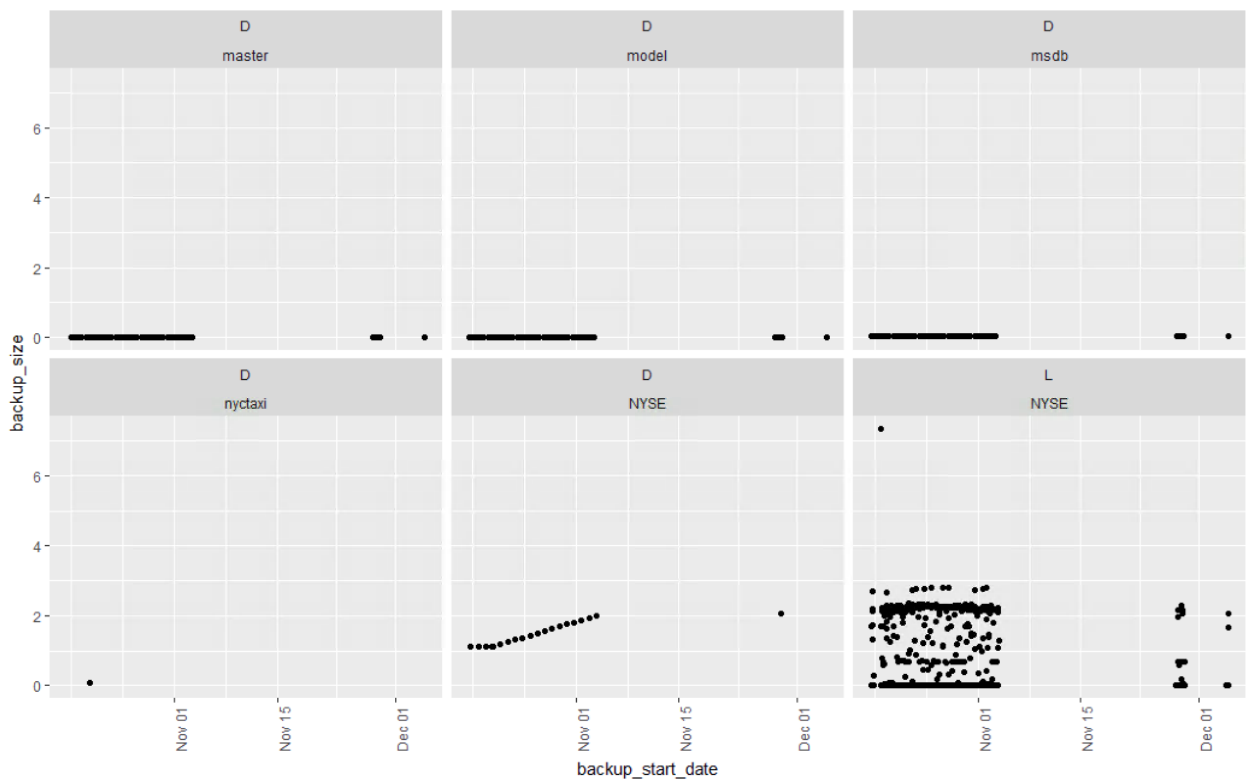
The ggplot scatter plot to get us started. For this case, display everything in the dataframe. The x axis will be the backup_startdate, the y axis will be the backup_size, geom_point tells ggplot we are creating a scatter plot, imagine facet_wrap as a ggplot group by, it indicates that every backup type and name should have its own plot, if you have three backup types per database, and 50 databases that would be 150 plots, it will probably blow up, or take a very very long time to render. The last line, theme will adjust the text on the x axis to an angle so you can see the dates, a 90 degree pivot.
ggplot(msdbBackupHist, aes(x=backup_start_date, y=backup_size)) +
  geom_point() +
  facet_wrap(type ~ name) +
  theme(axis.text.x = element_text(angle = 90, hjust = 1))
When creating and groupling these keep in mind the scale, if you have a combination of low gigabyte size databases and terabyte size databases the graph will scale to meet the terabyte size, so be careful. Sort of like asking what is the atomic weight of oxygen in kilotons, it will never show up on the graph.
You can already see that my NYSE database is growing steadily (when my server is turned on) and my log backups for NYSE are all over the place and pretty large considering the size of the database.
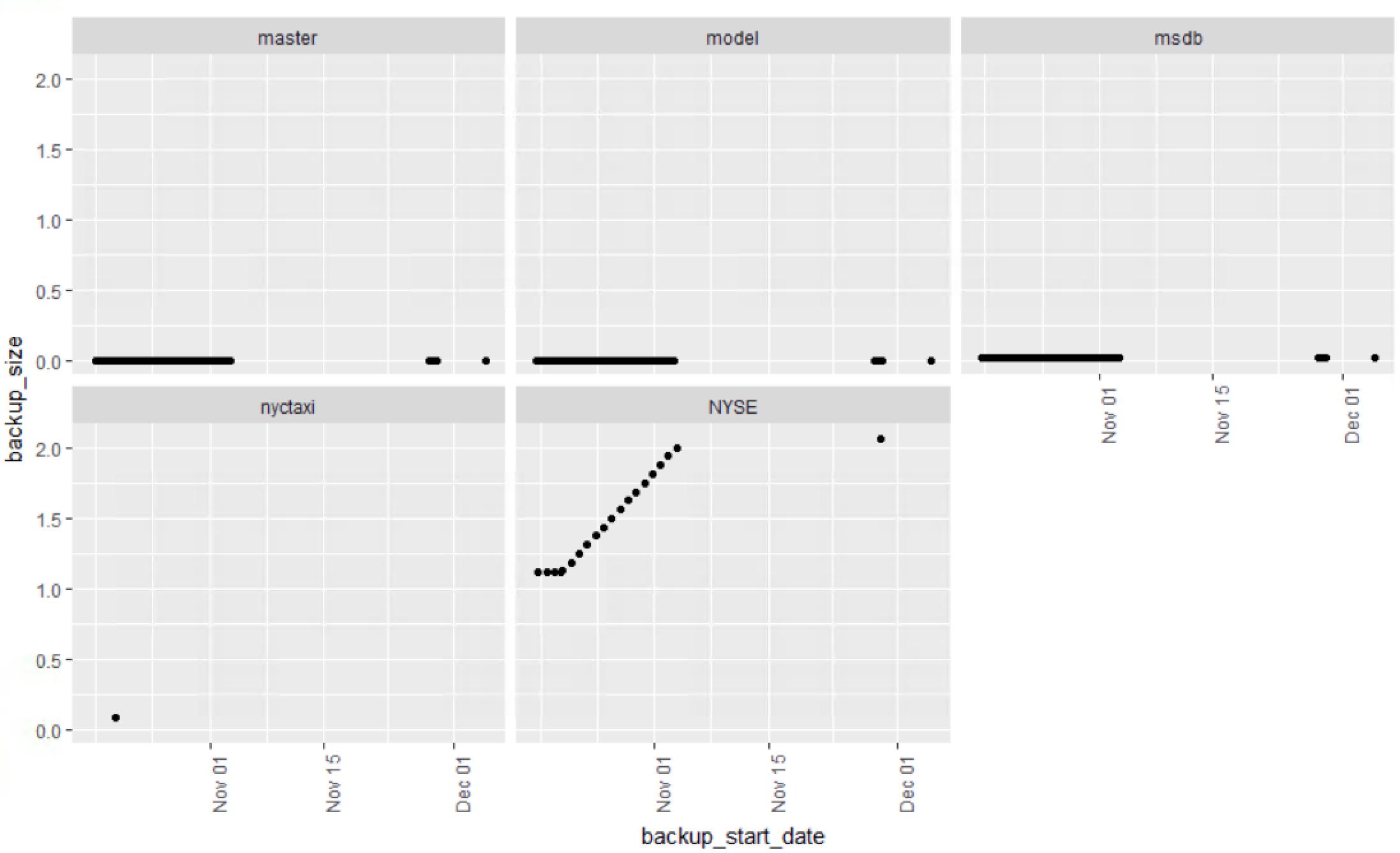
Lets scope this down a bit and create a new dataframe with just the database backups. You can go farther and exclude system databases if you like, in fact you can do that from the stored procedure. Keep msdb though, i have seen customers with multi gb msdb databases, its worth of monitoring
# Create a dataframe for just the backups
DbBackups <- msdbBackupHist[msdbBackupHist$type == 'D',]


ggplot(DbBackups, aes(x=backup_start_date, y=backup_size)) +
  geom_point() +
  facet_wrap(~name) +
  theme(axis.text.x = element_text(angle = 90, hjust = 1))
You can definitely see NYSE is growing, msdb is growing too, but at this scale it is not detectable.
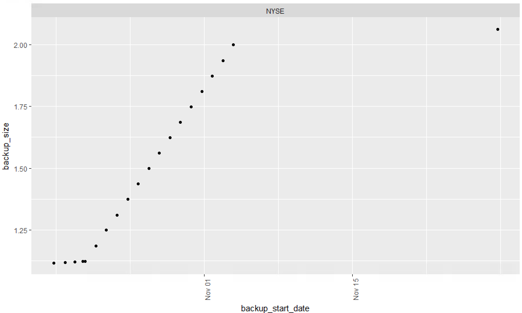
This certainly shows the flexibility of R, you can perform a filter, or select in the function,as long as the result of DbBackups[DbBackups$name == "NYSE",] is a dataframe it will totally work. Use these with caution, while this is cool it could be considered sloppy code.
# Show just nyse with selection in ggplot
ggplot(DbBackups[DbBackups$name == "NYSE",], aes(x=backup_start_date, y=backup_size)) +
  geom_point() +
  facet_wrap(~name) +
  theme(axis.text.x = element_text(angle = 90, hjust = 1))
Looking at just one database is a little easier.
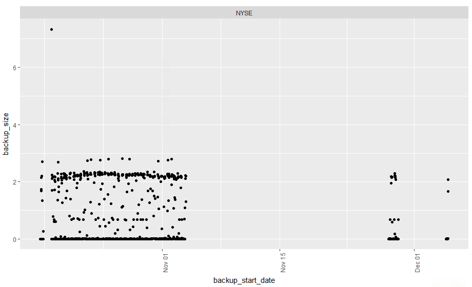
Finally lets create a dataframe just for log backups, facet_wrap is indicated but since i only have one database with log backups i will get only one result.
# Create a dataframe jsut for log file backups
LogBackups <- msdbBackupHist[msdbBackupHist$type == 'L',]

ggplot(LogBackups, aes(x=backup_start_date, y=backup_size)) +
  geom_point() +
  facet_wrap(~ name) +
  theme(axis.text.x = element_text(angle = 90, hjust = 1))
Hopefully this will get you started, to more reports, the point of all of this is to get you using R, and visualization is the best way to do this. I imagine and hope from this you will come up with dozens of variations and far better reports than i have.