From the last post, we have a dataset, now lets do something with it.
Continue reading
Category Archives: sqlshep
Multiple Linear Regression, Real, and Recent MPG Data – Data Engineering
Published March 1, 2018 / by shep2010You were warned! If you have ever sat in on a single data science talk you probably learned that the data engineering phase of a project will take 80% of your time. This is an anecdotal number, but my experience to date seems to reenforce this number. On average it will take about 80% of whatever time you have to perform the data engineering tasks. This blog is going to likely prove that, though you will not have had to do the actual work, just copy and paste the code and run it. You will however get an idea of the pain in the ass you are in for.
I am going to approach this post and the scripts exactly the way i came to the dataset, so i will remove rows, then learn something new and remove some more rows or maybe add them back. I could simply put the data engineering at the top, and not explain anything but that is not how the world will work. The second, third, forth, one hundredth time you do this you will have the scripts and knowledge. With any new dataset, curiosity and exploration will make the process of modeling much easier.

Getting Started with R and SQL (Regardless of SQL Version) Using ODBC
Published November 29, 2017 / by shep2010So here you are, you know SQL or you at least do something with it everyday and are wondering what all the hoopla is about R and data science. Lets break down the first barrier, R and data science actually have little to do with each other, R is a language, data science is an abstract field of work, sort of like saying I am a computer scientist, that will narrow it down but not by much. What is your industry, what languages do you use, what is your education, hacker, bachelors, masters, phd…? You can be a Data Scientist and never use R.
But we are going to use R, today, right now, get ready.
Lets get started, again…
Published November 28, 2017 / by shep2010The hardest thing about having a blog is without exception, having a blog! It will sit and wait for you forever to come back to it, I think about it every day and the hundred post that need to be completed. In my case, content is not the problem it’s the fact that some posts like this one will take a few minutes to one hour, and I have posts that have taken me two days to write, not because they were difficult, but because the technical accuracy of the post had to be perfect, or at least as perfect as I could come up with. I have already decided the first person I hire will be responsible for going back and verifying my posts… I feel sorry for them already.
Azure Burn
Published June 8, 2017 / by shep2010I really like the title of this post, it is far more nefarious sounding that what this article truly is. What I mean is Azure burn rate, as in, how fast are you burning your Azure credits or real money.
My subscription, as do all new subscriptions, currently has a processor core cap of 20, which is normal and can be lifted in five minutes by opening a support ticket with MSFT from within Azure, instructions here. Incase you are wondering, MSFT will allow you to have 10,000 cores or more, and you will suddenly get very special attention from the entire company, so be reasonable in your request. I will be looking a AWS at some point, since I am no longer a MSFT employee my primary focus is the individual adopting new skills, not a specific platform. AWS has some interesting bid pricing for compute I am interested in. More later on that.
Setting up a cloud Data Science test environment, on a budget
Published June 5, 2017 / by shep2010Before I get into another long diatribe, know that the minimum you need to get started with R is R, and R Studio and know that they will run on just about anything. But if you want a bit more of an elaborate setup including SQL, read on.
Many years ago I took great pride in having a half dozen machines or more running all flavors of windows and SQL to play with and experiment on, it did not matter what it was, it would bend to my will. And in case you are wondering, NT would run very nicely on a Packard Bell.
Once I took over the CAT lab I was in hog heaven, I had a six figure budget and was required to spend it on cool fast toys and negotiate as much free stuff from vendors as I possible could. It was terrible, tough job to have. Jump forward to now, I own one Mac Book pro and one IPhone, and serves every need I have.
Continue reading
Visualization, Histogram
Published January 3, 2017 / by shep2010So, last blog we covered a tiny bit of vocabulary, hopefully it was not too painful, today we will cover a little bit more about visualizations. You have noticed by now that R behaves very much like a scripting language which having been a T-SQL guy seemed familiar to me. And you have noticed that it behaves like a programing language in that I can install a package, and invoke function or data set stored in that package, very much like a dll, though no compiling is required. It’s clear that it is very flexible as a language, which you will learn is its strength and its downfall. If you decide to start designing your own R packages, you can write them as terribly as you want, though i would rather you didn’t.
If you want to find out what datasets are available run “data()”, and as we covered in a prior blog, data(package=) will give you the datasets for a specific package. This will provide you nice list of datasets to doodle with, as you learn something new explore the datasets to see what you can apply your new-found knowledge to.
First lets check out the histogram. If you have worked with SQL you know what a histogram is, and it is marginally similar to a statistics visual histogram. We are going to look at a real one. The basic definition is that it is a graphical representation of the distribution of numerical data.
When to use it? When you want to know the distribution of a single column or variable.
“Hist” ships with base R, which means no package required. We will go through a few Histograms from different packages.
You have become familiar with this by now, “data()” will load the mtcars dataset for use, “View” will open a new pane so you can review it, and help() will provide some information on the columns/variables in the dataset. Fun fact, if you run “view” (lowercase v) it will display the contents to the console, not a new pane. “?hist” will open the help for the hist command.
data(mtcars)
View(mtcars)
help(mtcars)

?hist
Did you notice we did not load a package? mtcars ships with base R, run “data()” to see all the base datasets.
Hist takes at a single quantitative variable, this can be passed by creating a vector or referencing just the dataframe variable you are interested in.
Try each of these out one at a time.
#When you see the following code, this is copying the contents
#of one variable into a vector, it is not necessary for what
#we are doing but it is an option. Once copied just pass it in to the function.

cylinders <- mtcars$cyl
hist(cylinders)

#Otherwise, invoke the function and pass just the variable you are interested in.

hist(mtcars$cyl)
hist(mtcars$cyl, breaks=3)
hist(mtcars$disp)
hist(mtcars$wt)
hist(mtcars$carb)
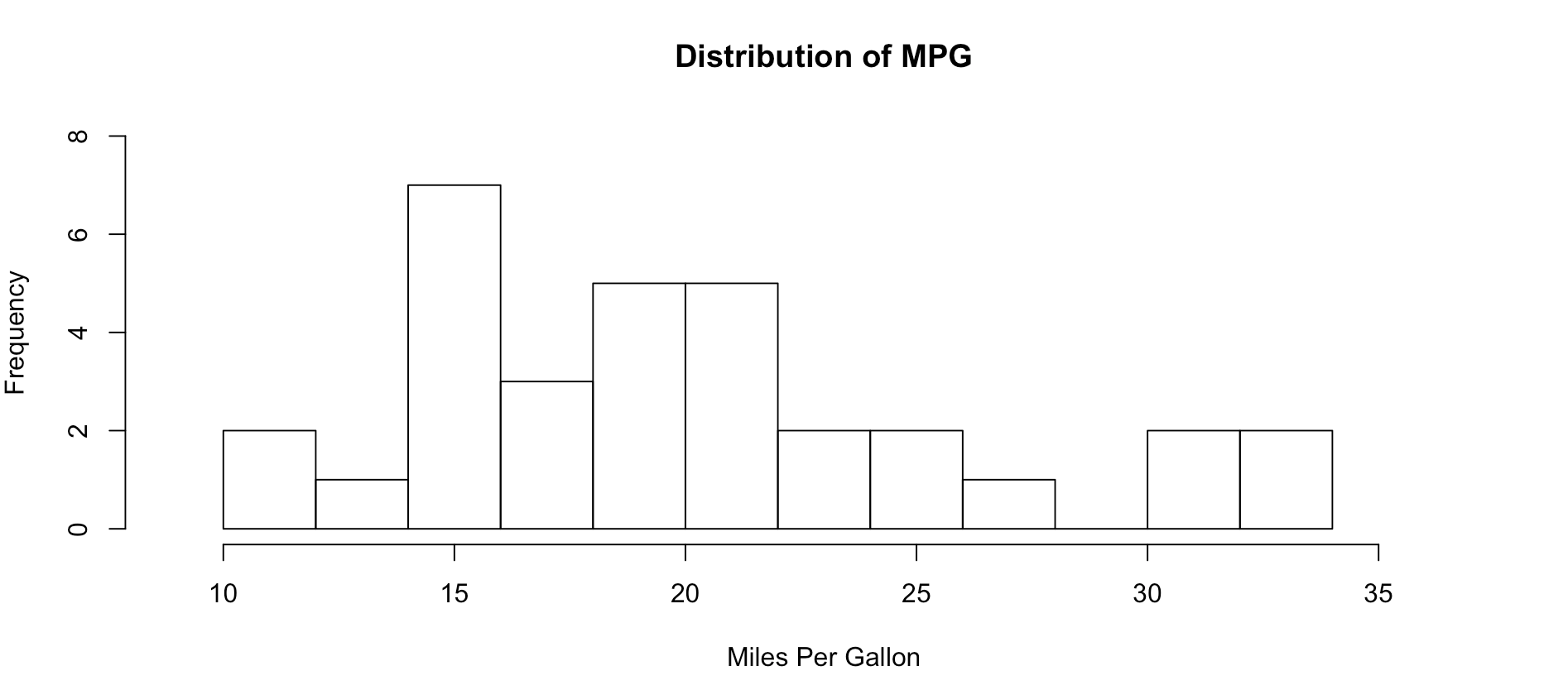
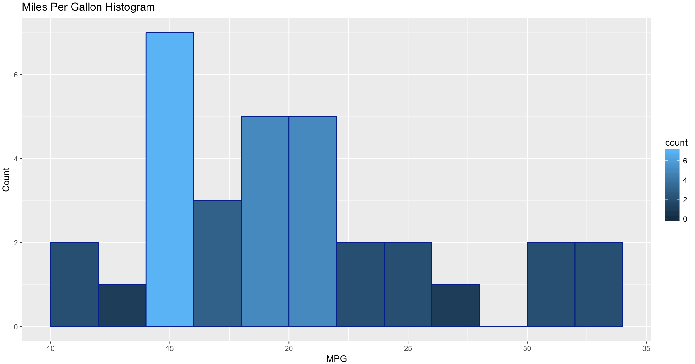
As you get wiser you can start adding more options to clean up the histogram so its starts to look a little more appealing, inherently histograms are not visually appealing but they are a good for data discovery and exploration. Without much thought you can see that more vehicles get 15mpg.
hist(mtcars$mpg, breaks = 15)

hist(mtcars$mpg, breaks = 15,
    xlim = c(9,37),
    ylim = c(0,8),
    main = "Distribution of MPG",
    xlab = "Miles Per Gallon")
Lets kick it up a notch, now we are going to use the histogram function from the Mosaic package. The commands below should be looking familiar by now.
install.packages("mosaic")
library(mosaic)

help(mosaic)
Notice there is more than one way to pass in our dataset. Since histogram needs a vector, a dataset with one column, any method you want to use to create that on the fly will probably work.
#try out a set of numbers
histogram(c(1,2,2,3,3,3,4,4,4,4))
#from the mtcars dataset let look at mpg and a few others and try out some options
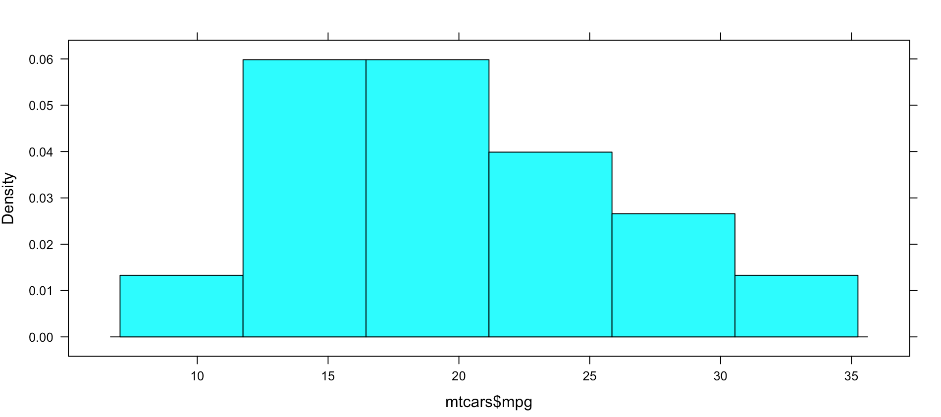
histogram(mtcars$mpg)
#Can you see the difference in these? which is the default?
histogram(~mpg, data=mtcars)
histogram(~mpg, data=mtcars, type="percent")
histogram(~mpg, data=mtcars, type="count")
histogram(~mpg, data=mtcars, type="density")
Not very dazzling, but it is the density of the data. This is from "histogram(mtcars$mpg)"
Well, this is all sort of interesting, but quite frankly it is still just showing a data density distribution. Is there away to add a second dimension to the visual without creating three histograms manually? Well, sort of, divide the data up by a category.
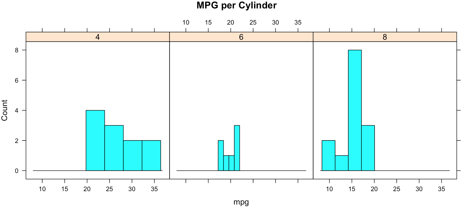
While less pretty with this particular dataset, you can see that it divided the histograms up by cylinders using the "|". You will also notice that i passed in "cyl" as a factor, this means treat it as a qualitative value, without the "as.factor" the number of cylinders in the label will not display, and that does not help with readability. Remove the as.factor to see what happens. Create your own using mtcars.wt and hp, do any patterns emerge?
histogram(~mpg | as.factor(cyl),
          main = "MPG per Cylinder",
          data=mtcars,
          center=TRUE,
          type="count",
          n=4,
          layout = c(3,1))
Well that was fun, remember when i said lets kick it up a notch? Here we go again. My favorite, and probably the most popular R visualization packages is ggplot or more recently, GGPLOT2
install.packages("ggplot2")
library(ggplot2)
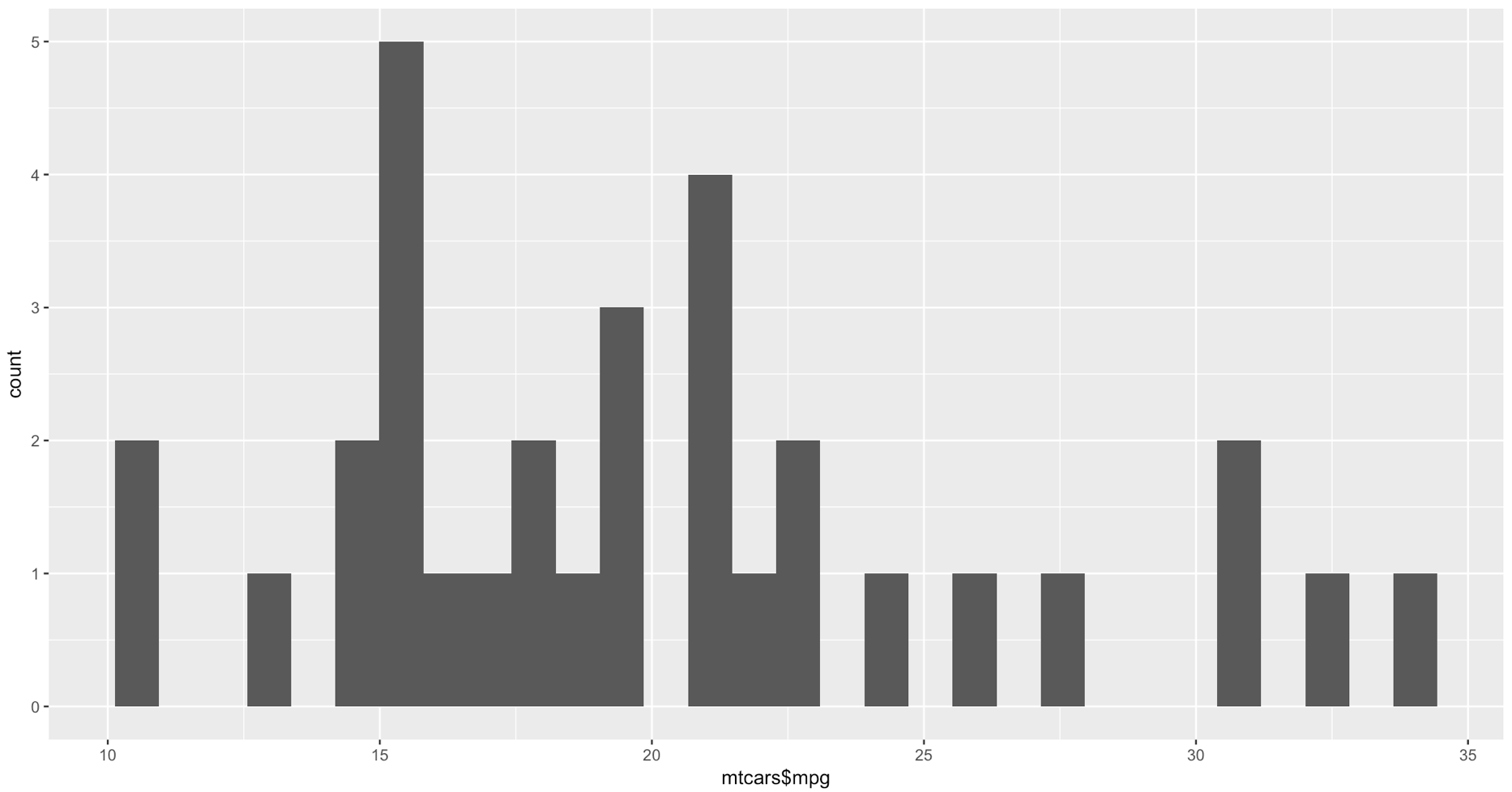
qplot(mtcars$mpg, geom="histogram")
WOW, the world suddenly looks very different, just the default histogram look as if we have entered the world of grown up visualizations.
Ggplot has great flexibility. Check out help and search the web to see what you can come up with on your own. The package worth of an academic paper, or if you want to dazzle your boss.
ggplot(data=mtcars, aes(mtcars$mpg),) +
  geom_histogram(breaks=seq(10, 35, by =2),
    col="darkblue",
    aes(fill=..count..))+
    labs(title="Miles Per Gallon Histogram") +
    labs(x="MPG", y="Count")
Todays Commands
Base R
data()
View()
help()
hist()
install.packages()
library()
Mosaic Package
histogram
Ggplot2 Package
qplot()
ggplot()
geom_histogram()
Shep
Stats stuff 1 In the beginning
Published January 2, 2017 / by shep2010There is no escaping it, you are going to have to know some stat stuff. Every now and then I will through in a blog post to cover some of this, its good for me to attempt to brain dump it, and its good for you to try and assimilate it. Nothing is going to make sense without it. It only hurts a little bit and I am going to try and give as many samples as possible and break down each concept as much as I possibly can. In the end you will be grateful for software, but stats came from long hand math calculations and have formulas that look like they could single handledly put a rocket in space.
If you are a RDBMS gal or guy some of the definitions will seem wonky, and if you are talking to an academic this will be the first communication breakdown, hopefully this will help.
Lets get some definitions out of the way, these are critical, it does not mean you need to question the lingo you use on a daily basis, but if you hear it from you statisticians or DS folks, make sure you are on the same page.
Population – A population is ALL THE DATA. As a data guy I lived in a world where if we were trying to make a decision we used all the data, this is why we had SQL performance problems, our customers sucked at statistics and did not know there was a way to sample a data set. That being said, i also would not like to check my bank account balance based on a sample. So, when you see a population referenced that means the entire data, all of it. If I am using a population of the United States, that means I am using all 330 million or so people in the US for my research. In Statistics, it is denoted as an uppercase N.
Census – A census is a study of EVERYTHING in a given population. Most countries have a census. One of the more popular results of the census is the American Community Survey, it frequently provides great statistical training and research material.
Sample – A sample is as it sounds, it’s a sample of a population, hence not all the data. There are sub-classes of samples we will get into later. But for now know that a sample is a portion of a population. In Statistics, it is denoted as an lowercase n.
Parameter – A parameter is a numerical quantity that tells us something about the population, such as quantity of a specific ethnicity, number high school graduates, proportion of singles. Do not confuse this with a numeric quantity of sample, that is called a statistic. Ah ha!
Variable – A variable in statistics is what most SQL Folks, me included call a column, there is a very long definition, they contain anything that describe a characterization, qualitative and quantitative.
Case – A case in statistics is a single row of data. You can imagine that if you have a patient, all of the columns(variables) will make up the data for that patient, hence it is called a case. So, if you hear this outside of academia see if they are discussing a row, or something else entirely. Usually, this terminology references something sciencey, less so outside of medical research or scientific fields. I have never heard a row of banking data referred to as a case.
Data – Plural for of data. Some get bent out of shape over the use of this, I find them more annoying than the usage, I mean its not like I am using there their they’re incorrectly.
Datum – Singular form of data.
Qualitative Data – In many respects this is an easy one, if its not Quantitative its probably Qualitative, another more familiar name for it is categorical or, a category. Categorical data is defined as which? Which color, which model of, which dog breed, which grade are you in.
If you recall, looking at the dataset we used for the Florida education choropleth you will recall that there was a variable called ruralurbancontinuum , though it was a number it was used as a categorical value. The values of this field are 1-9 and related to a category of population density used US wide. In this case no math could be done gainst the value even though it is a number, the Census could just have easily used A-I instead of 1-9.
Quantitative Data – This one is pretty easy if you remember that you can do math on a quantitative variable. Its is always a number. It can be my height, my weight, my pulse rate, the money in my checking account, my shoe size. If I have population or sample of these items I can average them, get a standard deviation etc. The word quantitative has a root of quantity, that should help you remember it.
To go a little bit deeper into the rabbit whole there are two types of Quantitative data, I know, I’m sorry… Hopefully looking at the root word of each will help.
Quantitative Discreet – Counting data. They ask How Many?
How many people on a bus?
-There are 20 people on the bus, not 19.5 or 20.5.
How many cars in my driveway?
-There are 2 cars in my driveway and one in the yard, though most of that on is missing it is still one car.
How many books do you own?
-I own 100 books, not 99.5, though an argument could be made for owning half a book, it is still one registered ISBN even if you do not have all of the book.
How many emails did you get to day?
-I received 50 emails today.
Quantitative Continuous – Measuring data, this asks How Much?
What is your height?
What is your weight?
What is the weight of a vehicle?
What ii the MPG of a vehicle?
The following sources help with statistics, FOR FREE
Khan academy of course, as well as;
Introductory Statistic, OpenStax
Australian Bureau of Statistics, Go figure, their definitions are too the point
Visualization, The gateway drug II
Published December 30, 2016 / by shep2010In the last blog you were able to get a dataset with county and population data to display on a US map and zoom in on a state, and maybe even a county if you went exploring. In this demo we will be using the same choroplethr package but this time we will be using external data. Specifically, we will focus on one state, and check out the education level per county for one state.
The data is hosted by the USDA Economic Research Division, under Data Products / County-level Data Sets. What will be demonstrated is the proportion of the population who have completed college, the datasets “completed some college”, “completed high school”, and “did not complete high school” are also available on the USDA site.
For this effort, You can grab the data off my GitHub site or the data is at the bottom of this blog post, copy it out into a plain text file. Make sure you change the name of the file in the script below, or make sure the file you create is “Edu_CollegeDegree-FL.csv”.
Generally speaking when you start working with GIS data of any sort you enter a whole new world of acronyms and in many cases mathematics to deal with the craziness. The package we are using eliminates almost all of this for quick and dirty graphics via the choroplethr package. The county choropleth takes two values, the first is the region which must be the FIPS code for that county. If you happen to be working with states, then the FIPS state code must be used for region. To make it somewhat easier, the first two digits of the county FIPS code is the state code, the remainder is the county code for the data we will be working with.
So let’s get to it;
Install and load the choroplethr package
install.packages("choroplethr")
library(choroplethr)
Use the setwd() to set the local working directory, getwd() will display what the current R working directory.
setwd("/Users/Data")
getwd()
Read.csv will read in a comma delimited file. “<-“ is the assignment operator, much like using the “=”. The “=” can be used as well. Which to assignment operator to use is a bit if a religious argument in the R community, i will stay out of it.
# read a csv file from my working directory
edu.CollegeDegree <- read.csv("Edu_CollegeDegree-FL.csv")
View() will open a new tab and display the contents of the data frame.
View(edu.CollegeDegree)
str() will display the structure of the data frame, essentially what are the data types of the data frame
str(edu.CollegeDegree)
Looking at the structure of the dataframe we can see that the counties imported as Factors, for this task it will not matter as i will not need the county names, but in the future it may become a problem. To nip this we will reimport using stringsAsFactors option of read.csv we will get into factors later, but for now we don't need them.
edu.CollegeDegree <- read.csv("Edu_CollegeDegree-FL.csv",stringsAsFactors=FALSE)

#Recheck our structure
str(edu.CollegeDegree)
Now the region/county name is a character however, the there is actually more data in the file than we need. While we only have 68 counties, we have more columns/variables than we need. The only year i am interested in is the CollegeDegree2010.2014 so there are several ways to remove the unwanted columns.
The following is actually using index to include only columns 1,2,3,8 much like using column numbers in SQL vs the actual column name, this can bite you in the butt if the order or number of columns change though not required for this import, header=True never hurts. You only need to run one of the following commands below, but you can see two ways to reference columns.
edu.CollegeDegree <- read.csv("Edu_CollegeDegree-FL.csv", header=TRUE,stringsAsFactors=FALSE)[c(1,2,3,8)]

# or Use the colun names

edu.CollegeDegree <- read.csv("Edu_CollegeDegree-FL.csv", header=TRUE,stringsAsFactors=FALSE)[c("FIPS","region","X2013RuralUrbanCode","CollegeDegree2010.2014")]

#Lets check str again
str(edu.CollegeDegree)
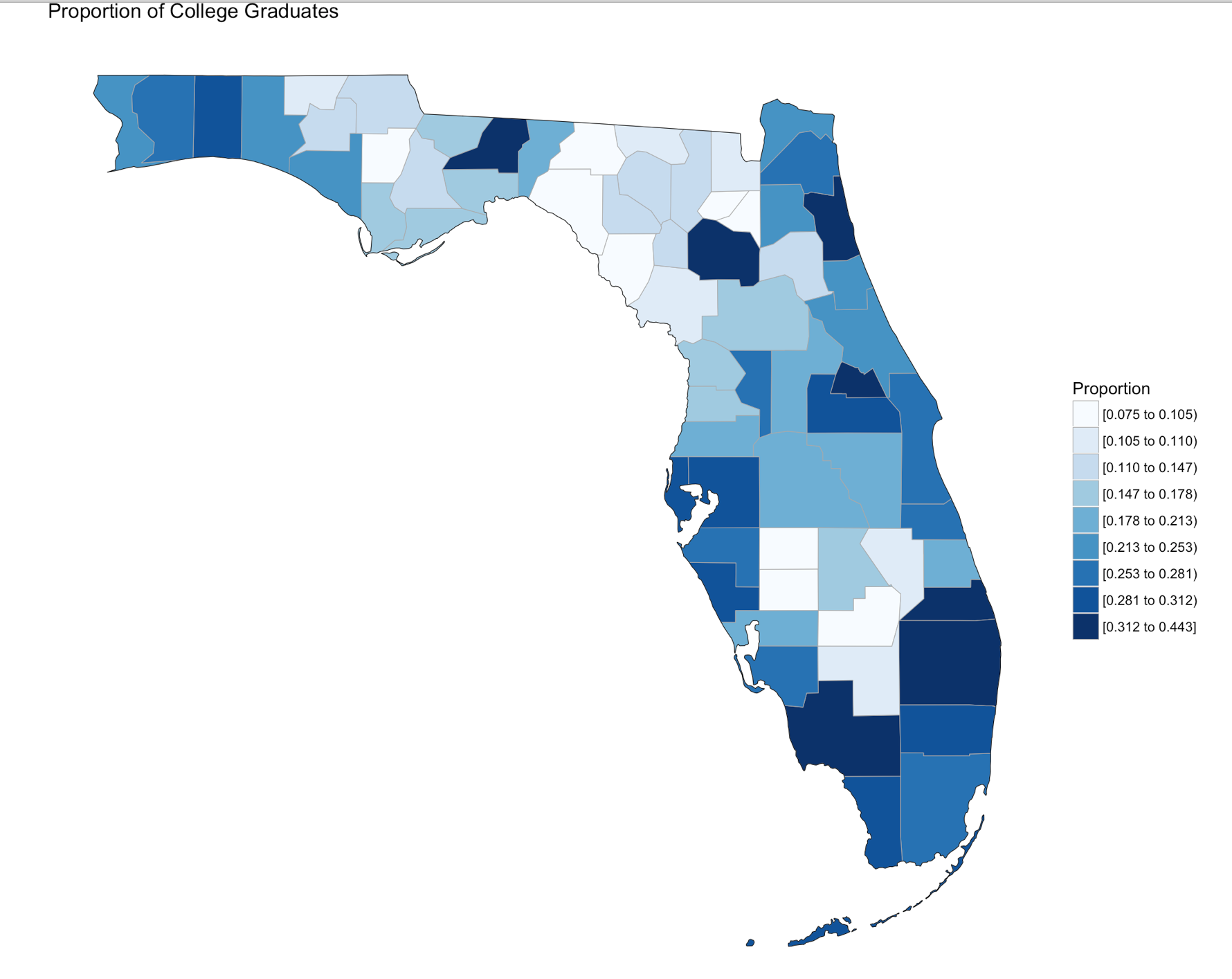
Using summary() we can start reviewing the data from statistical perspective. The CollegeDegree2010.2014 variable, we can see the county with the lowest proportion of college graduates is .075, or 7.5% of the population of that county the max value is 44.3%. The average across all counties is 20.32% that have completed college.
summary(edu.CollegeDegree)
Looking at the data we can see that we have a FIPS code, and the only other column we are interested in for mapping is CollegeDegree2010.2014, so lets create a dataframe with just what we need.
View(edu.CollegeDegree)

# the follwoing will create a datafram with just the FIPS and percentage of college grads
flCollege <- edu.CollegeDegree[c(1,4)]

# Alternatively, you can use the column names vs. the positions. Probably smarter ;-)
flCollege <- edu.CollegeDegree[c("FIPS","CollegeDegree2010.2014")]

# the following will create a dataframe with just the FIPS and percentage of college grads

flCollege
But, from reading the help file on county_choropleth, it requires that only two variables(columns) be passed in, region, and value. Region must be a FIPS code so, we need to rename the columns using colnames().
colnames(flCollege)[which(colnames(flCollege) == 'FIPS')] <- 'region'
colnames(flCollege)[which(colnames(flCollege) == 'CollegeDegree2010.2014')] <- 'value'
So, lets map it!
Since we are only using Florida, set the state_zoom, it will work without the zoom but you will get many warnings. You will also notice a warning that 12000 is not mappable. Looking at the data you will see that 12000 is the entire state of Florida.
county_choropleth(flCollege,
                  title = "Proportion of College Graduates ",
                  legend="Proportion",
                  num_colors=9,
                  state_zoom="florida")
For your next task, go find a different state and a different data set from the USDA or anywhere else for that matter and create your own map. Beware of the "value", that must be an integer, sometimes these get imported as character if there is a comma in the number. This may be a good opportunity for you to learn about gsub and as.numeric, it would look something like the following command. Florida is the dataframe, and MedianIncome is the column.
florida$MedianIncome <- as.numeric(gsub(",", "",florida$MedianIncome))
USDA Economic Research Division Sample Data
FIPS,region,2013RuralUrbanCode,CollegeDegree1970,CollegeDegree1980,CollegeDegree1990,CollegeDegree2000,CollegeDegree2010-2014
12001,"Alachua, FL",2,0.231,0.294,0.346,0.387,0.408
12003,"Baker, FL",1,0.036,0.057,0.057,0.082,0.109
12005,"Bay, FL",3,0.092,0.132,0.157,0.177,0.216
12007,"Bradford, FL",6,0.045,0.076,0.081,0.084,0.104
12009,"Brevard, FL",2,0.151,0.171,0.204,0.236,0.267
12011,"Broward, FL",1,0.097,0.151,0.188,0.245,0.302
12013,"Calhoun, FL",6,0.06,0.069,0.082,0.077,0.092
12015,"Charlotte, FL",3,0.088,0.128,0.134,0.176,0.209
12017,"Citrus, FL",3,0.06,0.071,0.104,0.132,0.168
12019,"Clay, FL",1,0.098,0.168,0.179,0.201,0.236
12021,"Collier, FL",2,0.155,0.185,0.223,0.279,0.323
12023,"Columbia, FL",4,0.083,0.093,0.11,0.109,0.141
12027,"DeSoto, FL",6,0.048,0.082,0.076,0.084,0.099
12029,"Dixie, FL",6,0.056,0.049,0.062,0.068,0.075
12031,"Duval, FL",1,0.089,0.14,0.184,0.219,0.265
12033,"Escambia, FL",2,0.092,0.141,0.182,0.21,0.239
12035,"Flagler, FL",2,0.047,0.137,0.173,0.212,0.234
12000,Florida,0,0.103,0.149,0.183,0.223,0.268
12037,"Franklin, FL",6,0.046,0.09,0.124,0.124,0.16
12039,"Gadsden, FL",2,0.046,0.086,0.112,0.129,0.163
12041,"Gilchrist, FL",2,0.027,0.071,0.074,0.094,0.11
12043,"Glades, FL",6,0.031,0.078,0.071,0.098,0.103
12045,"Gulf, FL",3,0.057,0.068,0.092,0.101,0.147
12047,"Hamilton, FL",6,0.055,0.059,0.07,0.073,0.108
12049,"Hardee, FL",6,0.045,0.074,0.086,0.084,0.1
12051,"Hendry, FL",4,0.076,0.076,0.1,0.082,0.106
12053,"Hernando, FL",1,0.061,0.086,0.097,0.127,0.157
12055,"Highlands, FL",3,0.081,0.097,0.109,0.136,0.159
12057,"Hillsborough, FL",1,0.086,0.145,0.202,0.251,0.298
12059,"Holmes, FL",6,0.034,0.06,0.074,0.088,0.109
12061,"Indian River, FL",3,0.107,0.155,0.191,0.231,0.267
12063,"Jackson, FL",6,0.064,0.081,0.109,0.128,0.142
12065,"Jefferson, FL",2,0.061,0.113,0.147,0.169,0.178
12067,"Lafayette, FL",9,0.048,0.085,0.052,0.072,0.116
12069,"Lake, FL",1,0.091,0.126,0.127,0.166,0.21
12071,"Lee, FL",2,0.099,0.133,0.164,0.211,0.253
12073,"Leon, FL",2,0.241,0.32,0.371,0.417,0.443
12075,"Levy, FL",6,0.051,0.078,0.083,0.106,0.105
12077,"Liberty, FL",8,0.058,0.08,0.073,0.074,0.131
12079,"Madison, FL",6,0.07,0.083,0.097,0.102,0.104
12081,"Manatee, FL",2,0.096,0.124,0.155,0.208,0.275
12083,"Marion, FL",2,0.074,0.096,0.115,0.137,0.172
12085,"Martin, FL",2,0.079,0.16,0.203,0.263,0.312
12086,"Miami-Dade, FL",1,0.108,0.168,0.188,0.217,0.264
12087,"Monroe, FL",4,0.091,0.159,0.203,0.255,0.297
12089,"Nassau, FL",1,0.049,0.091,0.125,0.189,0.23
12091,"Okaloosa, FL",3,0.132,0.166,0.21,0.242,0.281
12093,"Okeechobee, FL",4,0.047,0.057,0.098,0.089,0.107
12095,"Orange, FL",1,0.116,0.157,0.212,0.261,0.306
12097,"Osceola, FL",1,0.067,0.092,0.112,0.157,0.178
12099,"Palm Beach, FL",1,0.119,0.171,0.221,0.277,0.328
12101,"Pasco, FL",1,0.049,0.068,0.091,0.131,0.211
12103,"Pinellas, FL",1,0.1,0.146,0.185,0.229,0.283
12105,"Polk, FL",2,0.088,0.114,0.129,0.149,0.186
12107,"Putnam, FL",4,0.062,0.081,0.083,0.094,0.116
12113,"Santa Rosa, FL",2,0.098,0.144,0.186,0.229,0.265
12115,"Sarasota, FL",2,0.142,0.177,0.219,0.274,0.311
12117,"Seminole, FL",1,0.094,0.195,0.263,0.31,0.35
12109,"St. Johns, FL",1,0.085,0.144,0.236,0.331,0.414
12111,"St. Lucie, FL",2,0.081,0.109,0.131,0.151,0.19
12119,"Sumter, FL",3,0.047,0.07,0.078,0.122,0.264
12121,"Suwannee, FL",6,0.056,0.065,0.082,0.105,0.119
12123,"Taylor, FL",6,0.064,0.086,0.098,0.089,0.1
12125,"Union, FL",6,0.033,0.059,0.079,0.075,0.086
12127,"Volusia, FL",2,0.107,0.13,0.148,0.176,0.213
12129,"Wakulla, FL",2,0.018,0.084,0.101,0.157,0.172
12131,"Walton, FL",3,0.067,0.096,0.119,0.162,0.251
12133,"Washington, FL",6,0.04,0.063,0.074,0.092,0.114
Visualization, The Gateway Drug
Published December 29, 2016 / by shep2010Visualization is said to be the gateway drug to statistics. In an effort to get you all hooked, I am going to spend some time on visualization. Its fun (I promise), i expect that after you see how easy some visuals are in R you will be off and running with your own data explorations. Data visualization is one of the Data Science pillars, so it is critical that you have a working knowledge of as many visualizations as you can, and be able to produce as many as you can. Even more important is the ability to identify a bad visualization, if for no other reason to make certain you do not create one and release it into the wild, there is a site for those people, don’t be those people!
We are going to start easy, you have installed R Studio, if you have not back up one blog and do it. Your first visualization is what is typically considered advanced, but I will let you be the judge of that after we are done.
Some lingo to learn:
Packages – Packages are the fundamental units of reproducible R code. They include reusable R functions, the documentation that describes how to use them, and sample data.
Choropleth – is a thematic map in which areas are shaded or patterned in proportion to the measurement of the statistical variable being displayed on the map, such as population density or per-capita income.
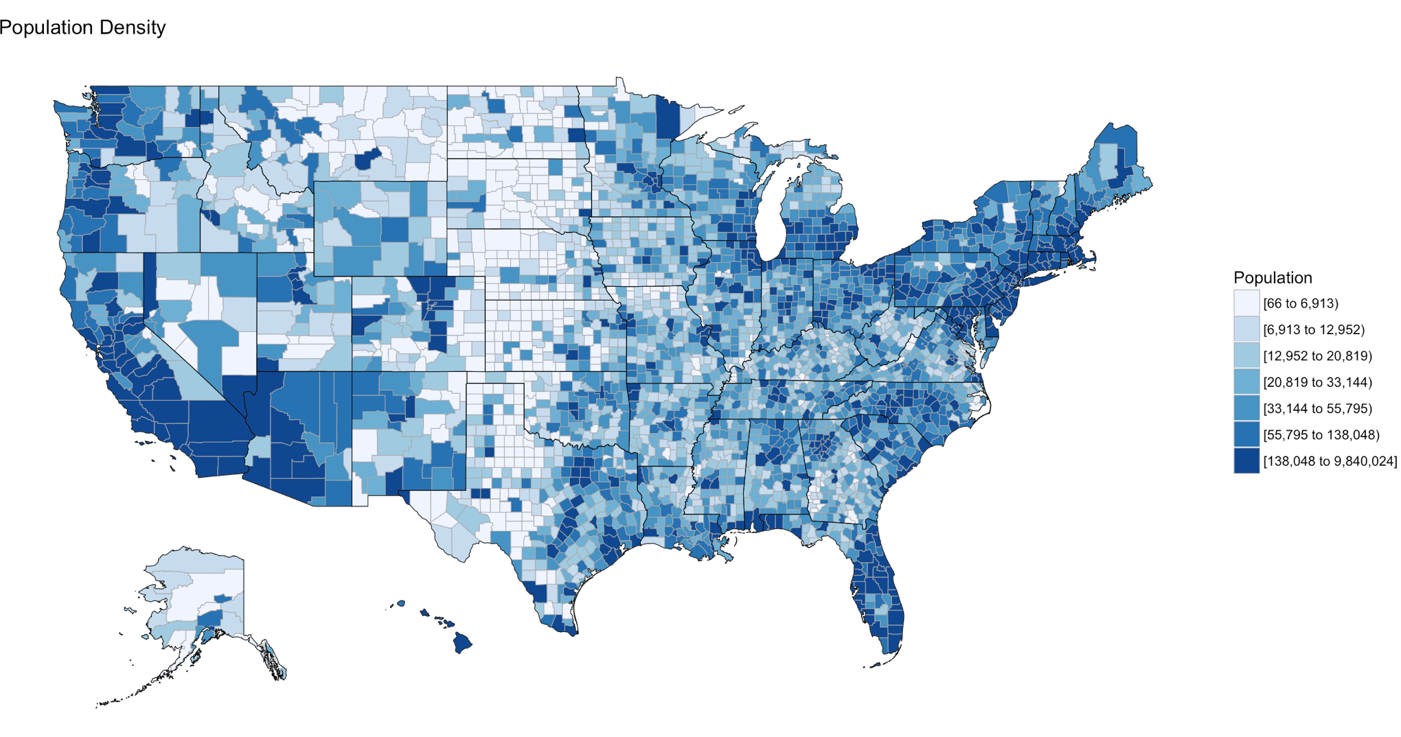
Below is the code for a choropleth, using the package choroplethr and the data set df_pop_county, which is the population of every county in the US.
This is what todays primary objective is;
To learn more about any R command “?”, “??”, or “help(“object”)” Keep in mind, R is case sensitive. If you can only remember part of a command name use apropos().
?str

?df_pop_county

??summary

help(county_choropleth)

apropos("county_")
#Install package called choroplethr,
#quotes are required,
#you will get a meaningless error without them
#Only needs to be installed once per machine
install.packages("choroplethr")
The library function will load the installed package to make any functions available for use.
library("choroplethr")To find out what functions are in a package use help(package=””).
help(package="choroplethr")
Many packages come with test or playground datasets, you will use many in classes and many for practice, data(package=””) will list the datasets that ship with a package.
data(package="choroplethr")
For this example we will be using the df_pop_county dataset, this command will load it from the package and you will be able to verify it is available by checking out the Environment Pane in R Studio.
data("df_pop_county")
View(“”) will open a view pane so you can explore the dataset. Similar to clicking on the dataset name in the Environment Pane.
View(df_pop_county)
Part of learning R is learning the features and commands for data exploration, str will provide you with details on the structure of the object it is passed.
str(df_pop_county)
Summary will provide basic statistics about each column/variable in the object that it is passed.
summary(df_pop_county)
If your heart is true, you should get something very similar to the image above after running the following code. county_choropleth is a function that resides in the choroplethr package, it is used to generate a county level US map. The data passed in must be in the format of county number and value, the value will populate the map. WHen the map renders it will be in the plot pane of the RStudio IDE, be sure to select zoom and check out your work.
#?county_choropleth
county_choropleth(df_pop_county)
There are som additioanl parameters we can pass to the function, use help to find more.
county_choropleth(df_pop_county,
                  title = "Population Density",
                  legend="Population")
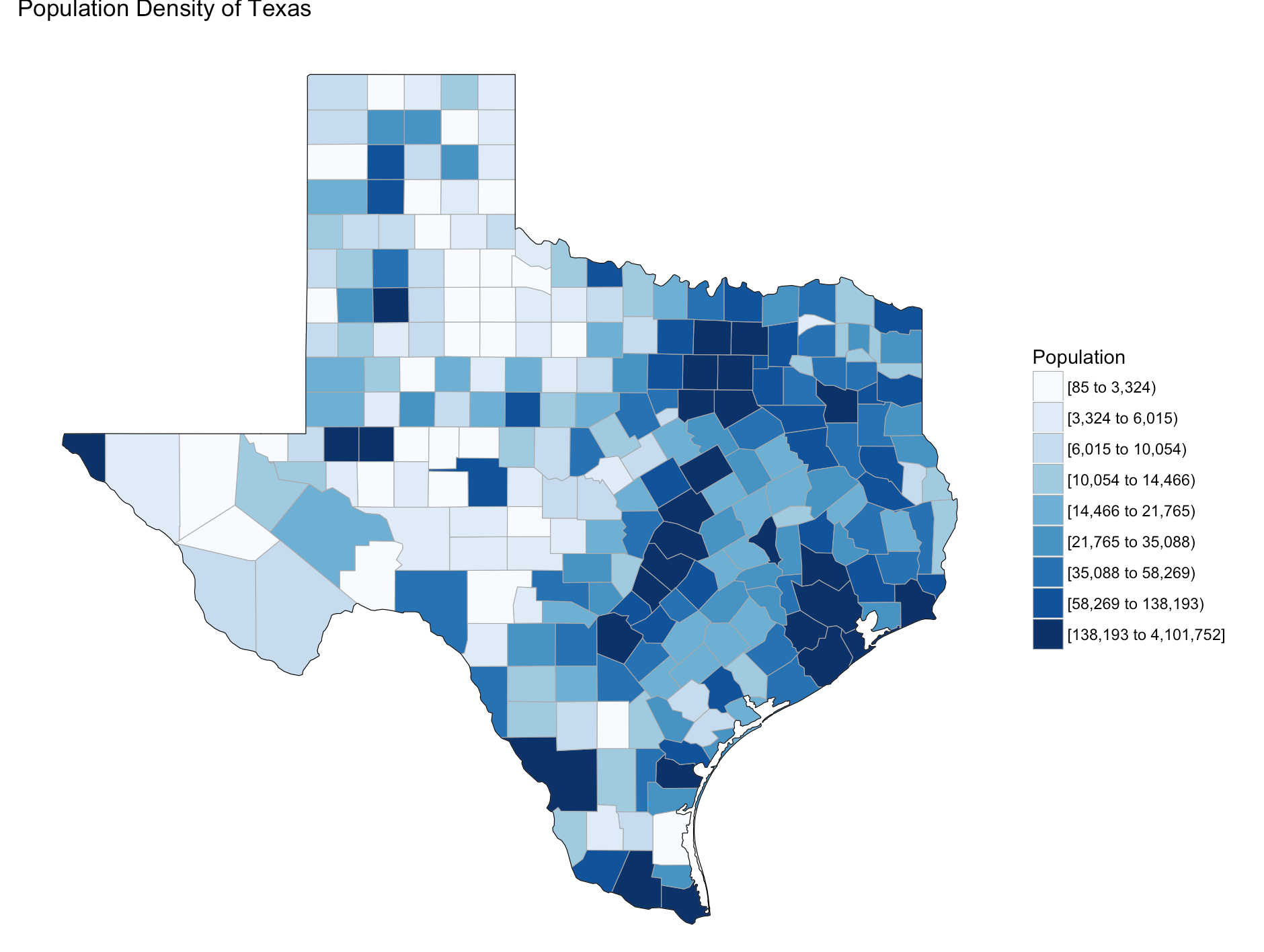
Try changing the number of colors and change the state zoom. If your state is not working read the help to see if you can find out why.
county_choropleth(df_pop_county,
                  title = "Population Density of Texas",
                  legend="Population",
                  num_colors=9,
                  state_zoom="texas")
There is an additional option for county_choropleth, reference_map. If it does not work for you do not fret, as of this blog post it is not working for me either, the last R upgrade whacked it, be ready for this to happen and make sure you have backs and versions, especially before you get up on stage in front 200 people to present.
There you have it! Explore the commands used, look at the other datasets that ship with choroplethr and look at the other functions that ship with choroplethr, it can be tricky to figure out which ones work, be sure to check the help for each function you want to run, no help may mean no longer supported. Remember that these packages are community driven and written, which is good, but sometimes they can be a slightly imperfect.
In the next post i will cover how to upload and create your own dataset and use the choroplethr function with your own data. On a side note, the choropleth falls under a branch of statistics called descriptive statistics which covers visuals used to describe data.