I should probably continue the blog where I mentioned i would write about Logistic Regression. I have been putting this off for a while as i needed some time to pass between a paper my college stats team and I submitted and this blog post. Well, here we are. This is meant to demonstrate Logistic Regression, nothing more, i am going to use election data because it is interesting, not because i care about proving anything. Census data, demographics, maps, election data are all interesting to me, so that makes it fun to play with.
I am going to be using a file that is on my github site that actually came form about a dozen different sources, it has been whittled down to 54 variables and you will see the the data science process that it will become even smaller. As this is a toy dataset for demonstration purposes only, i am not going to reference too many of the sources as they are across many years so making a decision based on this data would be a very bad idea. So, demo, toy data only!
First things first, lets load the data and then we will jump ahead and look at some pictures.
setwd("/Users/Data")
getwd()

data.Main <- read.csv("USA.dataAll.csv",stringsAsFactors=FALSE,header=TRUE)

#install.packages("car")
library(car)

#install.packages("ggplot2")
library(ggplot2)
Data Cleanup, get rid of the NA's. Missing data is a complicated thing, i am choosing zeros over imputation, mean, median or mode, or you deleting the row. WHen you do this, choose wisely.
#remove all NAs and infinites
is.na(data.Main) <- sapply(data.Main, is.infinite)
data.Main[is.na(data.Main)] <-0

#New York County has two entries, only need one.
data.Main <- data.Main[!(data.Main$X == "1864"),]
Check out your variable names, go play around, i have covered data discovery and investigation in prior blog posts, so i will not do it here.
names(data.Main[6:26])
options(scipen=999)
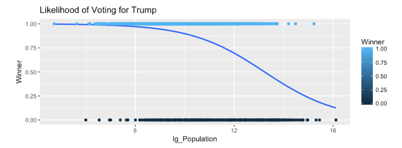
I am going to jump way ahead to demonstrate what logistic regression is and how it is visualized. The following is a binomial distribution cumulative distribution function generated by the glm or general linear model with binomial being passed as the family of algorithm to use. Notice that we are passing Winner a 0 or 1 value, and lg_population which is a log of population just so the data is a little more friendly in the graph or in fancy math terms, allow the distribution to resemble something more normal, also know as Normal Distribution.
What we are inevidibly looking for here is the nice curve seen below and not a straight line. When we start looking at P-Values you will notice that the lack of a curve and high p-values tend to correlate, thus the variable would add no value to the model.
ggplot(data.Main, aes(lg_Population, Winner,colour=Winner)) +
  stat_smooth(method="glm", method.args=list(family="binomial"), se=FALSE)+
  geom_point() +
  ggtitle("Likelihood of Voting for Trump")


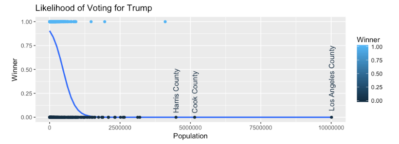
#if you want to see the difference , No log and add text for outliers,
ggplot(data.Main, aes(Population, Winner,colour=Winner)) +
  stat_smooth(method="glm", method.args=list(family="binomial"), se=FALSE)+
  geom_point() +
  geom_text(data=subset(data.Main, Population > 3500000),aes(Population,Winner,label=county_name), angle=90,hjust=-.1,) +
  ggtitle("Likelihood of Voting for Trump")
In short, the binomial glm shows the proportion of a county that voted for Trump crossed with population. So we can see that anything on the far left of the graph had a proportion (y axis) of nearly 1, (nearly 100%) of the county voted for Trump, this far left also means that these counties had a very small population based on the X axis. This indicates that the lower the population of a county, the more likely they are to vote for Trump, as we move to the write you will see the line dropping and moving right which indicates that as population of a county increases a smaller proportion is likely to vote for Trump.
Log Populaiton

If the log is not used you can see the data appears to skew, but that is because we have a population outlier, Los Angeles County. But the curve is evident. This would indicate that for Logistic Regression we may have something here we can use for a prediction.
Population

The ggplot R code for all of the interesting columns is located on my github site in a Jupyter notebook for R. Please download and play with it. And if you do not have R setup for Jupyter notebooks, great instructions here.
Next post we will build a model.
