Picking up from the last post we will now look at Chebyshevs rule. For this one we will be using ggplot2 histogram with annotations just to shake things up a bit.
Chebyshevs rule, theorem, inequality, whatever you want to call it states that all possible datasets regardless of shape will have 75% of the data within 2 standard deviations, and 88.89% within 3 standard deviations. This should apply to mound shaped datasets as well as bimodal (two mounds) and multimodal.
First, below is the empirical R code from the last blog post using ggplot2 if you are interested, otherwise skip this and move down. This is the script for the empirical rule calculations. Still using the US-Education.csv data.
require(ggplot2)
usa <- read.csv("/data/US-Education.csv",stringsAsFactors=FALSE)
str(usa)
highSchool <- subset(usa[c("FIPS.Code","Percent.of.adults.with.a.high.school.diploma.only..2010.2014")],FIPS.Code >0)
#reanme the second column to something less annoying
colnames(highSchool)[which(colnames(highSchool) == 'Percent.of.adults.with.a.high.school.diploma.only..2010.2014')] <- 'percent'
#create a variable with the mean and the standard devaiation
hsMean <- mean(highSchool$percent,na.rm=TRUE)
hsSD <- sd(highSchool$percent,na.rm=TRUE)
#one standard deviation from the mean will "mean" one SD
#to the left (-) of the mean and one SD to the right(+) of hte mean.
oneSDleftRange <- (hsMean - hsSD)
oneSDrightRange <- (hsMean + hsSD)
oneSDleftRange;oneSDrightRange
oneSDrows <- nrow(subset(highSchool,percent > oneSDleftRange & percent < oneSDrightRange))
oneSDrows / nrow(highSchool)
#two standard deviations from the mean will "mean" two SDs
#to the left (-) of the mean and two SDs to the right(+) of the mean.
twoSDleftRange <- (hsMean - hsSD*2)
twoSDrightRange <- (hsMean + hsSD*2)
twoSDleftRange;twoSDrightRange
twoSDrows <- nrow(subset(highSchool,percent > twoSDleftRange & percent < twoSDrightRange))
twoSDrows / nrow(highSchool)
#two standard deviations from the mean will "mean" two SDs
#to the left (-) of the mean and two SDs to the right(+) of the mean.
threeSDleftRange <- (hsMean - hsSD*3)
threeSDrightRange <- (hsMean + hsSD*3)
threeSDleftRange;threeSDrightRange
threeSDrows <- nrow(subset(highSchool,percent > threeSDleftRange & percent < threeSDrightRange))
threeSDrows / nrow(highSchool)
ggplot(data=highSchool, aes(highSchool$percent)) +
geom_histogram(breaks=seq(10, 60, by =2),
col="blue",
aes(fill=..count..))+
labs(title="Completed High School") +
labs(x="Percentage", y="Number of Counties")
ggplot(data=highSchool, aes(highSchool$percent)) +
geom_histogram(breaks=seq(10, 60, by =2),
col="blue",
aes(fill=..count..))+
labs(title="Completed High School") +
labs(x="Percentage", y="Number of Counties") +
geom_vline(xintercept=hsMean,colour="green",size=2)+
geom_vline(xintercept=oneSDleftRange,colour="red",size=1)+
geom_vline(xintercept=oneSDrightRange,colour="red",size=1)+
geom_vline(xintercept=twoSDleftRange,colour="blue",size=1)+
geom_vline(xintercept=twoSDrightRange,colour="blue",size=1)+
geom_vline(xintercept=threeSDleftRange,colour="black",size=1)+
geom_vline(xintercept=threeSDrightRange,colour="black",size=1)+
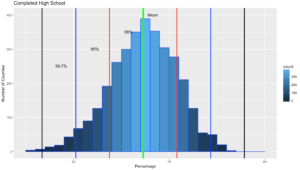
annotate("text", x = hsMean+2, y = 401, label = "Mean")+
annotate("text", x = oneSDleftRange+4, y = 351, label = "68%")+
annotate("text", x = twoSDleftRange+4, y = 301, label = "95%")+
annotate("text", x = threeSDleftRange+4, y = 251, label = "99.7%")
It would do no good to use the last dataset for to try out Chebyshevs rule as we know it is mond shaped, and fit oddly well to the empirical rule. Now lets try a different column in the US-Education dataset.
usa <- read.csv("/data/US-Education.csv",stringsAsFactors=FALSE)
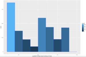
ggplot(data=usa, aes(usa$X2013.Rural.urban.Continuum.Code)) +
geom_histogram(breaks=seq(1, 10, by =1),
col="blue",
aes(fill=..count..))
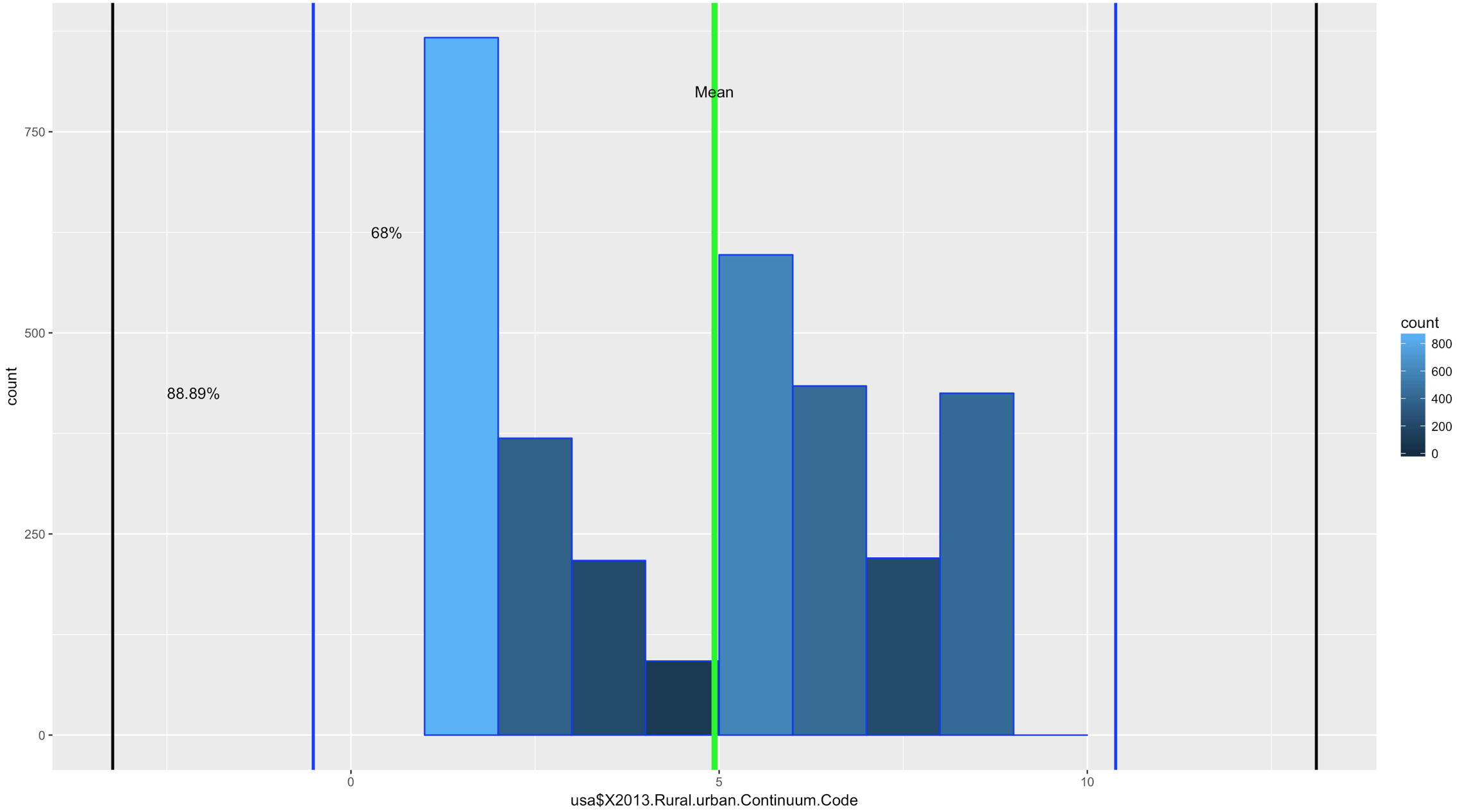
Comparatively speaking, this one looks a little funky, this is certainly bimodal, if not nearly trimodal. This should be a good test for Chebyshev.
So, lets reuse some of the code above, drop the first standard dviation since Chebyshev does not need it and see if we can get this to work with "X2013.Rural.urban.Continuum.Code"
usa <- read.csv("/data/US-Education.csv",stringsAsFactors=FALSE)
str(usa)
urbanMean <- mean(usa$X2013.Rural.urban.Continuum.Code,na.rm=TRUE)
urbanSD <- sd(usa$X2013.Rural.urban.Continuum.Code,na.rm=TRUE)
#two standard deviations from the mean will "mean" two SDs
#to the left (-) of the mean and two SDs to the right(+) of the mean.
twoSDleftRange <- (urbanMean - urbanSD*2)
twoSDrightRange <- (urbanMean + urbanSD*2)
twoSDleftRange;twoSDrightRange
twoSDrows <- nrow(subset(usa,X2013.Rural.urban.Continuum.Code > twoSDleftRange & usa$X2013.Rural.urban.Continuum.Code < twoSDrightRange))
twoSDrows / nrow(usa)
#two standard deviations from the mean will "mean" two SDs
#to the left (-) of the mean and two SDs to the right(+) of the mean.
threeSDleftRange <- (urbanMean - urbanSD*3)
threeSDrightRange <- (urbanMean + urbanSD*3)
threeSDleftRange;threeSDrightRange
threeSDrows <- nrow(subset(usa,X2013.Rural.urban.Continuum.Code > threeSDleftRange & X2013.Rural.urban.Continuum.Code < threeSDrightRange))
threeSDrows / nrow(usa)
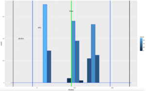
ggplot(data=usa, aes(usa$X2013.Rural.urban.Continuum.Code)) +
geom_histogram(breaks=seq(1, 10, by =1),
col="blue",
aes(fill=..count..))+
geom_vline(xintercept=urbanMean,colour="green",size=2)+
geom_vline(xintercept=twoSDleftRange,colour="blue",size=1)+
geom_vline(xintercept=twoSDrightRange,colour="blue",size=1)+
geom_vline(xintercept=threeSDleftRange,colour="black",size=1)+
geom_vline(xintercept=threeSDrightRange,colour="black",size=1)+
annotate("text", x = urbanMean, y = 800, label = "Mean")+
annotate("text", x = twoSDleftRange+1, y = 625, label = "68%")+
annotate("text", x = threeSDleftRange+1.1, y = 425, label = "88.89%")
If you looked at the data and you looked at the range of two standard deviations above, you should know we have a problem; 98% of the data fell within 2 standard deviations. While yes, 68% of the data is also in the range it turns out this is a terrible example. The reason i include it is because it is just as important to see a test result that fails your expectation as it is for you to see on ethat is perfect! You will notice that the 3rd standard deviations is far outside the data range.
SO, what do we do? fake data to the rescue!

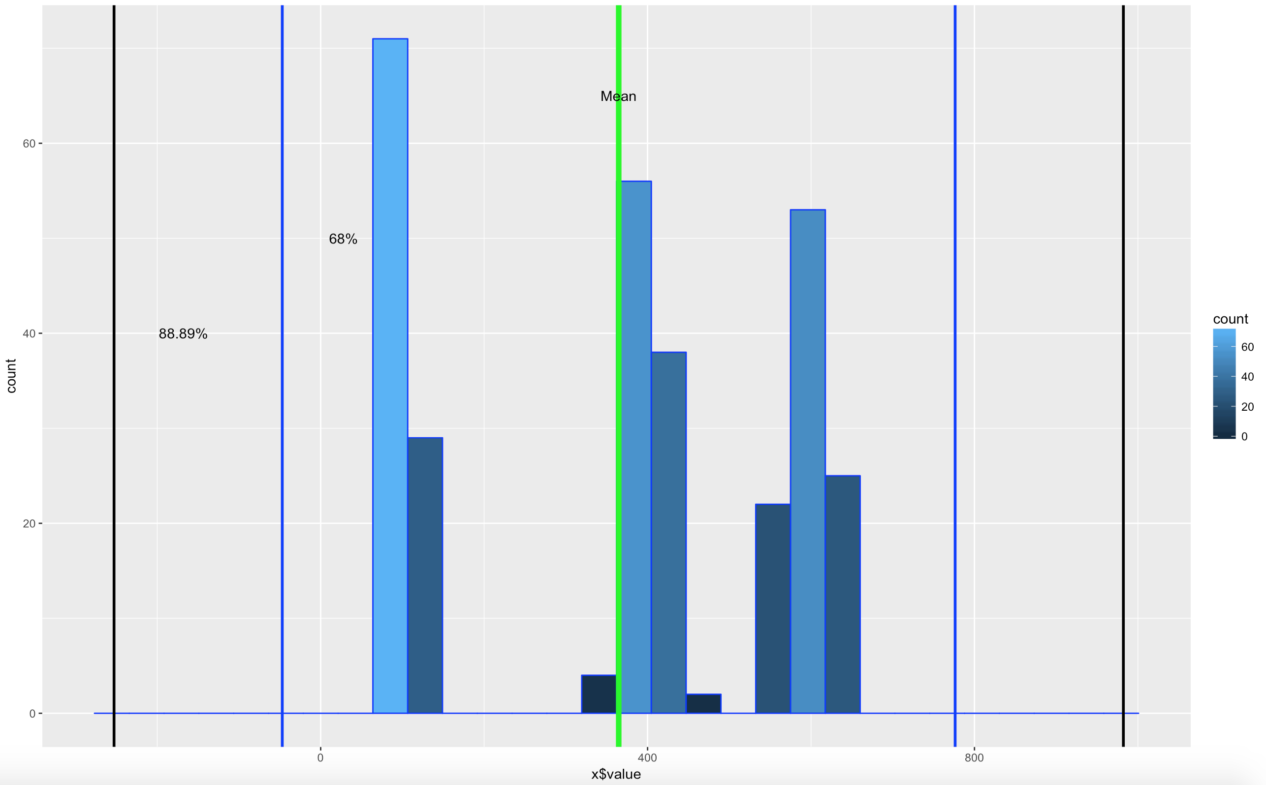
I try really hard to avoid using made up data because to me it makes no sense, where as car data, education data, population data, that all makes sense. But, there is no getting around it! Here is what you need to know, rnorm() generates random data based on a normal distribution using the variables standard deviation and a mean! But wait, we are trying to get multi-modal distribution. Then concatenate more than one normal distribution, eh? Lets try three.
We are going to test for one standard deviation just to see what it is, even though Chebyshevs rule has no interest in it, remember the rule states that 75% the data will fall within 2 standard deviations.
#set.seed() will make sure the random number generation is not random everytime
set.seed(500)
x <- as.data.frame(c(rnorm(100,100,10)
,(rnorm(100,400,20))
,(rnorm(100,600,30))))
colnames(x) <- c("value")
#hist(x$value,nclass=100)
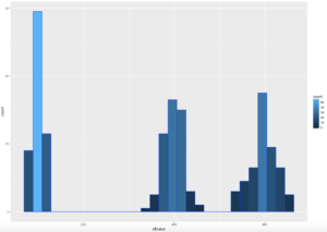
ggplot(data=x, aes(x$value)) +
geom_histogram( col="blue",
aes(fill=..count..))
sd(x$value)
mean(x$value)
#if you are interested in looking at just the first few values
head(x)
xMean <- mean(x$value)
xSD <- sd(x$value)
#one standard deviation from the mean will "mean" 1 * SD
#to the left (-) of the mean and one SD to the right(+) of the mean.
oneSDleftRange <- (xMean - xSD)
oneSDrightRange <- (xMean + xSD)
oneSDleftRange;oneSDrightRange
oneSDrows <- nrow(subset(x,value > oneSDleftRange & x < oneSDrightRange))
print("Data within One standard deviations");oneSDrows / nrow(x)
#two standard deviations from the mean will "mean" 2 * SD
#to the left (-) of the mean and two SDs to the right(+) of the mean.
twoSDleftRange <- (xMean - xSD*2)
twoSDrightRange <- (xMean + xSD*2)
twoSDleftRange;twoSDrightRange
twoSDrows <- nrow(subset(x,value > twoSDleftRange & x$value < twoSDrightRange))
print("Data within Two standard deviations");twoSDrows / nrow(x)
#three standard deviations from the mean will "mean" 3 * SD
#to the left (-) of the mean and two SDs to the right(+) of the mean.
threeSDleftRange <- (xMean - xSD*3)
threeSDrightRange <- (xMean + xSD*3)
threeSDleftRange;threeSDrightRange
threeSDrows <- nrow(subset(x,value > threeSDleftRange & x$value < threeSDrightRange))
print("Data within Three standard deviations");threeSDrows / nrow(x)
WOOHOO, Multimodal! Chebyshev said it works on anything, lets find out. The histogram below is a hot mess based on how the data was created, but it is clear that the empirical rule will not apply here, as the data is not mound shaped and is multimodal or trimodal.
Though Chebyshevs rule has no interest in 1 standard deviation i wanted to show it just so you could see what the 1 SD looks like. I challenge you to take the rnorm and see if you can modify the mean and SD parameters passed in to make it fall outside o the 75% of two standard deviations.
[1] "Data within One standard deviations" = 0.3966667 # or 39.66667%
[1] "Data within Two standard deviations" = 1 # or 100%
[1] "Data within Three standard deviations" = 1 or 100%
Lets add some lines;
ggplot(data=x, aes(x$value)) +
  geom_histogram( col="blue",
                    aes(fill=..count..))+
                    geom_vline(xintercept=xMean,colour="green",size=2)+
                    geom_vline(xintercept=twoSDleftRange,colour="blue",size=1)+
                    geom_vline(xintercept=twoSDrightRange,colour="blue",size=1)+
                    geom_vline(xintercept=threeSDleftRange,colour="black",size=1)+
                    geom_vline(xintercept=threeSDrightRange,colour="black",size=1)+
                    annotate("text", x = xMean, y = 65, label = "Mean")+
                    annotate("text", x = twoSDleftRange+75, y = 50, label = "68%")+
                    annotate("text", x = threeSDleftRange+85, y = 40, label = "88.89%")
There you have it! It is becoming somewhat clear that based on the shape of the data and if you are using empirical or Chebyshevs rule, data falls into some very predictable patters, maybe from that we can make some predictions about new data coming in...?
Shep