So, last blog we covered a tiny bit of vocabulary, hopefully it was not too painful, today we will cover a little bit more about visualizations. You have noticed by now that R behaves very much like a scripting language which having been a T-SQL guy seemed familiar to me. And you have noticed that it behaves like a programing language in that I can install a package, and invoke function or data set stored in that package, very much like a dll, though no compiling is required. It’s clear that it is very flexible as a language, which you will learn is its strength and its downfall. If you decide to start designing your own R packages, you can write them as terribly as you want, though i would rather you didn’t.
If you want to find out what datasets are available run “data()”, and as we covered in a prior blog, data(package=) will give you the datasets for a specific package. This will provide you nice list of datasets to doodle with, as you learn something new explore the datasets to see what you can apply your new-found knowledge to.
First lets check out the histogram. If you have worked with SQL you know what a histogram is, and it is marginally similar to a statistics visual histogram. We are going to look at a real one. The basic definition is that it is a graphical representation of the distribution of numerical data.
When to use it? When you want to know the distribution of a single column or variable.
“Hist” ships with base R, which means no package required. We will go through a few Histograms from different packages.
You have become familiar with this by now, “data()” will load the mtcars dataset for use, “View” will open a new pane so you can review it, and help() will provide some information on the columns/variables in the dataset. Fun fact, if you run “view” (lowercase v) it will display the contents to the console, not a new pane. “?hist” will open the help for the hist command.
data(mtcars)
View(mtcars)
help(mtcars)

?hist
Did you notice we did not load a package? mtcars ships with base R, run “data()” to see all the base datasets.
Hist takes at a single quantitative variable, this can be passed by creating a vector or referencing just the dataframe variable you are interested in.
Try each of these out one at a time.
#When you see the following code, this is copying the contents
#of one variable into a vector, it is not necessary for what
#we are doing but it is an option. Once copied just pass it in to the function.

cylinders <- mtcars$cyl
hist(cylinders)

#Otherwise, invoke the function and pass just the variable you are interested in.

hist(mtcars$cyl)
hist(mtcars$cyl, breaks=3)
hist(mtcars$disp)
hist(mtcars$wt)
hist(mtcars$carb)
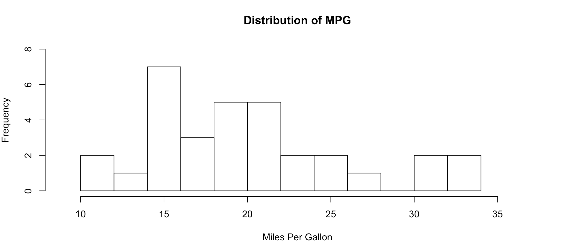
As you get wiser you can start adding more options to clean up the histogram so its starts to look a little more appealing, inherently histograms are not visually appealing but they are a good for data discovery and exploration. Without much thought you can see that more vehicles get 15mpg.
hist(mtcars$mpg, breaks = 15)

hist(mtcars$mpg, breaks = 15,
    xlim = c(9,37),
    ylim = c(0,8),
    main = "Distribution of MPG",
    xlab = "Miles Per Gallon")
Lets kick it up a notch, now we are going to use the histogram function from the Mosaic package. The commands below should be looking familiar by now.
install.packages("mosaic")
library(mosaic)

help(mosaic)
Notice there is more than one way to pass in our dataset. Since histogram needs a vector, a dataset with one column, any method you want to use to create that on the fly will probably work.
#try out a set of numbers
histogram(c(1,2,2,3,3,3,4,4,4,4))

#from the mtcars dataset let look at mpg and a few others and try out some options
histogram(mtcars$mpg)

#Can you see the difference in these?  which is the default?
histogram(~mpg, data=mtcars)
histogram(~mpg, data=mtcars, type="percent")
histogram(~mpg, data=mtcars, type="count")
histogram(~mpg, data=mtcars, type="density")
Not very dazzling, but it is the density of the data. This is from "histogram(mtcars$mpg)"
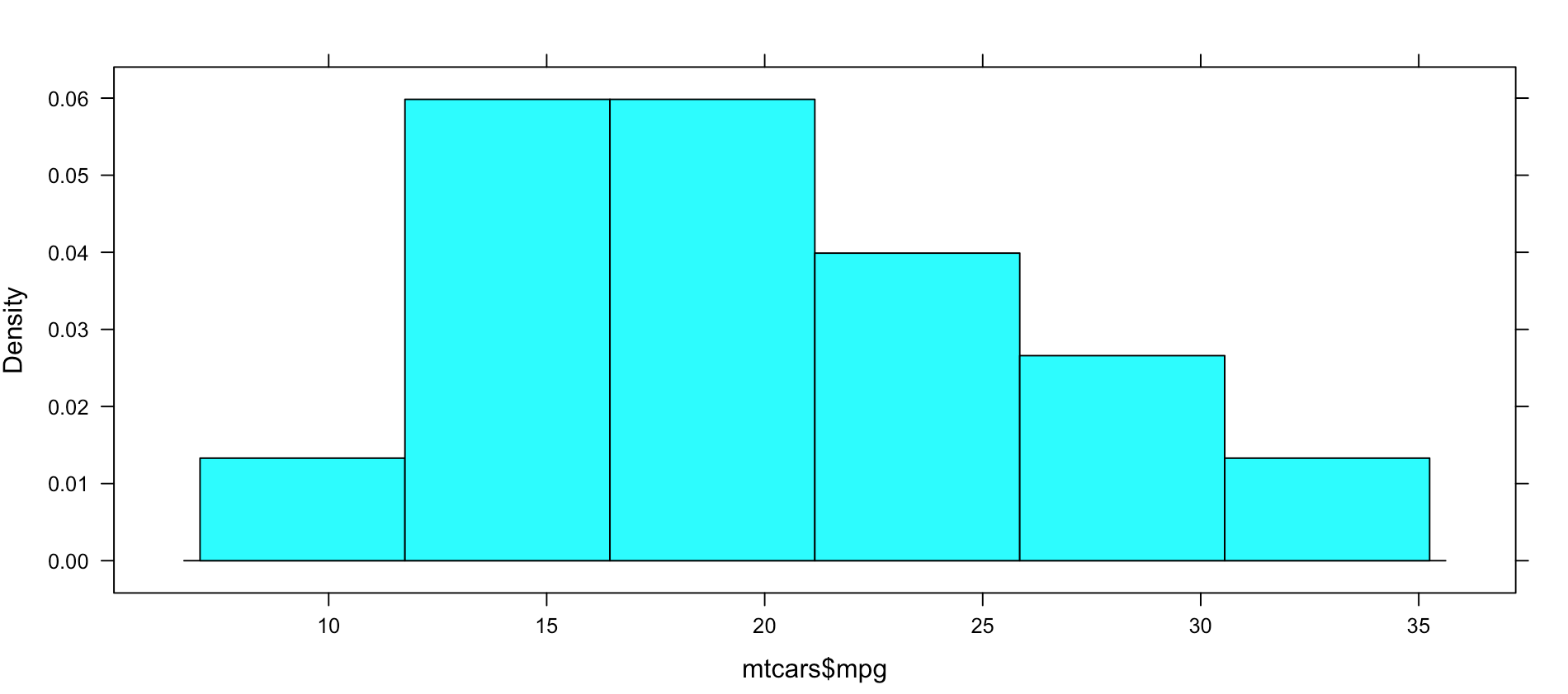
Well, this is all sort of interesting, but quite frankly it is still just showing a data density distribution. Is there away to add a second dimension to the visual without creating three histograms manually? Well, sort of, divide the data up by a category.
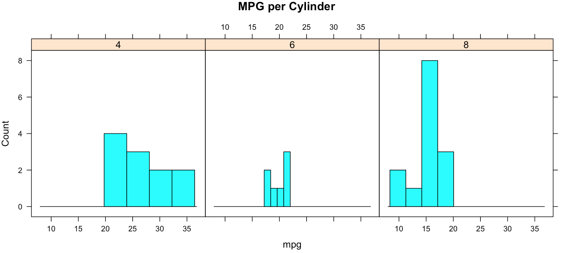
While less pretty with this particular dataset, you can see that it divided the histograms up by cylinders using the "|". You will also notice that i passed in "cyl" as a factor, this means treat it as a qualitative value, without the "as.factor" the number of cylinders in the label will not display, and that does not help with readability. Remove the as.factor to see what happens. Create your own using mtcars.wt and hp, do any patterns emerge?
histogram(~mpg | as.factor(cyl),
          main = "MPG per Cylinder",
          data=mtcars,
          center=TRUE,
          type="count",
          n=4,
          layout = c(3,1))
Well that was fun, remember when i said lets kick it up a notch? Here we go again. My favorite, and probably the most popular R visualization packages is ggplot or more recently, GGPLOT2
install.packages("ggplot2")
library(ggplot2)
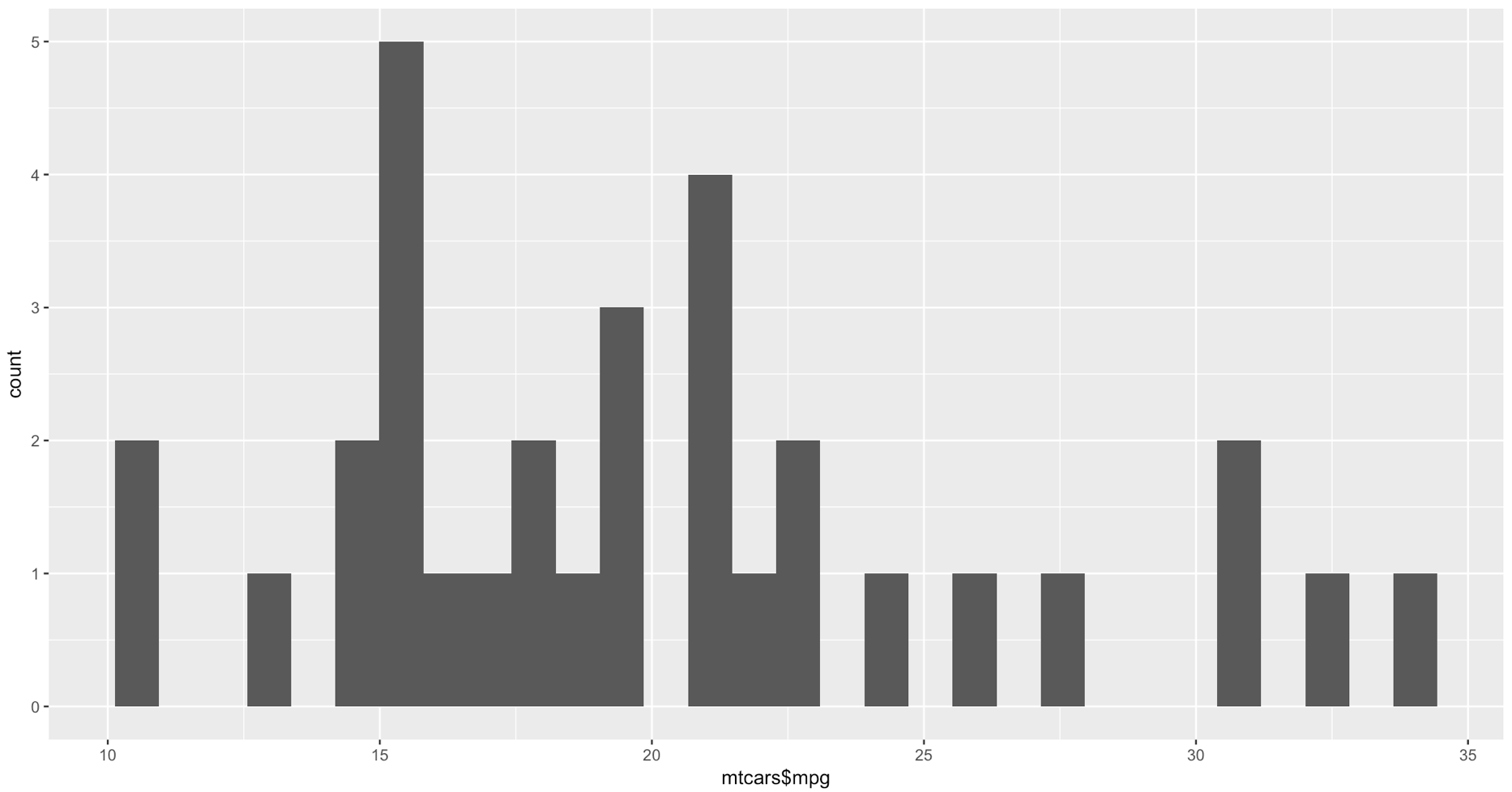
qplot(mtcars$mpg, geom="histogram")
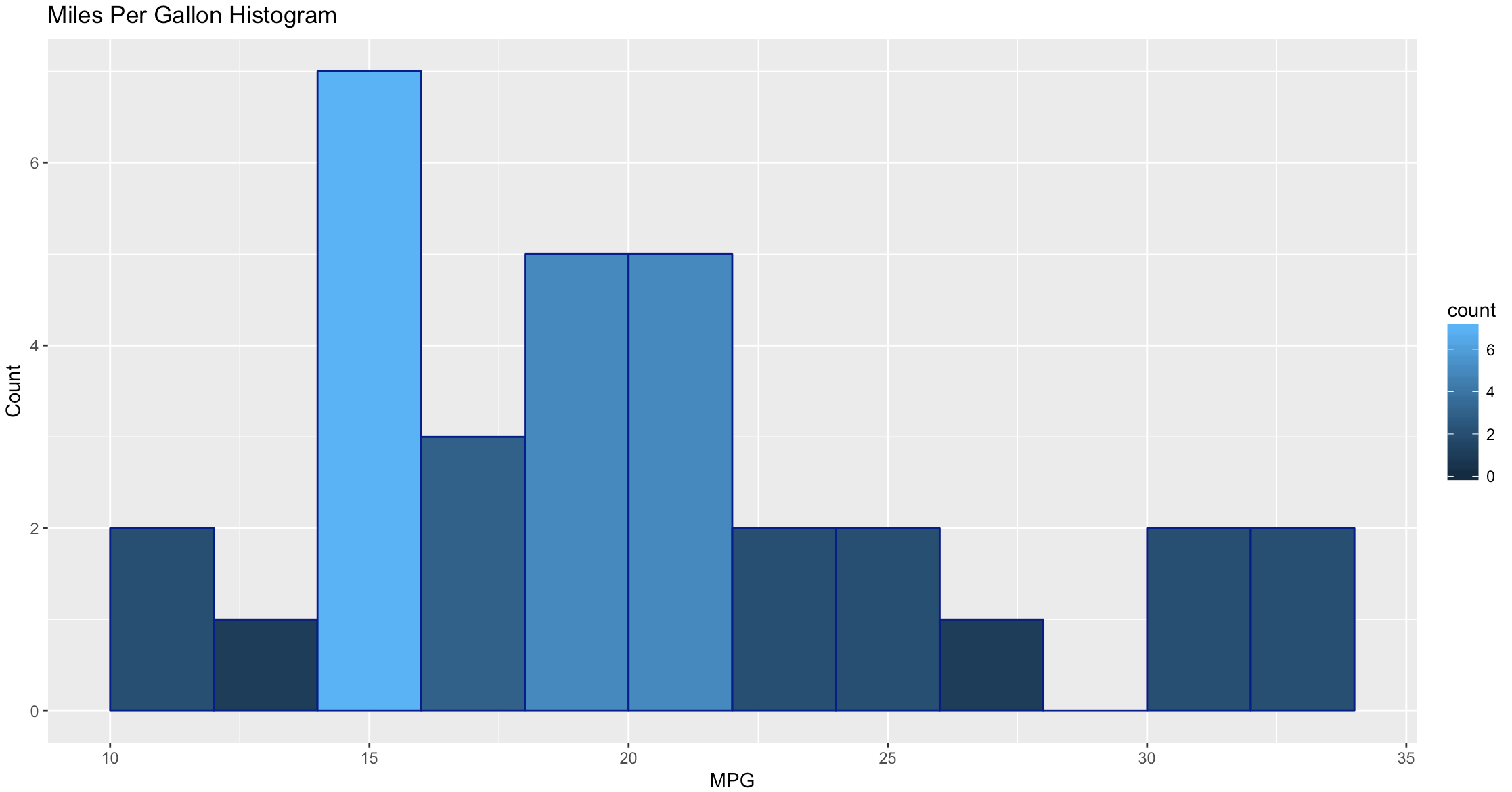
WOW, the world suddenly looks very different, just the default histogram look as if we have entered the world of grown up visualizations.
Ggplot has great flexibility. Check out help and search the web to see what you can come up with on your own. The package worth of an academic paper, or if you want to dazzle your boss.
ggplot(data=mtcars, aes(mtcars$mpg),) +
  geom_histogram(breaks=seq(10, 35, by =2),
    col="darkblue",
    aes(fill=..count..))+
    labs(title="Miles Per Gallon Histogram") +
    labs(x="MPG", y="Count")
Todays Commands
Base R
data()
View()
help()
hist()
install.packages()
library()
Mosaic Package
histogram
Ggplot2 Package
qplot()
ggplot()
geom_histogram()
Shep