The next few posts is just adding some more explanatory variables to see if we can get a better model from predicting mpg. We are going to keep it simple today and focus on just quantitative variables not categorical(qualitative), if that does not make any sense to you it will soon.
In the REAL world you would never predict a vehicle mpg by weight alone, there are dozens if not hundred of other variables to consider. Lucky for us the mtcars dataset only has 11 variables to consider. The grand finale of this linear regression will be a real dataset we can play with from the EPA with thousands of rows and dozens of columns. 😀
Lets get to it!
First things first, data exploration! For this series i want to make the names slightly more meaningful, move the row name to an actual row and create the liters per 100 kilometers. None of this is absolutely required but they are all good data engineering tasks to learn.
data(mtcars)

#rename the columns to something slightly more meaningful
names(mtcars)[2]<-paste("Cylinders")
names(mtcars)[3]<-paste("Displacement")
names(mtcars)[4]<-paste("Horsepower")
names(mtcars)[5]<-paste("RearAxleRatio")
names(mtcars)[6]<-paste("Weight")
names(mtcars)[7]<-paste("QuarterMile")
names(mtcars)[8]<-paste("VSengine")
names(mtcars)[9]<-paste("TransmissionAM")
names(mtcars)[10]<-paste("Gears")
names(mtcars)[11]<-paste("Carburetors")

# Create liters per 100 kilometers column
mtcars$lp100k <- (100 * 3.785) / (1.609 * mtcars$mpg)


#fix the row names, i want them to be a column
mtcars$Model <- row.names(mtcars)
row.names(mtcars) <- NULL
names(mtcars)
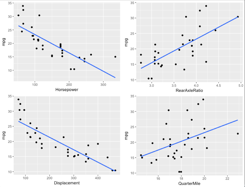
We will start with exploring a few simple variables, first is it linear? I am going to pull a ggplot trick here, in Base R graphics you can use "par(mfrow=c(2,2))" to get 4 graphs in one pane. GGPlot will not have it, so, awesome function called multiplot here.
##Explore

p1 <- ggplot(mtcars,aes(x = Horsepower, y = mpg)) +
  geom_point() +
  geom_smooth(method='lm', se= F)

p2 <- ggplot(mtcars,aes(x = Displacement, y = mpg)) +
  geom_point() +
  geom_smooth(method='lm', se= F)

p3 <- ggplot(mtcars,aes(x = RearAxleRatio, y = mpg)) +
  geom_point() +
  geom_smooth(method='lm', se= F)

p4 <- ggplot(mtcars,aes(x = QuarterMile, y = mpg)) +
  geom_point() +
  geom_smooth(method='lm', se= F)

#We have seen weight already, see the last several posts.
#ggplot(mtcars,aes(x = Weight, y = mpg)) +
#  geom_point() +
#  geom_smooth(method='lm', se= F)

# for this to work you will need the function definition linked above.
multiplot(p1, p2, p3, p4, cols=2)
GGplot is not looking to shabby, eh? So what do we have? Horsepower, rear axle ratio, engine displacement, and quarter mile time. The first three, do seem to have a relatively decent linear relationship to mpg, rear axle ratio may be a bit of a stretch looks bad below 4.0 then goes worse. Quarter mile time looks terrible, at 18-19 second quarter mile time for instance could have a mpg of 10 to 30, not terribly linear, more random. For fun we will create a model with all of them and see what happens.
There are a couple ways to go about multiple scatter plots. One is pairs()
pairs(mtcars[3:7])
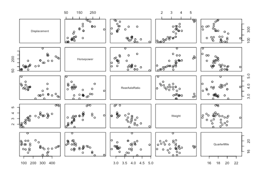
Also, a new package to introduce GGally which has a pairs based on ggplot graphics. Notice i did some voodoo with the column index with mtcars, i only want mpg, and the five columns we have decided to use for this post. This is called slicing.
# more more scatter plot
#install.packages("GGally")
library(GGally)
ggpairs(mtcars[c(1,3:7)], aes(alpha = 0.5))
One thing i have not covered and probably should have by now is correlation, put simply it is the degree of relationship between two variables. You have seen this already in the mpg to weight regression, weight had a negative correlation to mpg, hence it went from the upper left of the scatter plot to the lower right. You can see in the graphs above displacement also has a negative correlation to mpg while rear axle ratio and quarter mile have a positive correlation. Correlation is what is used to create the linear regression coefficient, more specifically the Pearson Correlation Coefficient. If you click on the image below in enlarge it you can see that each variable has a correlation to each other, if two explanatory variables are perfectly correlated you should drop one. You can also get an idea how well an expalnatory variable will be at helping determine the predictor.

Another check is to see if the data is normally distributed, in other words is it mound shaped. I will save you the trouble of running this, its really not. This is a small data set, far too small to get everything perfect. The larger EPA dataset i have my eye on will be a better test of this. We will move on with this, but be prepared for wonkyness.
## normally distributed
p1 <- ggplot(mtcars,aes(x = Horsepower)) +
  geom_histogram(bins=10)

p2 <- ggplot(mtcars,aes(x = Displacement)) +
  geom_histogram(bins=10)

p3 <- ggplot(mtcars,aes(x = RearAxleRatio)) +
  geom_histogram(bins=10)

p4 <- ggplot(mtcars,aes(x = QuarterMile)) +
  geom_histogram(bins=10)

#ggplot(mtcars,aes(x = Weight)) +
#   geom_histogram(bins=15)

multiplot(p1, p2, p3, p4, cols=2)
Recall what i said about data=, never shortcut the variable names.
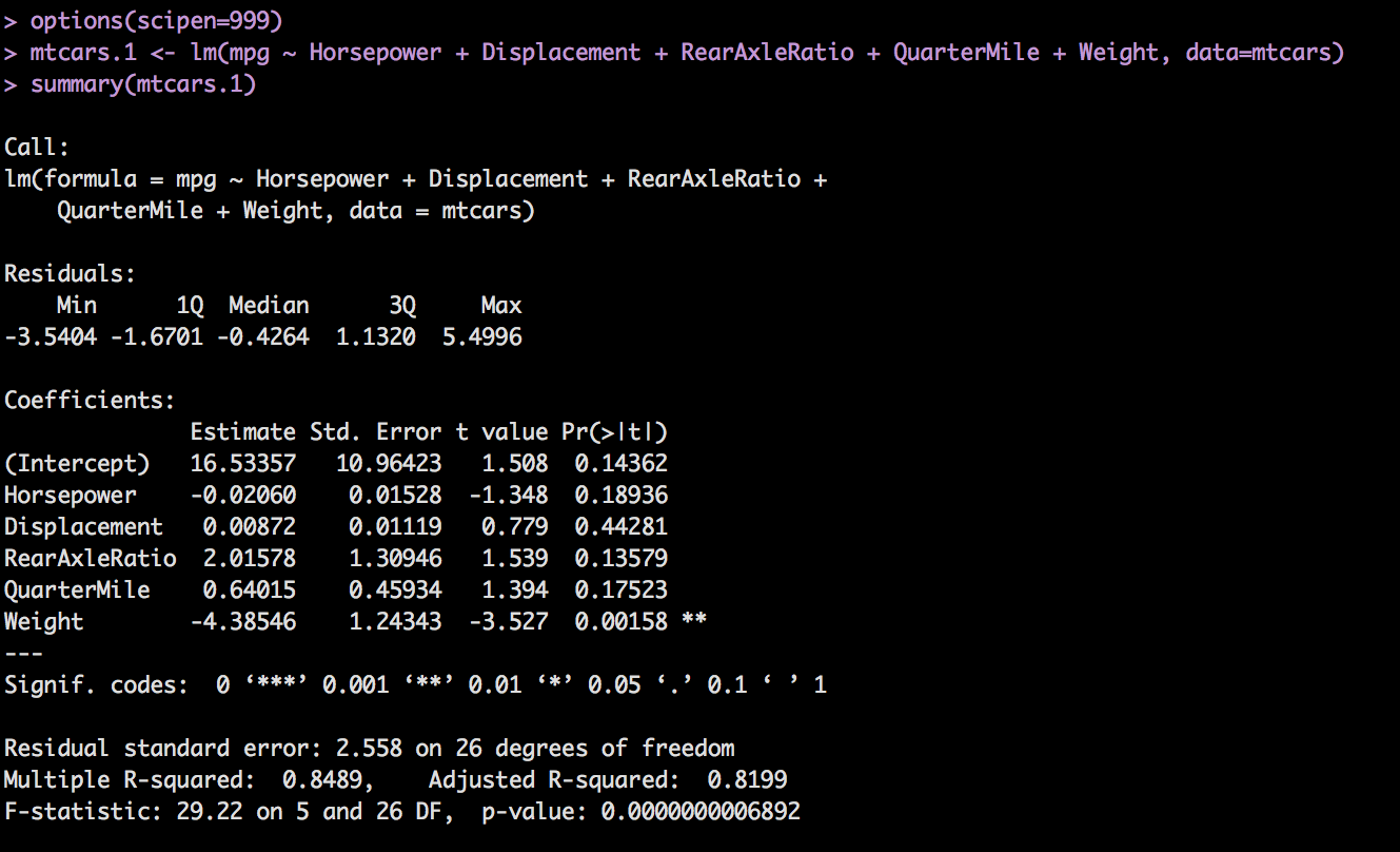
mtcars.1 <- lm(mpg ~ Horsepower + Displacement + RearAxleRatio + QuarterMile + Weight, data=mtcars)
summary(mtcars.1)
And the results. Recall we are looking for a p-value for each coefficient of < .05, an Adjusted R-Squared as high as possible, closer to 1 the better. Residuals of constant variance and Normal QQ plot that follows the line.
Though we were hoping that the relationship between Horsepower, rear axle ratio, engine displacement and mpg were okay-ish, the model disagrees.
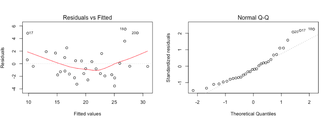
par(mfrow=c(2,2))
plot(mtcars.1)
Residuals don't look any better than weight alone, high and low end of the mpg scale will have issues and there are some outliers in the fitted values plot.
So the rule is, remove the worst performing p-value and run again. Displacement, you're fired!
mtcars.2 <- lm(mpg ~ Horsepower + RearAxleRatio + QuarterMile + Weight, data=mtcars)
summary(mtcars.2)
Notice what happened, examining p-value and looking for < .05 Weight and HorsePower became more significant, Quartermile, RearAxleRatio became less. So, next step is boot the worst, Quartermile you're fired***.

***In reviewing this post i realized that quarter mile in fact was not the lowest, but instead of correcting it i decided to leave it in and just call it out. This is one of the pains of building a model based on p-value, by removing the wrong variable i still created a better model, what would have happened had i done it correctly and removed Horsepower? I am going to spoil the ending and let you know that HP survived until the very end... Was i right or wrong?
mtcars.3 <- lm(mpg ~ Horsepower + RearAxleRatio + Weight, data=mtcars)
summary(mtcars.3)
Now, Horsepower and Weight look good compared to model 2 and RearAxleRatio is is significantly above .05. So, guess what...

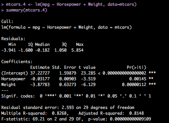
mtcars.4 <- lm(mpg ~ Horsepower + Weight, data=mtcars)
summary(mtcars.4)
And Finally, we are running out of variables so luckily everything dropped to well below .05 before we got to no variables, though that is an unlikely scenario, we knew weight was worth something. Our adjusted R-Squared is 81%, the standard error for the intercept is 1.6 with a t value of 23, which is good. And the p-value for the entire model is super low, so, we have a good model considering we have a small amount of data and a pretty tight range of predictions we can make.
So lets do a prediction since we have gone through the trouble to do all of this.
Horsepower <- c(100,150,200)
Weight <- c(2.5,3.5,5.2)
newcars = data.frame(Horsepower,Weight)

predict(mtcars.4,newdata=newcars,interval="confidence")
These predictions are reasonable, they are in line with a vehicle of 1974. Find out the HP in your vehicle and the weight try out the prediction and see what you get. My vehicle is 395 hp, at 5700 pounds, the model does not accommodate that very well. Review yesterdays blog if you are unfamiliar with why that happens.

That was however, relatively painful we had to create 4 models and review each one, what if we had had 100 variables? We still have variables in the dataframe we have not used yet, so, two more problems to solve very soon.
Pingback: Multiple Linear Regression Level 205.3 - Data Science 2 Go LLC