The hardest thing about having a blog is without exception, having a blog! It will sit and wait for you forever to come back to it, I think about it every day and the hundred post that need to be completed. In my case, content is not the problem it’s the fact that some posts like this one will take a few minutes to one hour, and I have posts that have taken me two days to write, not because they were difficult, but because the technical accuracy of the post had to be perfect, or at least as perfect as I could come up with. I have already decided the first person I hire will be responsible for going back and verifying my posts… I feel sorry for them already.
Tag Archives: SQLShep
Spring Intersections 2017
Published June 2, 2017 / by shep2010Spring SQL Intersections 2017 is over, to those who attended I hope you enjoyed the sessions and found everything presented useful! I led the Data Science track this spring and plan on presenting many more sessions in the years to come. I have presented before, and I have presented at intersections before, but this was my first foray into original data science content, or to be more accurate, statistical learning content.
How do I Data Science?
Spring, SQL Intersections, and Posts
Published March 29, 2017 / by shep2010I have been in academic mode since January hence the lack of posts, on the bright side come June i will have a bout 40 posts minimum i will need to start pumping out, so look forward to that.
Much to read below, but fill out this survey if you please!
Continue reading
Visualization, Histogram
Published January 3, 2017 / by shep2010So, last blog we covered a tiny bit of vocabulary, hopefully it was not too painful, today we will cover a little bit more about visualizations. You have noticed by now that R behaves very much like a scripting language which having been a T-SQL guy seemed familiar to me. And you have noticed that it behaves like a programing language in that I can install a package, and invoke function or data set stored in that package, very much like a dll, though no compiling is required. It’s clear that it is very flexible as a language, which you will learn is its strength and its downfall. If you decide to start designing your own R packages, you can write them as terribly as you want, though i would rather you didn’t.
If you want to find out what datasets are available run “data()”, and as we covered in a prior blog, data(package=) will give you the datasets for a specific package. This will provide you nice list of datasets to doodle with, as you learn something new explore the datasets to see what you can apply your new-found knowledge to.
First lets check out the histogram. If you have worked with SQL you know what a histogram is, and it is marginally similar to a statistics visual histogram. We are going to look at a real one. The basic definition is that it is a graphical representation of the distribution of numerical data.
When to use it? When you want to know the distribution of a single column or variable.
“Hist” ships with base R, which means no package required. We will go through a few Histograms from different packages.
You have become familiar with this by now, “data()” will load the mtcars dataset for use, “View” will open a new pane so you can review it, and help() will provide some information on the columns/variables in the dataset. Fun fact, if you run “view” (lowercase v) it will display the contents to the console, not a new pane. “?hist” will open the help for the hist command.
data(mtcars)
View(mtcars)
help(mtcars)

?hist
Did you notice we did not load a package? mtcars ships with base R, run “data()” to see all the base datasets.
Hist takes at a single quantitative variable, this can be passed by creating a vector or referencing just the dataframe variable you are interested in.
Try each of these out one at a time.
#When you see the following code, this is copying the contents
#of one variable into a vector, it is not necessary for what
#we are doing but it is an option. Once copied just pass it in to the function.

cylinders <- mtcars$cyl
hist(cylinders)

#Otherwise, invoke the function and pass just the variable you are interested in.

hist(mtcars$cyl)
hist(mtcars$cyl, breaks=3)
hist(mtcars$disp)
hist(mtcars$wt)
hist(mtcars$carb)
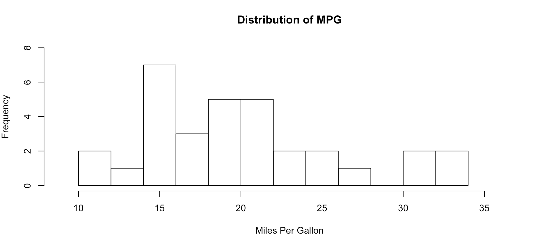
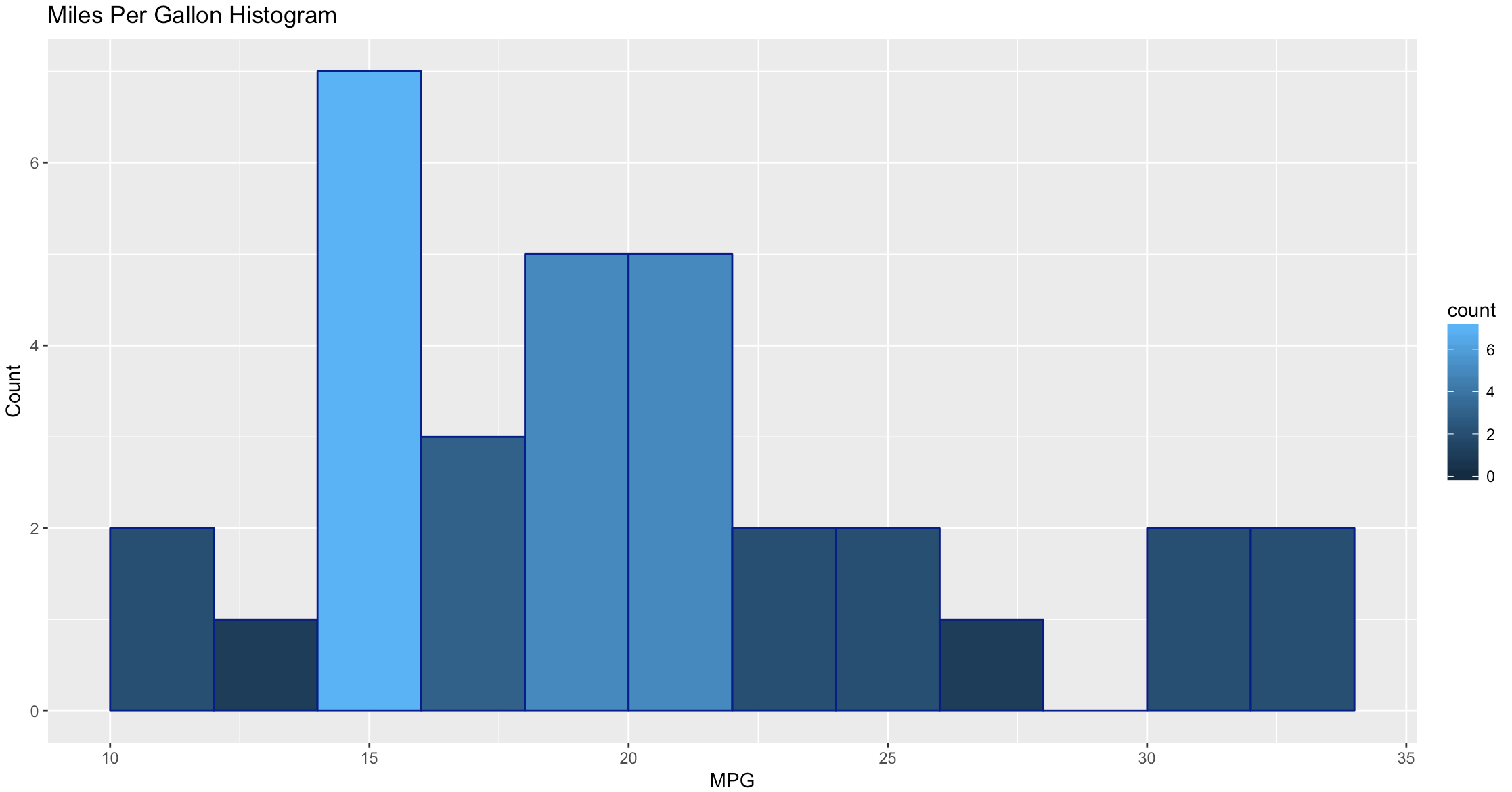
As you get wiser you can start adding more options to clean up the histogram so its starts to look a little more appealing, inherently histograms are not visually appealing but they are a good for data discovery and exploration. Without much thought you can see that more vehicles get 15mpg.
hist(mtcars$mpg, breaks = 15)

hist(mtcars$mpg, breaks = 15,
    xlim = c(9,37),
    ylim = c(0,8),
    main = "Distribution of MPG",
    xlab = "Miles Per Gallon")
Lets kick it up a notch, now we are going to use the histogram function from the Mosaic package. The commands below should be looking familiar by now.
install.packages("mosaic")
library(mosaic)

help(mosaic)
Notice there is more than one way to pass in our dataset. Since histogram needs a vector, a dataset with one column, any method you want to use to create that on the fly will probably work.
#try out a set of numbers
histogram(c(1,2,2,3,3,3,4,4,4,4))
#from the mtcars dataset let look at mpg and a few others and try out some options
histogram(mtcars$mpg)
#Can you see the difference in these? which is the default?
histogram(~mpg, data=mtcars)
histogram(~mpg, data=mtcars, type="percent")
histogram(~mpg, data=mtcars, type="count")
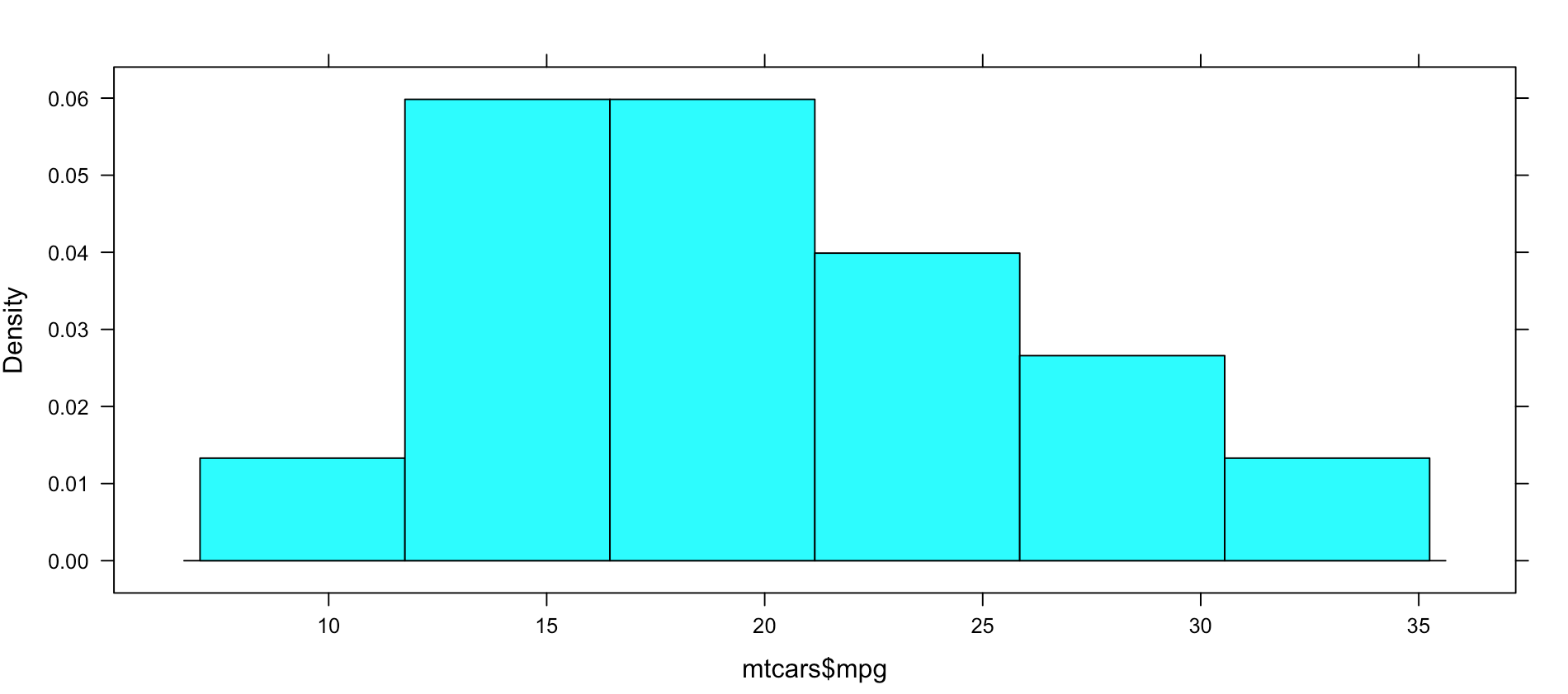
histogram(~mpg, data=mtcars, type="density")
Not very dazzling, but it is the density of the data. This is from "histogram(mtcars$mpg)"
Well, this is all sort of interesting, but quite frankly it is still just showing a data density distribution. Is there away to add a second dimension to the visual without creating three histograms manually? Well, sort of, divide the data up by a category.
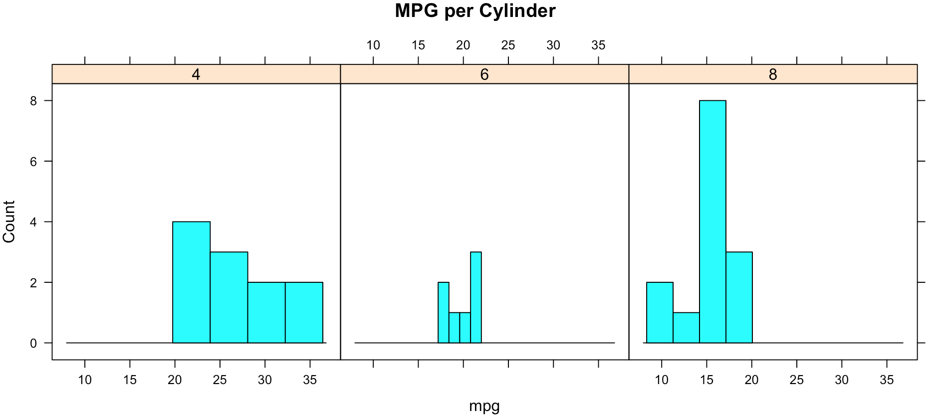
While less pretty with this particular dataset, you can see that it divided the histograms up by cylinders using the "|". You will also notice that i passed in "cyl" as a factor, this means treat it as a qualitative value, without the "as.factor" the number of cylinders in the label will not display, and that does not help with readability. Remove the as.factor to see what happens. Create your own using mtcars.wt and hp, do any patterns emerge?
histogram(~mpg | as.factor(cyl),
          main = "MPG per Cylinder",
          data=mtcars,
          center=TRUE,
          type="count",
          n=4,
          layout = c(3,1))
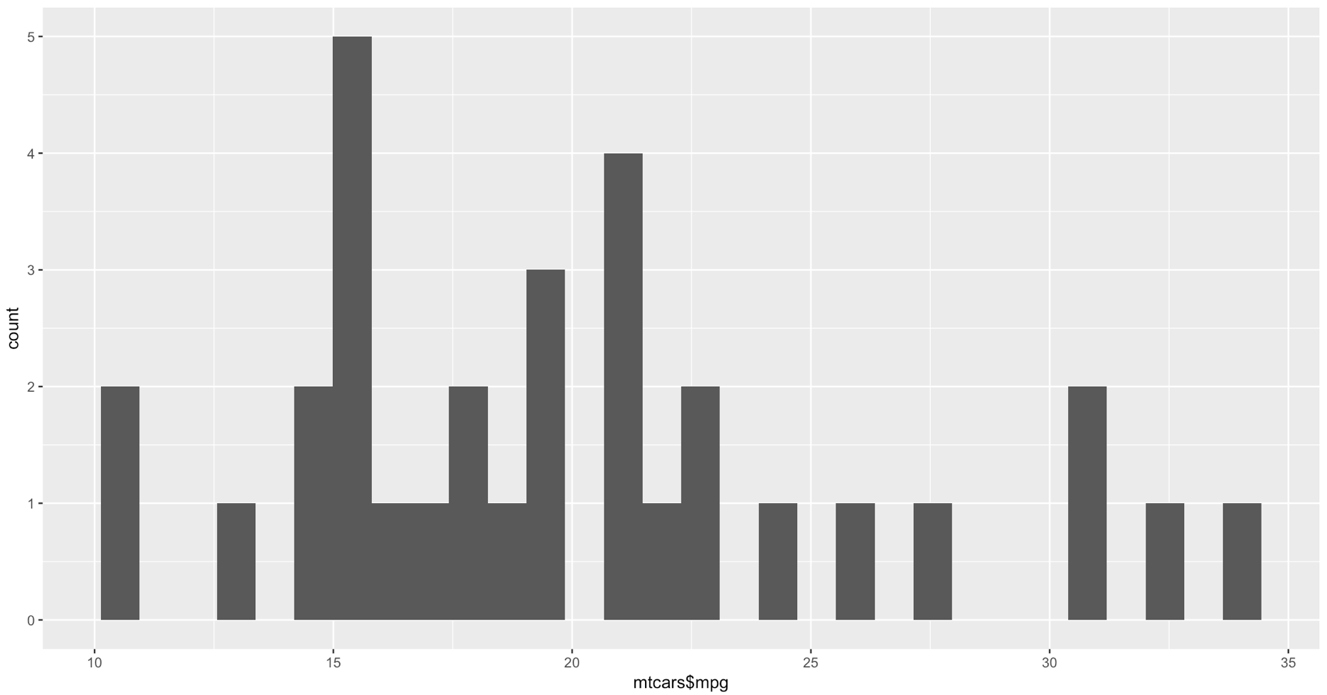
Well that was fun, remember when i said lets kick it up a notch? Here we go again. My favorite, and probably the most popular R visualization packages is ggplot or more recently, GGPLOT2
install.packages("ggplot2")
library(ggplot2)

qplot(mtcars$mpg, geom="histogram")
WOW, the world suddenly looks very different, just the default histogram look as if we have entered the world of grown up visualizations.
Ggplot has great flexibility. Check out help and search the web to see what you can come up with on your own. The package worth of an academic paper, or if you want to dazzle your boss.
ggplot(data=mtcars, aes(mtcars$mpg),) +
  geom_histogram(breaks=seq(10, 35, by =2),
    col="darkblue",
    aes(fill=..count..))+
    labs(title="Miles Per Gallon Histogram") +
    labs(x="MPG", y="Count")
Todays Commands
Base R
data()
View()
help()
hist()
install.packages()
library()
Mosaic Package
histogram
Ggplot2 Package
qplot()
ggplot()
geom_histogram()
Shep
Visualization, The gateway drug II
Published December 30, 2016 / by shep2010In the last blog you were able to get a dataset with county and population data to display on a US map and zoom in on a state, and maybe even a county if you went exploring. In this demo we will be using the same choroplethr package but this time we will be using external data. Specifically, we will focus on one state, and check out the education level per county for one state.
The data is hosted by the USDA Economic Research Division, under Data Products / County-level Data Sets. What will be demonstrated is the proportion of the population who have completed college, the datasets “completed some college”, “completed high school”, and “did not complete high school” are also available on the USDA site.
For this effort, You can grab the data off my GitHub site or the data is at the bottom of this blog post, copy it out into a plain text file. Make sure you change the name of the file in the script below, or make sure the file you create is “Edu_CollegeDegree-FL.csv”.
Generally speaking when you start working with GIS data of any sort you enter a whole new world of acronyms and in many cases mathematics to deal with the craziness. The package we are using eliminates almost all of this for quick and dirty graphics via the choroplethr package. The county choropleth takes two values, the first is the region which must be the FIPS code for that county. If you happen to be working with states, then the FIPS state code must be used for region. To make it somewhat easier, the first two digits of the county FIPS code is the state code, the remainder is the county code for the data we will be working with.
So let’s get to it;
Install and load the choroplethr package
install.packages("choroplethr")
library(choroplethr)
Use the setwd() to set the local working directory, getwd() will display what the current R working directory.
setwd("/Users/Data")
getwd()
Read.csv will read in a comma delimited file. “<-“ is the assignment operator, much like using the “=”. The “=” can be used as well. Which to assignment operator to use is a bit if a religious argument in the R community, i will stay out of it.
# read a csv file from my working directory
edu.CollegeDegree <- read.csv("Edu_CollegeDegree-FL.csv")
View() will open a new tab and display the contents of the data frame.
View(edu.CollegeDegree)
str() will display the structure of the data frame, essentially what are the data types of the data frame
str(edu.CollegeDegree)
Looking at the structure of the dataframe we can see that the counties imported as Factors, for this task it will not matter as i will not need the county names, but in the future it may become a problem. To nip this we will reimport using stringsAsFactors option of read.csv we will get into factors later, but for now we don't need them.
edu.CollegeDegree <- read.csv("Edu_CollegeDegree-FL.csv",stringsAsFactors=FALSE)

#Recheck our structure
str(edu.CollegeDegree)
Now the region/county name is a character however, the there is actually more data in the file than we need. While we only have 68 counties, we have more columns/variables than we need. The only year i am interested in is the CollegeDegree2010.2014 so there are several ways to remove the unwanted columns.
The following is actually using index to include only columns 1,2,3,8 much like using column numbers in SQL vs the actual column name, this can bite you in the butt if the order or number of columns change though not required for this import, header=True never hurts. You only need to run one of the following commands below, but you can see two ways to reference columns.
edu.CollegeDegree <- read.csv("Edu_CollegeDegree-FL.csv", header=TRUE,stringsAsFactors=FALSE)[c(1,2,3,8)]

# or Use the colun names

edu.CollegeDegree <- read.csv("Edu_CollegeDegree-FL.csv", header=TRUE,stringsAsFactors=FALSE)[c("FIPS","region","X2013RuralUrbanCode","CollegeDegree2010.2014")]

#Lets check str again
str(edu.CollegeDegree)
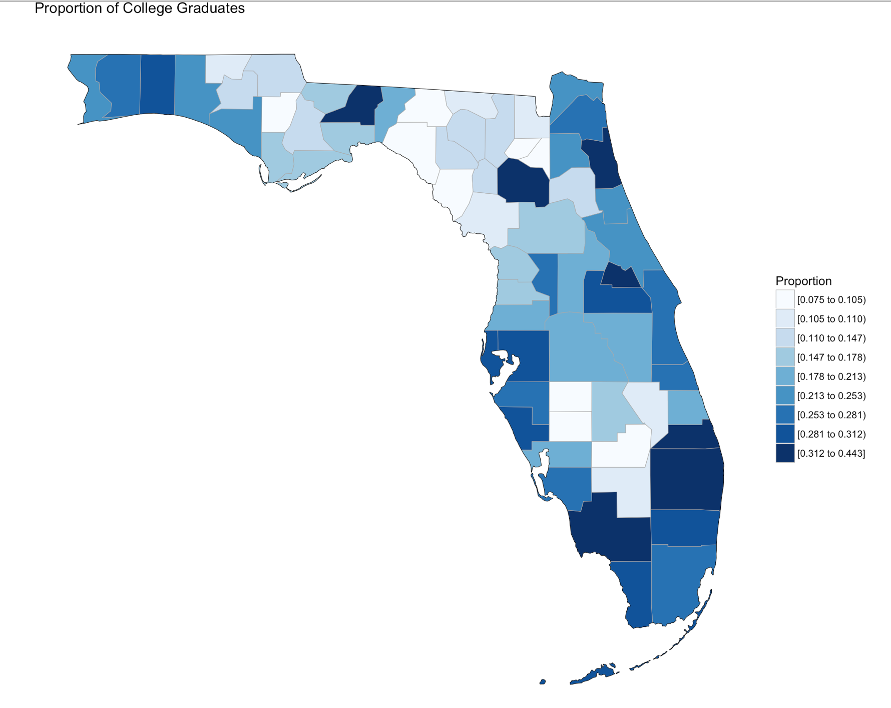
Using summary() we can start reviewing the data from statistical perspective. The CollegeDegree2010.2014 variable, we can see the county with the lowest proportion of college graduates is .075, or 7.5% of the population of that county the max value is 44.3%. The average across all counties is 20.32% that have completed college.
summary(edu.CollegeDegree)
Looking at the data we can see that we have a FIPS code, and the only other column we are interested in for mapping is CollegeDegree2010.2014, so lets create a dataframe with just what we need.
View(edu.CollegeDegree)

# the follwoing will create a datafram with just the FIPS and percentage of college grads
flCollege <- edu.CollegeDegree[c(1,4)]

# Alternatively, you can use the column names vs. the positions. Probably smarter ;-)
flCollege <- edu.CollegeDegree[c("FIPS","CollegeDegree2010.2014")]

# the following will create a dataframe with just the FIPS and percentage of college grads

flCollege
But, from reading the help file on county_choropleth, it requires that only two variables(columns) be passed in, region, and value. Region must be a FIPS code so, we need to rename the columns using colnames().
colnames(flCollege)[which(colnames(flCollege) == 'FIPS')] <- 'region'
colnames(flCollege)[which(colnames(flCollege) == 'CollegeDegree2010.2014')] <- 'value'
So, lets map it!
Since we are only using Florida, set the state_zoom, it will work without the zoom but you will get many warnings. You will also notice a warning that 12000 is not mappable. Looking at the data you will see that 12000 is the entire state of Florida.
county_choropleth(flCollege,
                  title = "Proportion of College Graduates ",
                  legend="Proportion",
                  num_colors=9,
                  state_zoom="florida")
For your next task, go find a different state and a different data set from the USDA or anywhere else for that matter and create your own map. Beware of the "value", that must be an integer, sometimes these get imported as character if there is a comma in the number. This may be a good opportunity for you to learn about gsub and as.numeric, it would look something like the following command. Florida is the dataframe, and MedianIncome is the column.
florida$MedianIncome <- as.numeric(gsub(",", "",florida$MedianIncome))
USDA Economic Research Division Sample Data
FIPS,region,2013RuralUrbanCode,CollegeDegree1970,CollegeDegree1980,CollegeDegree1990,CollegeDegree2000,CollegeDegree2010-2014
12001,"Alachua, FL",2,0.231,0.294,0.346,0.387,0.408
12003,"Baker, FL",1,0.036,0.057,0.057,0.082,0.109
12005,"Bay, FL",3,0.092,0.132,0.157,0.177,0.216
12007,"Bradford, FL",6,0.045,0.076,0.081,0.084,0.104
12009,"Brevard, FL",2,0.151,0.171,0.204,0.236,0.267
12011,"Broward, FL",1,0.097,0.151,0.188,0.245,0.302
12013,"Calhoun, FL",6,0.06,0.069,0.082,0.077,0.092
12015,"Charlotte, FL",3,0.088,0.128,0.134,0.176,0.209
12017,"Citrus, FL",3,0.06,0.071,0.104,0.132,0.168
12019,"Clay, FL",1,0.098,0.168,0.179,0.201,0.236
12021,"Collier, FL",2,0.155,0.185,0.223,0.279,0.323
12023,"Columbia, FL",4,0.083,0.093,0.11,0.109,0.141
12027,"DeSoto, FL",6,0.048,0.082,0.076,0.084,0.099
12029,"Dixie, FL",6,0.056,0.049,0.062,0.068,0.075
12031,"Duval, FL",1,0.089,0.14,0.184,0.219,0.265
12033,"Escambia, FL",2,0.092,0.141,0.182,0.21,0.239
12035,"Flagler, FL",2,0.047,0.137,0.173,0.212,0.234
12000,Florida,0,0.103,0.149,0.183,0.223,0.268
12037,"Franklin, FL",6,0.046,0.09,0.124,0.124,0.16
12039,"Gadsden, FL",2,0.046,0.086,0.112,0.129,0.163
12041,"Gilchrist, FL",2,0.027,0.071,0.074,0.094,0.11
12043,"Glades, FL",6,0.031,0.078,0.071,0.098,0.103
12045,"Gulf, FL",3,0.057,0.068,0.092,0.101,0.147
12047,"Hamilton, FL",6,0.055,0.059,0.07,0.073,0.108
12049,"Hardee, FL",6,0.045,0.074,0.086,0.084,0.1
12051,"Hendry, FL",4,0.076,0.076,0.1,0.082,0.106
12053,"Hernando, FL",1,0.061,0.086,0.097,0.127,0.157
12055,"Highlands, FL",3,0.081,0.097,0.109,0.136,0.159
12057,"Hillsborough, FL",1,0.086,0.145,0.202,0.251,0.298
12059,"Holmes, FL",6,0.034,0.06,0.074,0.088,0.109
12061,"Indian River, FL",3,0.107,0.155,0.191,0.231,0.267
12063,"Jackson, FL",6,0.064,0.081,0.109,0.128,0.142
12065,"Jefferson, FL",2,0.061,0.113,0.147,0.169,0.178
12067,"Lafayette, FL",9,0.048,0.085,0.052,0.072,0.116
12069,"Lake, FL",1,0.091,0.126,0.127,0.166,0.21
12071,"Lee, FL",2,0.099,0.133,0.164,0.211,0.253
12073,"Leon, FL",2,0.241,0.32,0.371,0.417,0.443
12075,"Levy, FL",6,0.051,0.078,0.083,0.106,0.105
12077,"Liberty, FL",8,0.058,0.08,0.073,0.074,0.131
12079,"Madison, FL",6,0.07,0.083,0.097,0.102,0.104
12081,"Manatee, FL",2,0.096,0.124,0.155,0.208,0.275
12083,"Marion, FL",2,0.074,0.096,0.115,0.137,0.172
12085,"Martin, FL",2,0.079,0.16,0.203,0.263,0.312
12086,"Miami-Dade, FL",1,0.108,0.168,0.188,0.217,0.264
12087,"Monroe, FL",4,0.091,0.159,0.203,0.255,0.297
12089,"Nassau, FL",1,0.049,0.091,0.125,0.189,0.23
12091,"Okaloosa, FL",3,0.132,0.166,0.21,0.242,0.281
12093,"Okeechobee, FL",4,0.047,0.057,0.098,0.089,0.107
12095,"Orange, FL",1,0.116,0.157,0.212,0.261,0.306
12097,"Osceola, FL",1,0.067,0.092,0.112,0.157,0.178
12099,"Palm Beach, FL",1,0.119,0.171,0.221,0.277,0.328
12101,"Pasco, FL",1,0.049,0.068,0.091,0.131,0.211
12103,"Pinellas, FL",1,0.1,0.146,0.185,0.229,0.283
12105,"Polk, FL",2,0.088,0.114,0.129,0.149,0.186
12107,"Putnam, FL",4,0.062,0.081,0.083,0.094,0.116
12113,"Santa Rosa, FL",2,0.098,0.144,0.186,0.229,0.265
12115,"Sarasota, FL",2,0.142,0.177,0.219,0.274,0.311
12117,"Seminole, FL",1,0.094,0.195,0.263,0.31,0.35
12109,"St. Johns, FL",1,0.085,0.144,0.236,0.331,0.414
12111,"St. Lucie, FL",2,0.081,0.109,0.131,0.151,0.19
12119,"Sumter, FL",3,0.047,0.07,0.078,0.122,0.264
12121,"Suwannee, FL",6,0.056,0.065,0.082,0.105,0.119
12123,"Taylor, FL",6,0.064,0.086,0.098,0.089,0.1
12125,"Union, FL",6,0.033,0.059,0.079,0.075,0.086
12127,"Volusia, FL",2,0.107,0.13,0.148,0.176,0.213
12129,"Wakulla, FL",2,0.018,0.084,0.101,0.157,0.172
12131,"Walton, FL",3,0.067,0.096,0.119,0.162,0.251
12133,"Washington, FL",6,0.04,0.063,0.074,0.092,0.114
Visualization, The Gateway Drug
Published December 29, 2016 / by shep2010Visualization is said to be the gateway drug to statistics. In an effort to get you all hooked, I am going to spend some time on visualization. Its fun (I promise), i expect that after you see how easy some visuals are in R you will be off and running with your own data explorations. Data visualization is one of the Data Science pillars, so it is critical that you have a working knowledge of as many visualizations as you can, and be able to produce as many as you can. Even more important is the ability to identify a bad visualization, if for no other reason to make certain you do not create one and release it into the wild, there is a site for those people, don’t be those people!
We are going to start easy, you have installed R Studio, if you have not back up one blog and do it. Your first visualization is what is typically considered advanced, but I will let you be the judge of that after we are done.
Some lingo to learn:
Packages – Packages are the fundamental units of reproducible R code. They include reusable R functions, the documentation that describes how to use them, and sample data.
Choropleth – is a thematic map in which areas are shaded or patterned in proportion to the measurement of the statistical variable being displayed on the map, such as population density or per-capita income.
Below is the code for a choropleth, using the package choroplethr and the data set df_pop_county, which is the population of every county in the US.
This is what todays primary objective is;
To learn more about any R command “?”, “??”, or “help(“object”)” Keep in mind, R is case sensitive. If you can only remember part of a command name use apropos().
?str

?df_pop_county

??summary

help(county_choropleth)

apropos("county_")
#Install package called choroplethr,
#quotes are required,
#you will get a meaningless error without them
#Only needs to be installed once per machine
install.packages("choroplethr")
The library function will load the installed package to make any functions available for use.
library("choroplethr")To find out what functions are in a package use help(package=””).
help(package="choroplethr")
Many packages come with test or playground datasets, you will use many in classes and many for practice, data(package=””) will list the datasets that ship with a package.
data(package="choroplethr")
For this example we will be using the df_pop_county dataset, this command will load it from the package and you will be able to verify it is available by checking out the Environment Pane in R Studio.
data("df_pop_county")
View(“”) will open a view pane so you can explore the dataset. Similar to clicking on the dataset name in the Environment Pane.
View(df_pop_county)
Part of learning R is learning the features and commands for data exploration, str will provide you with details on the structure of the object it is passed.
str(df_pop_county)
Summary will provide basic statistics about each column/variable in the object that it is passed.
summary(df_pop_county)
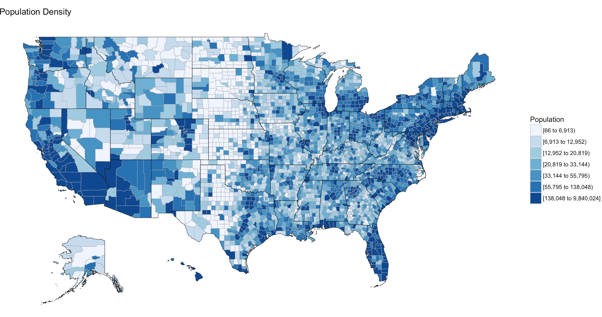
If your heart is true, you should get something very similar to the image above after running the following code. county_choropleth is a function that resides in the choroplethr package, it is used to generate a county level US map. The data passed in must be in the format of county number and value, the value will populate the map. WHen the map renders it will be in the plot pane of the RStudio IDE, be sure to select zoom and check out your work.
#?county_choropleth
county_choropleth(df_pop_county)
There are som additioanl parameters we can pass to the function, use help to find more.
county_choropleth(df_pop_county,
                  title = "Population Density",
                  legend="Population")
Try changing the number of colors and change the state zoom. If your state is not working read the help to see if you can find out why.
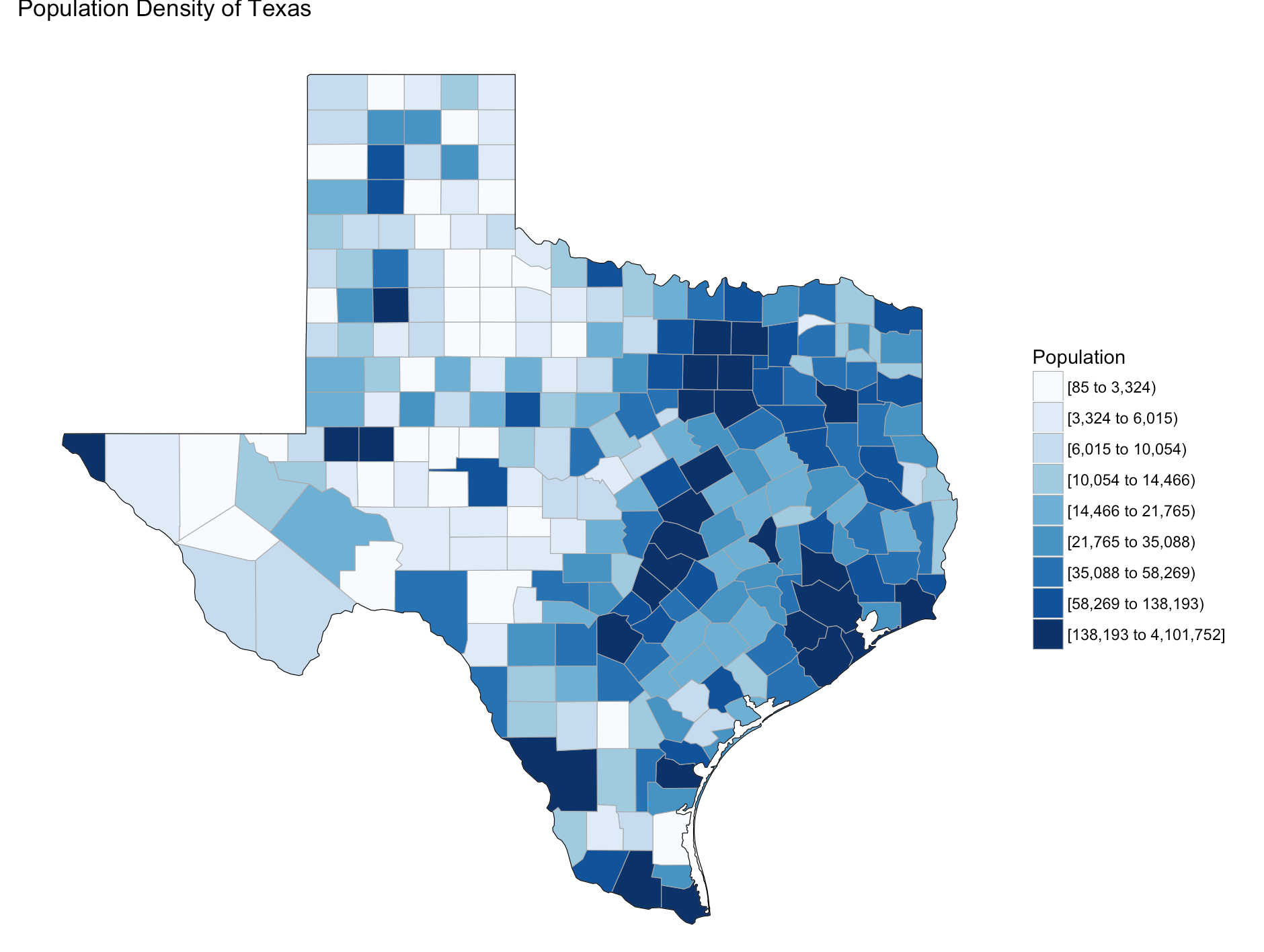
county_choropleth(df_pop_county,
                  title = "Population Density of Texas",
                  legend="Population",
                  num_colors=9,
                  state_zoom="texas")
There is an additional option for county_choropleth, reference_map. If it does not work for you do not fret, as of this blog post it is not working for me either, the last R upgrade whacked it, be ready for this to happen and make sure you have backs and versions, especially before you get up on stage in front 200 people to present.
There you have it! Explore the commands used, look at the other datasets that ship with choroplethr and look at the other functions that ship with choroplethr, it can be tricky to figure out which ones work, be sure to check the help for each function you want to run, no help may mean no longer supported. Remember that these packages are community driven and written, which is good, but sometimes they can be a slightly imperfect.
In the next post i will cover how to upload and create your own dataset and use the choroplethr function with your own data. On a side note, the choropleth falls under a branch of statistics called descriptive statistics which covers visuals used to describe data.
Getting started with R
Published December 28, 2016 / by shep2010First things first, you need to install R, more specifically, R Studio. For the near future everything I will be demoing and working on will be with R Studio, it runs on Mac, it Runs on PC, it runs on Linux. I personally use a Mac, anecdotal evidence seems to support that abut 80-90% of academia shows up to class with a Mac, adult learners show up with a PC more so than not, so make of that what you will. Don’t worry about SQL and R, or Revolution R yet, that will come up at a later date, we are going to walk before we run.
What I am not going to do is waste a blog with a thousand screen shots teaching you to install R and the long drawn out history, I gain little from knowing it and nothing from discussing it. It came from S and New Zealand, and has about 5000 add in packages. Dozens of others have already down this in blogs and videos about the history, go find one and hop to it.
Here is one to get you started, it has just the facts!
What I will say, is that R is maintained by the Comprehensive R Archive Network, this is where you go to get R. What you really want is R Studio, it’s a friendly IDE that if you have ever used SSMS, will look a tiny bit familiar, and once you have been using you will never want to use the base R or Microsoft R client again. Rstudio is the Defacto default R client. You can install both, R and R Studio, I have them both, I only ever use R Studio.
After it is installed find a nice little video to give you a tour of the IDE or go exploring on your own, i normally do better when I do some exploring and then jump into a how to video. IDE’s over the ages have changed little. What we will be interested in is the R script tab(will show up after you open or create a new R file), Console, then all the stuff on the right hand side, environment, history, files, plot, packages, help, and viewer. We will dive into all the tabs soon!
Get to it, come back when you have R Studio installed!
Comprehensive R Archive Network
R Studio
Shep
How do I Data Science?
Published December 27, 2016 / by shep2010As we are bombarded with DS (data science) this and DS that, it is difficult to figure out what that means. There really is no Data Science degree, or at least there wasn’t until a couple of years ago, now Berkeley will certainly sell you a masters for $60k, I do not know anyone who has gone through it, but I know people who have inquired and now cannot get the aggressive phone calls to stop. The program does look sound, but I am afraid they slung the degree together to meet an immediate need, not one that could go toe to toe with an actual data scientist. DS and machine learning is still approaching the peak of the Gartner hype cycle, what that means to me be very wary of those trying to separate you from your money offering the promise of DS nirvana.
So, what’s the point? Beware and question everything. I left Microsoft for the purpose of taking a two to three year sabbatical to fill in the academic gaps I have. I am doing it the Hard way, I am taking stats, advanced stats, many graduate level classes and lots of research. I am using Harvard Extension school for now, they have more than enough to keep me entertained, they do have a DS Graduate certificate that can be done in four classes, what they don’t mention is that a significant background in stats and programming web is encouraged as a prerequisite. For instance, one of the requirements was CS-171 which I am not sure they will be offering publically in the future, but this was mixed with the regular Harvard folks. I was required to learn CSS, HTML, JavaScript, and JQuery in the first weeks of the class so I could do the D3 exercises. I have a critique of the class I will publish one day, but know the class is known to take 30+ hours a week. This is a true DS visualization class, graphics in Excel is not, Tableau, maybe.
Which gets me to the point of todays blog, what is a data scientist, what skills do they need, what skills are required. The short answer is, it depends. The irony is most data scientist that I have met with a PhD in either Visualization, Stats, math, computer science, Physics, bioinformatics, (you name it) can serve in the role of Data Science if they have a strong data and statistics background, and many of them have trouble calling themselves data scientists. You heard it, many of the titled data scientist I have worked with don’t like to be called data scientist because they do not feel they meet the requirements of the perceived role. Which begs the question, what are the perceived skills of the role?
There are a few infographics floating around that discuss the skills of the Data folk. My favorite to date is the one DataCamp has published, look at it on your own, I am not going to plagiarize someone else’s work, but look at the eight job titles and descriptions of skills, what is common among all of them? SQL is expected for all eight, and R for five of roles. Keeping in mind that this is the generic title of SQL, not just MS SQL Server. So it would seem that having SQL and R you can be the bridge to many functional roles.
For the 30,000 foot view of skills required to be an actual DS, and as you will notice a requirement for half the other skills as well, see the Modern Data Scientist infographic. I think this is the best version of the requirements for the role, it is not technology specific, but is knowledge specific. I like this infographic because you can apply this regardless if you are an MS shop or more open source. I personally think the most SQL Server experts already have mastered Domain Knowledge and Soft Skill, though occasionally we may have issues with the collaborative, especially on Mondays. But our goal, me and you is not to master all four pillars of data science, that is what is called the Data Science Unicorn, few can do it, you really need to be in school until you are forty to master it. The goal is to be a master at one of these, awesome at a second pillar and somewhat functional with the other two pillars. I am constantly surprised at how few data scientist can program, even in T-SQL, they just get by if at all. I will cover some of that in a later blog, there is a reason it happens that way, but all the more opportunity for the SQL experts, we have one entire pillar already mastered, and are at least one quarter way through another.
I will say this though, the one thing you will not escape on this endeavor is Statistics, and Probability. You are going to have to suck it up, take a refresher, or take it for the first time. The boundaries only exist in your mind, Edx.org, MIT open courseware have all you need to get you started. If you want some pressure take one through a local university. The reason I like Harvard Extension is that there are no entrance boundaries, if you want to take Stat-104, you pay for it and then log in and take it. Some classes are offered on campus, some are with the really smart kids that got it through the front door, unlike me. Harvard Extension is considered the Back door to Harvard, I don’t really care, I’ve been doing this too long to care about the credentials, and quite frankly I was glad to find door at all.
Shep
In the beginning there was a Data guy
Published December 26, 2016 / by shep2010Well, here we go, its finally time to take this horse out of the barn! I’m Shep, some of you know me some of you do not, you can check my linked in profile to learn more about me, I’m just a bloke. I have been screwing around with SQL Server since 1994 SQL 4.21a, I am pretty sure we had the OS2 version laying around somewhere but we all ignored the purple ALR server and the dozen or so disks needed to install everything, until one night I got bored and decided to turn it on. Jump a head a dozen or so years and I am working for Microsoft five years as a SQL PFE, one year as frontline Windows Engineer (lapse in judgement) and eventually the SQL Server Customer Advisory Team (SQLCAT) in Redmond running the Lab. “PC (server) Recycle it” became my mantra, I took great joy in PC recycling an HP SuperDome, I know you’re clutching your pearls at the thought, especially considering the server cost $700,000 – $1,400,000. But, damn thing wouldn’t boot anymore what did you expect. For what its worth, HP brought it back, and the lab got another one.
While running the lab we had fewer customers than I would have liked to have seen since the entire world turned upside down and suddenly cloud computing was all the rage. SQL CAT became low priority, and everything cloud became everything. Most lab managers run for 1-2 years and move on to something else, many lab managers take the job for the sole purpose of getting on the CAT team, certainly a noble endeavor. I made it pretty clear up front that I never wanted to be on CAT, I just wanted to run the lab, so at the end of my two years I was at a precipice, leave CAT, leave Microsoft, do something else?
Like many SQL Server experts, once you do it long enough you are only really good at being a SQL Server expert, you know data, you know many data domains, you can think pretty fast on your feet, data and structures are living logic problems. Those all certainly seem like noble skills, so what’s next?
About ten years ago every C* suite executive started demanding big data after getting off an airplane having read CIO magazine, or some airline rag that regurgitates smart looking articles. The problem was they didn’t know what big data was, quite frankly neither did we. What happened that caused it was we stopped deleting data, compression became main stream in databases, devices started creating data, people essentially became devices to be tracked, the web began to dominate everything, so your mouse became a device to be tracked, where was it, and what was it doing, your phone, your path through a mall was now data on how to sell more stuff, your car. It is a toxic waste dump of unlimited data, all of it available to be mined and sadly be hacked.
Well, Data Scientists and statisticians to the rescue, or so the line goes. Statistics and data science is claimed to be the sexist job, I really don’t know what that means, how does one define a sexy job?
At the end of my CAT Lab tenure, R was in beta with SQL Server shipping in the CTPs, Azure ML (Machine Learning) was new and shiny and it certainly seemed like a good thing to invest in, so I put together a training plan for me and ended up working with the MS data scientists working on customer problems. The customer engagements were very much like a CAT engagement, phone call to triage, verify they had the data needed, make sure they have an actual question to be answered from the data, then a few of us would fly to the customer site and do a 5 day hackathon to attempt to give them a machine learning solution in Azure ML. Sometimes we could, sometimes we could not, but this gave me the opportunity to get my feet wet in the data science space and work with the Microsoft Data Science PhDs, which led me to quit Microsoft to focus full time on filling in the academic gaps needed to be good in that role.
But, why…? What I learned after working with customer SQL experts, their statisticians, their data scientists, and our data scientist is that 60%-80% of the time consuming portion of the job can be done by a SQL gal or guy. No Shit! The problem I learned was that first off they are speaking very different languages, one is coming from academia and the other quite frankly is computer science, or hard knock learning much like me. Second, on average 80% of the job of the data scientist is data wrangling and feature engineering, and unless they have been doing for a very long time and learned, they are trying to do all of it on their laptop in R or Python using a sample, something that SQL Server and most relational database engines are exceptionally good at and if well written, very fast at. Most data scientist would love help in this area, but there is still the failure of communication, they are speaking different languages. SQL folks have the innate ability to break walls down between groups (if they want to), there typically is no better data or domain expert than the SQL folks, so they would seem to be the perfect fit.
So the next question is how does one get there? Unfortunately its not just a 40 hour immersion class, but depending on deep and how far you want to go, that can be the beginning!
This blog and eventually the training the public talks I am developing will whittle away at the boundaries. Today the path looks intimidating and since data science is the sexy new job, there are a lot of companies telling you that in 12 weeks you can be a data scientist, though if you dig deeper you will find many of their students have graduated with math upper level math degrees. Microsoft is claiming tools like Azure ML will commoditize data science and bring it to the masses, but if you call and ask for statistical model help you will likely end up on the phone with a PhD, so there is a tiny discrepancy in what they are selling and what they are doing, but, magic black box machine learning is industry wide. I do believe ten years from now that machine learning will be built into everything and the knowledge required to take advantage of it will be widespread.
I will be sharing my academic experiences, as much knowledge as I can articulate, where I think academia is blowing it, where I think we are blowing it. What classes are worthwhile, lots and lots of samples in R and SQL along the way.
Shep