The next topics (Range, IQR, Variance and Standard Deviation) took up a combined 120 power point slides in my stats class, which means that describing all in a single post will not happen, and maybe two posts minimum, but I will try to keep it under 120 slides or pages.
So, range, IQR (Interquartile Range), variance and standard deviation fall under summary measures as ways to describe numerical data.
Range – is the measure of dispersion or spread. Using central tendency methods we can see where most of the data is piled up, but what do we know about the variability of the data? The range of the data is basically the maximum value – the minimum value.
What to know about range? It is sensitive to outliers. It is unconcerned about the distribution of the data in the set.
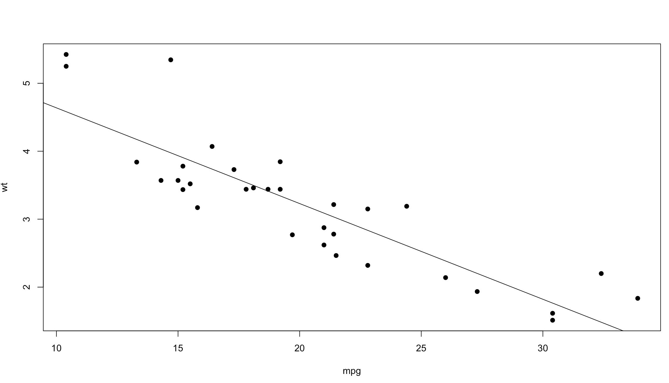
For instance, if I had a hybrid car in my mtcars dataset that achieved 120 mpg by the petrol standards set forth by the EPA, my range for mpg would be 10.40mpg to 120mpg. If I told you the cars in my sample had a mpg range of 10.40mpg to 120mpg what would you think of the cars? What range fails to disclose is that the next highest mpg car is 33.9, that’s pretty far away and not all representative of the true dataset.
Run the following, try it out on your own data sets.
data(mtcars)
View(mtcars)

range(mtcars$mpg)
range(mtcars$wt)
range(mtcars$hp)

# if you are old school hard core,
# "c" is to concatenate the results.

c(min(mtcars$hp),max(mtcars$hp))
Interquartile Range – since we have already discussed quartiles this one is easy, the inter-quartile-range is simply the middle 50%, the values that reside between the 1st quartile(25%) and the first 3rd(75%) quartile. Summary() and favstats will give us the min(0%), Q1, Q2, Q3, max (100%)as will quantile().
quantile(mtcars$mpg)
summary(mtcars$mpg)
favstats(mtcars$mpg)
IQRs help us find Outlier which is an observation point that is distant from other observations. An outlier may be due to variability in the measurement or it may indicate experimental error; the latter are sometimes excluded from the data set.
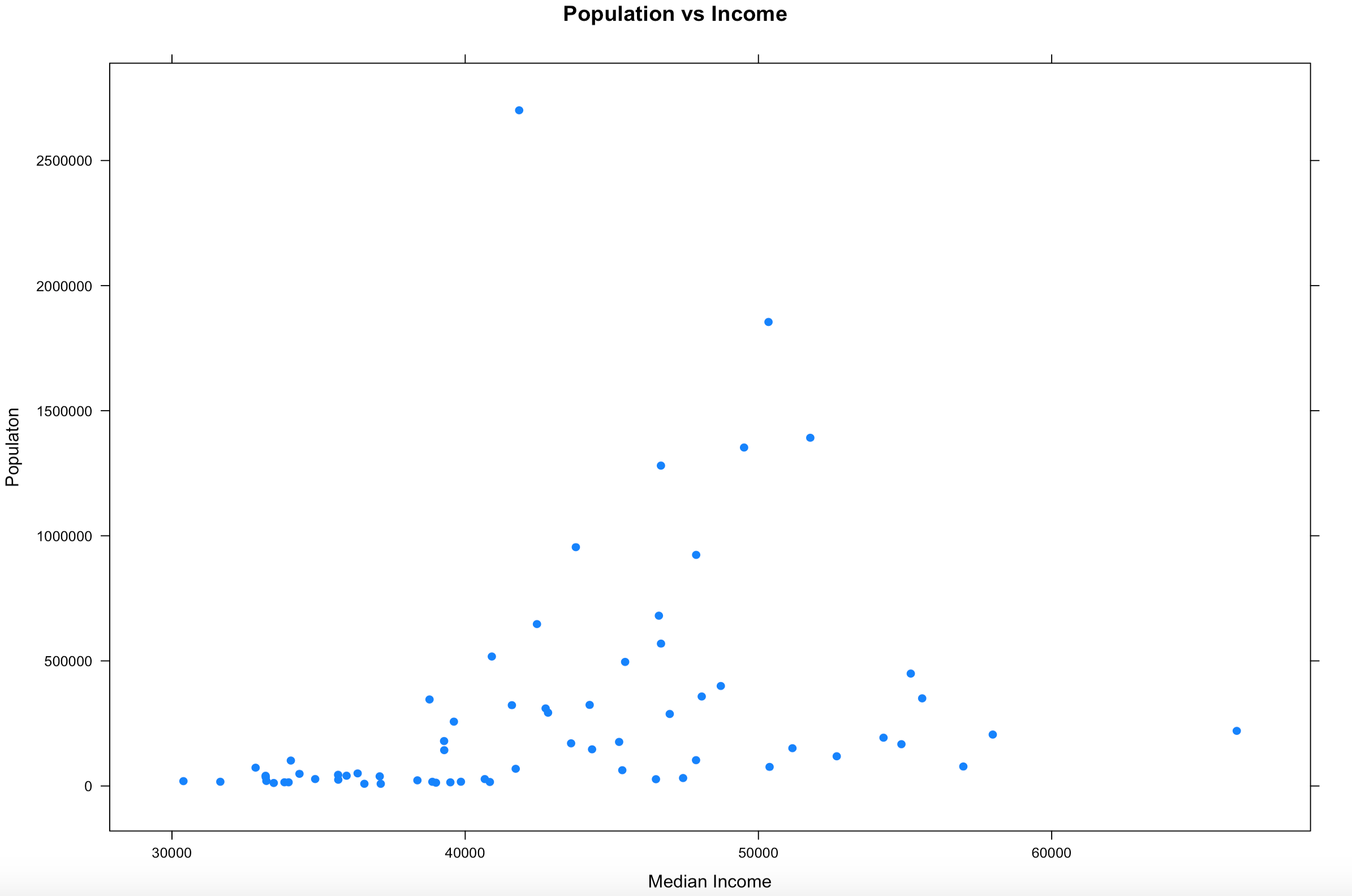
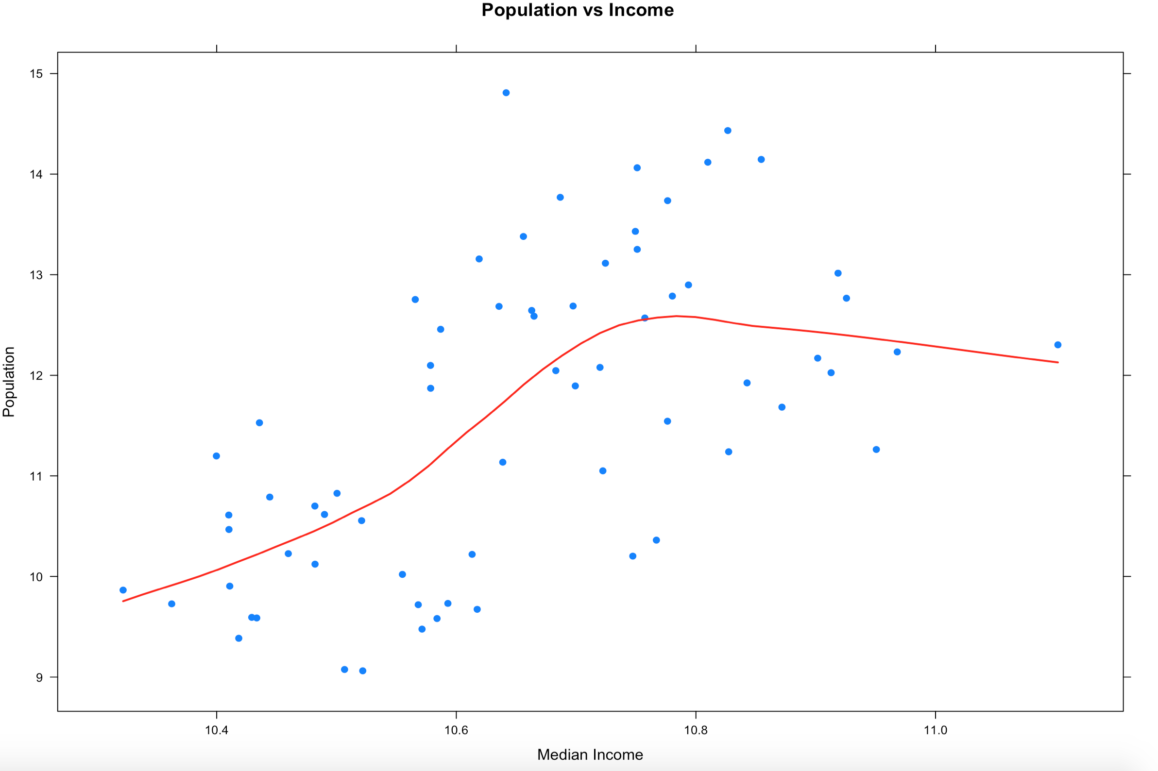
One of the techniques for removing outliers is to use the IQR to isolate the center 50% of the data. Lets use the Florida dataset from the scatterplot blog and see how the plot changes.
I am going to demonstrate the way i know to do this. Understand this is a method to perform this task, two years from now i will probably think this is amateuresque, but until then here we go.
We will need the first quintile and the third quantile and then subtract one from the other. to do this we are going to use summary().
florida <- read.csv("/Users/Shep/git/SQLShepBlog/FloridaData/FL-Median-Population.csv")

# Checkout everything summary tells us
summary(florida)

# Now isolate the column we are interested in
summary(florida$population)

# Now a little R indexing,
# the values we are interested in are the 2nd and 5th position
# of the output so we just reference those
summary(florida$population)[2]
summary(florida$population)[5]

# load the values into a variable
q1 <- summary(florida$population)[2]
q3 <- summary(florida$population)[5]

#Now that we have the variables run subset to grab the middle 50%
x<-subset(florida,population >=q1 & population <= q3)

#And lets run the scatterplot again
xyplot((population) ~ (MedianIncome),
       data=x,
       main="Population vs Income",
       xlab="Median Income",
       ylab = "Population",
       type = c("p", "smooth"), col.line = "red", lwd = 2,
       pch=19)
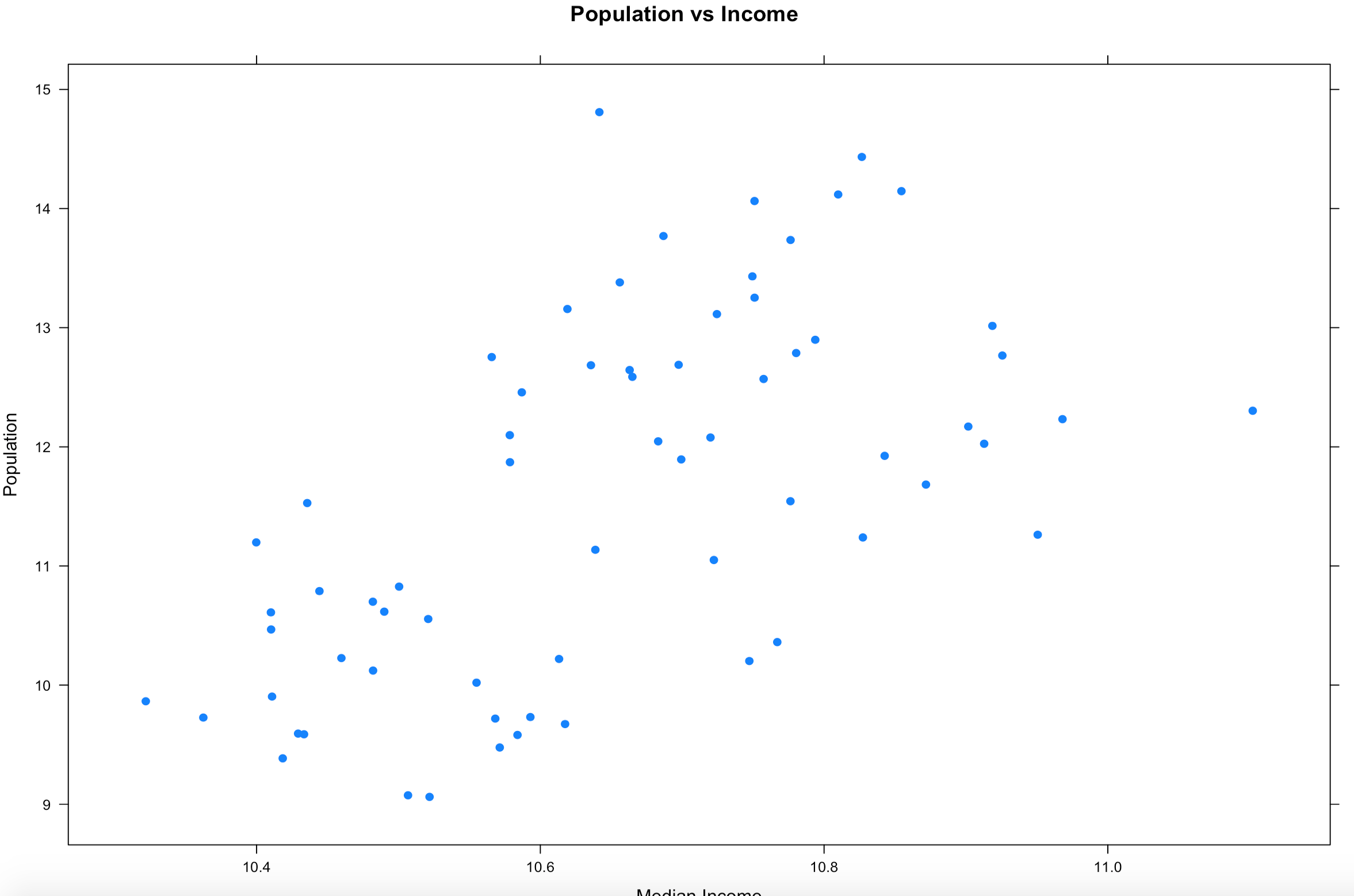
Notice what happened? By removing everything outside of the IQR our observations (Rows) went from 67 counties to 33 counties, that is quite literally half the data that got identified as an outlier because of the IQR outlier methodology. On the bright side our scatter plot looks a little more readable and realistic and the regression looks similar but bit more wiggly than before.
So what to do? When you wipe out half your data as an outlier this is when you need to consult the powers that be. In real life you will be solving a problem and there will be some guidance and boundaries provided. Since this is just visualization, the stakes are pretty low. If you are in exploration and discovery phase, guess what, you just discovered something. If you are looking at this getting ready to make a predictive model, is throwing out 50% of the data as outlier data the right decision? Its time to make a decision. The decision i am going to make is to try out a different outlier formula. How about we chop 5% of both ends and see what happens? If the dataset were every single count in the US, this may be different.
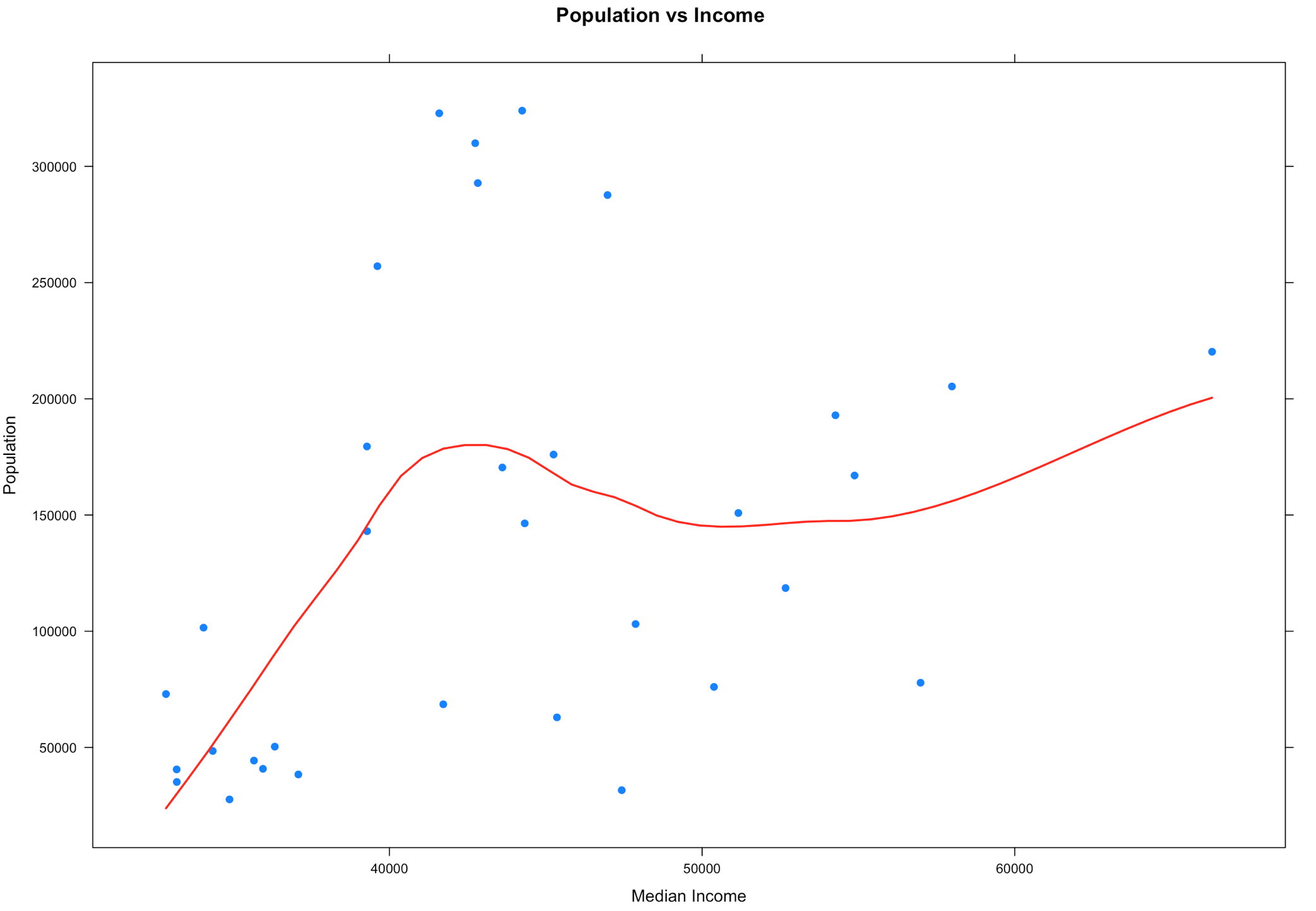
To do this we are going to need use quantile().
# Using quantile will give us some control of the proportions
# Run quantile first to see the results.
quantile(florida$population,probs = seq(0, 1, 0.05))
#Load q05 with the results of quantile at the 5% percentile
#Load q95 with the results of quantile at the 95% percentile
q05 <- quantile(florida$population,probs = seq(0, 1, 0.05))[2]
q95 <- quantile(florida$population,probs = seq(0, 1, 0.05))[20]
#Create the dataframe with the subset
x<-subset(florida,population >=q05 & population <= q95)
#try the xyplot again
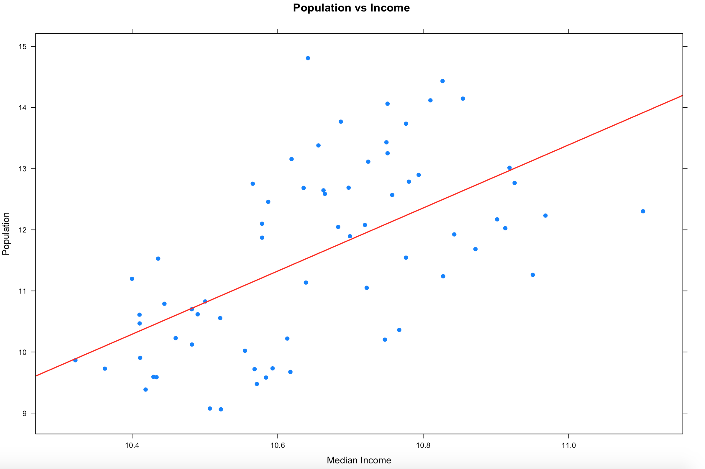
xyplot((population) ~ (MedianIncome),
data=x,
main="Population vs Income",
xlab="Median Income",
ylab = "Population",
type = c("p", "smooth"), col.line = "red", lwd = 2,
pch=19)
Did we make it better? We made it different. We also only dropped 8 counties from the dataset, so it was less impactful to the dataset. You can see that some of these are not going to be as perfect or as easy as mtcars, and that's the point. Using the entire population of the US with the interquartile range may be a reasonable method for detecting outliers, but its never just that easy. More often than not my real world data is never in a perfect mound with all the data within 2 standard deviations of the mean, also called the normal distribution. If this had been county election data, 5 of those 8 counties voted for Clinton in the last presidential election, if you consider that we tossed out 5 of the 9 counties she won what is the impact of dropping the outliers? Keep in mind that 67 observations(rows) is a very small dataset too. The point is, always ask questions!

Take these techniques and go exploring with your own data sets.
Shep